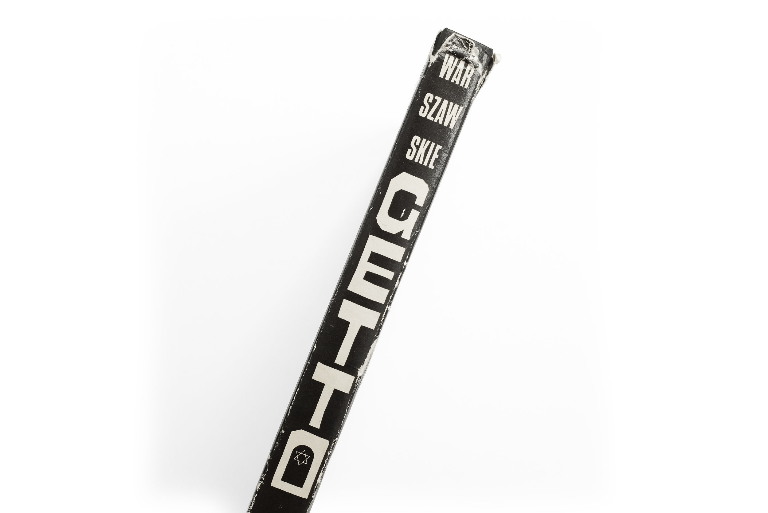
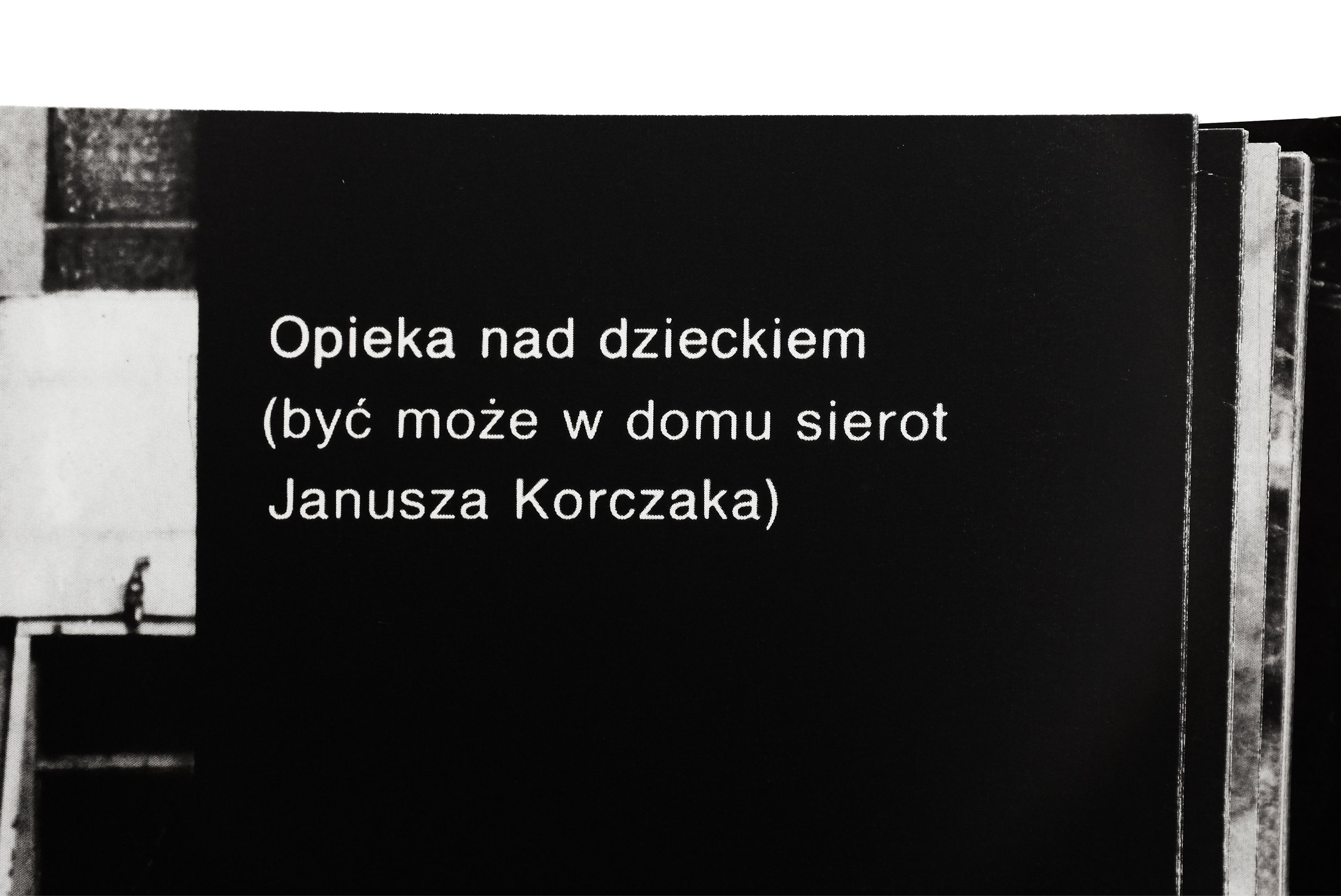
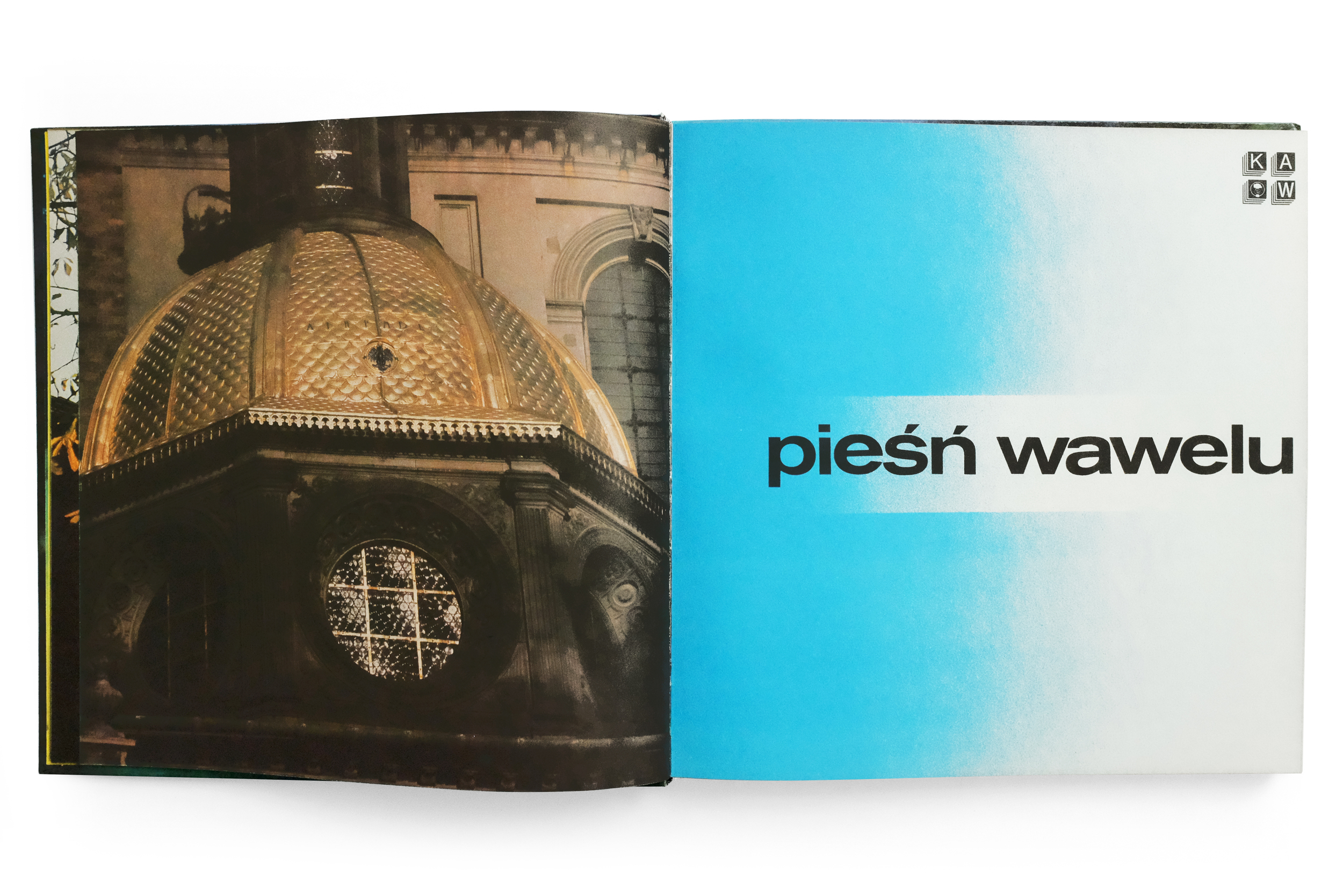
Anonyme Skulpturen


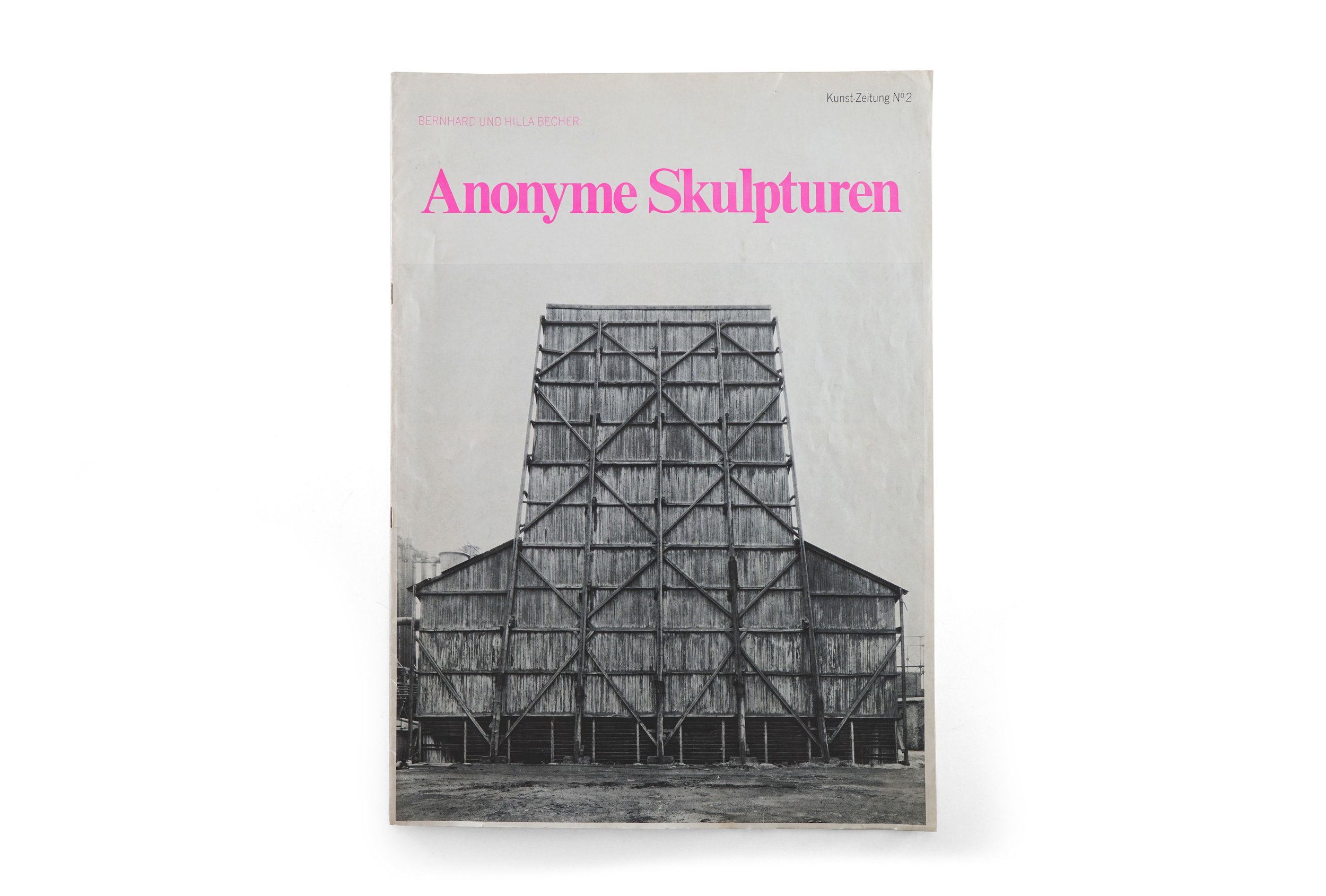
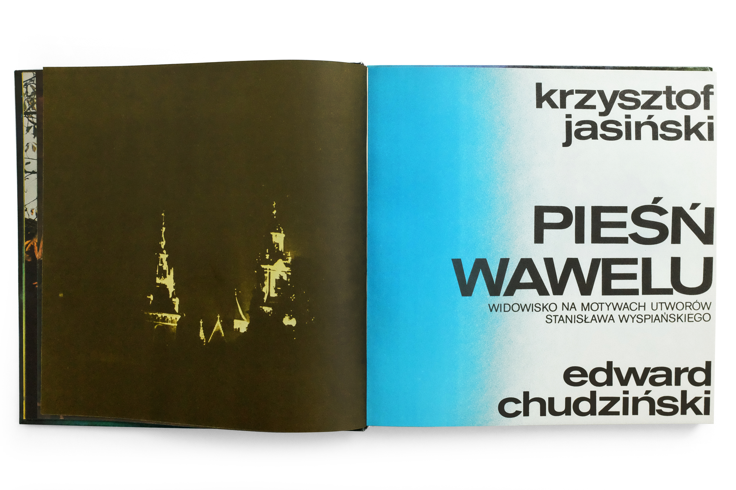
Anonyme Skulpturen — Kunst-Zeitung Vol 2
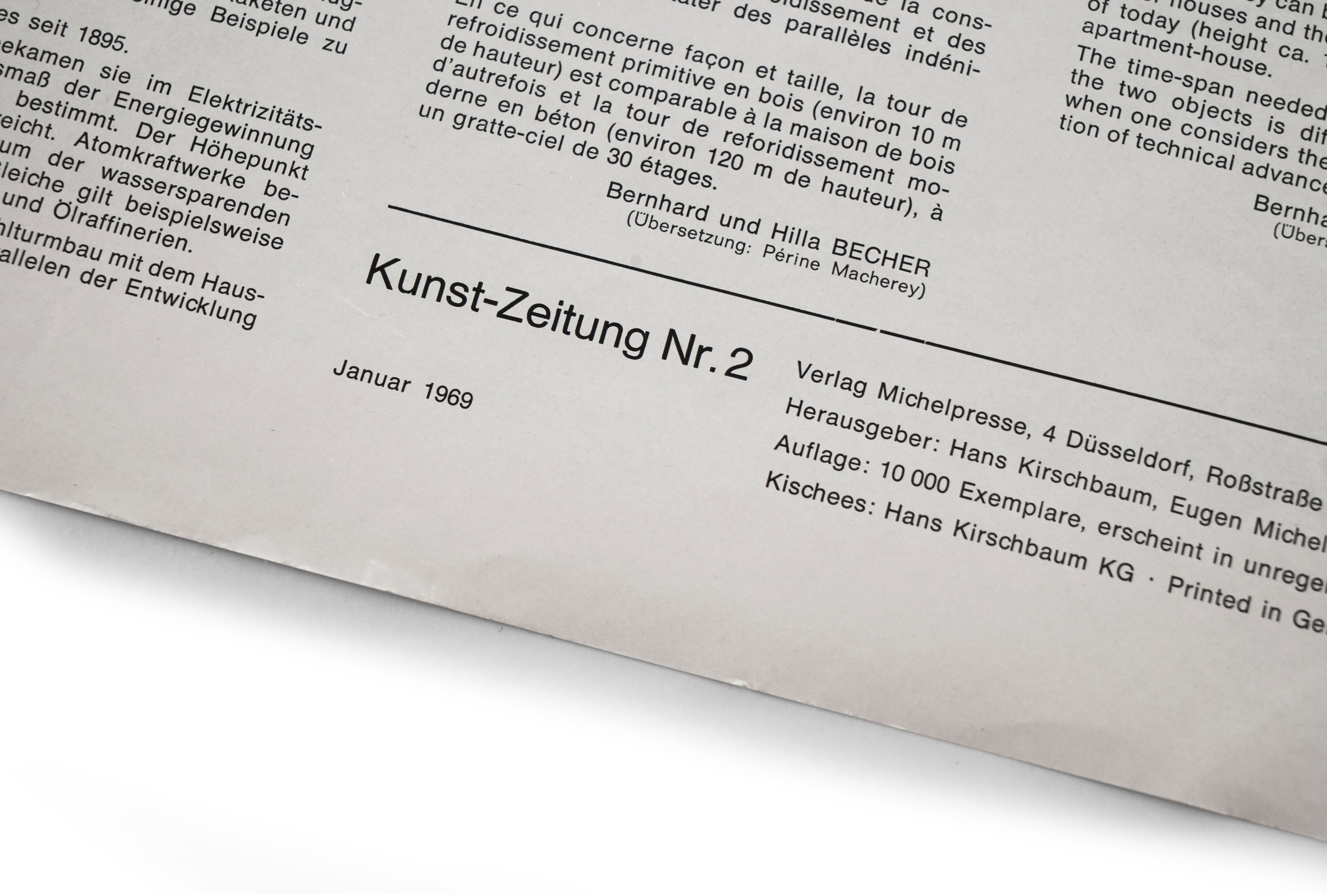
1969
Verlag Michelpresse
12pp.

printed in Düsseldorf
 

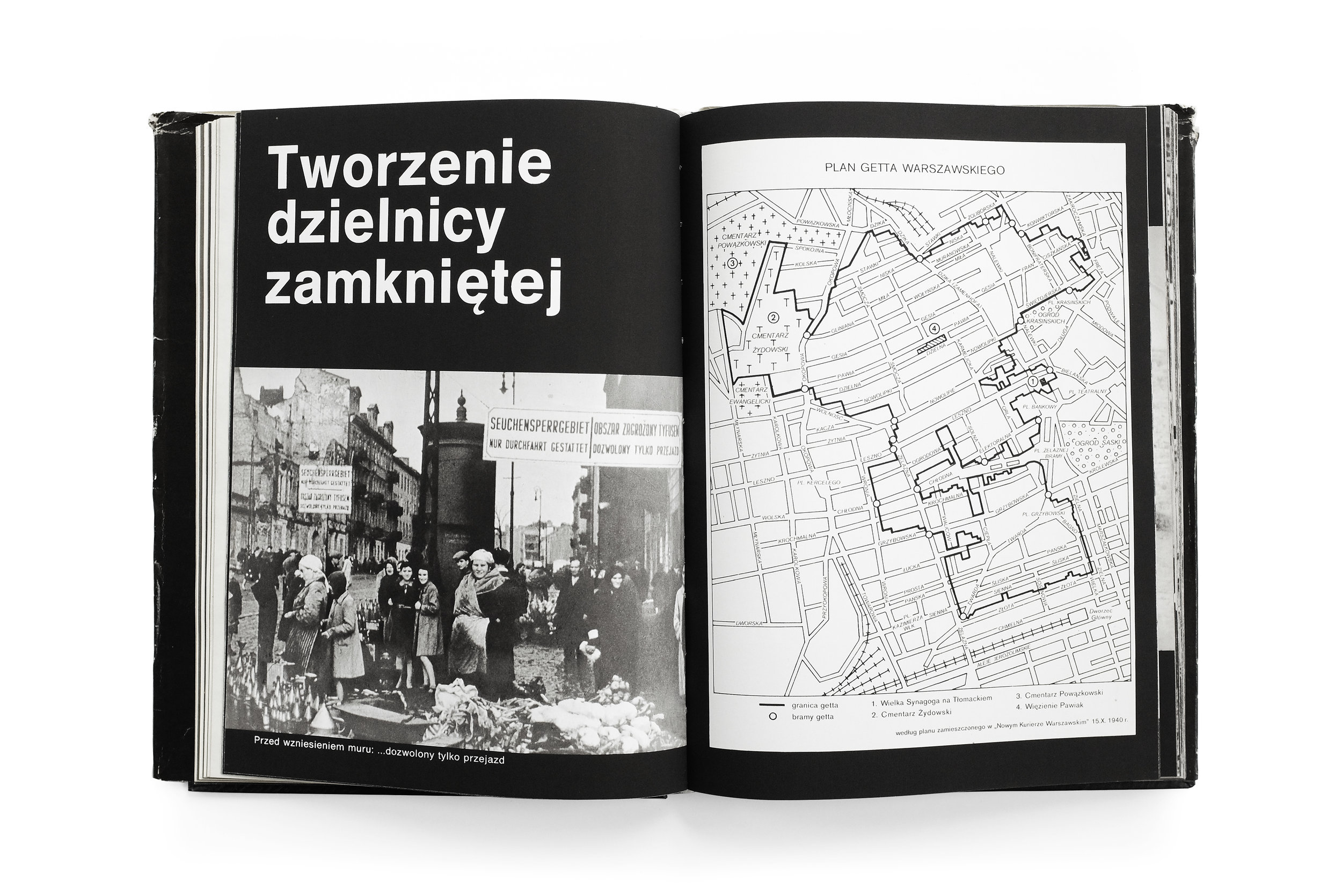
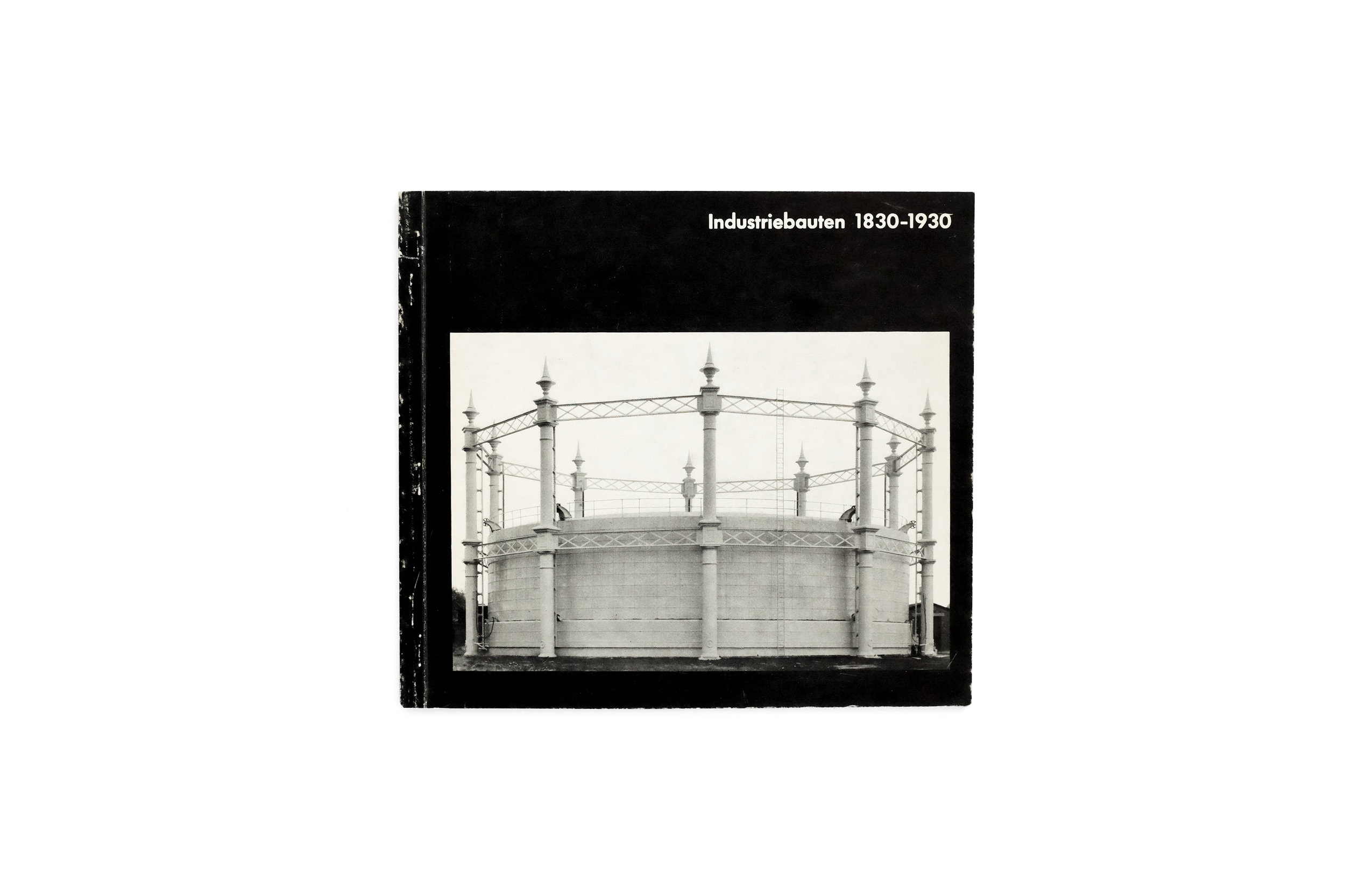
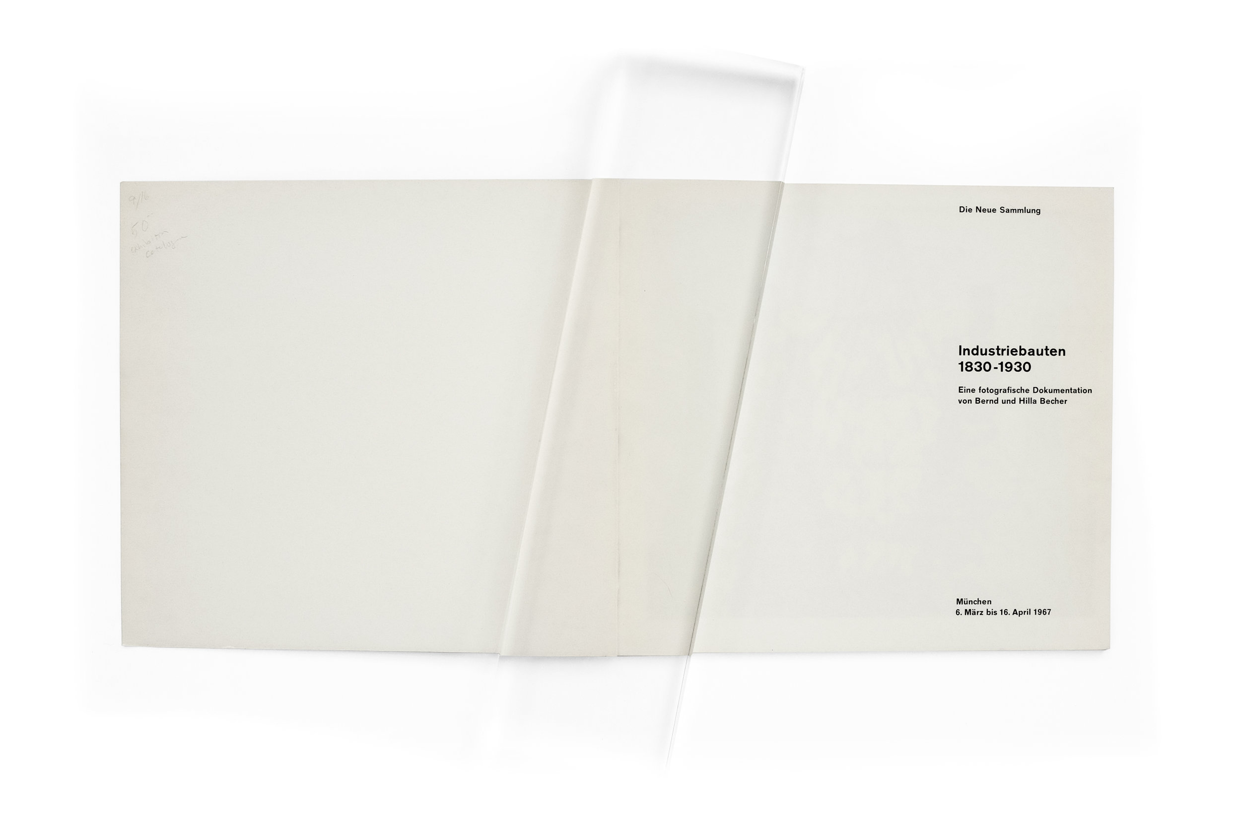
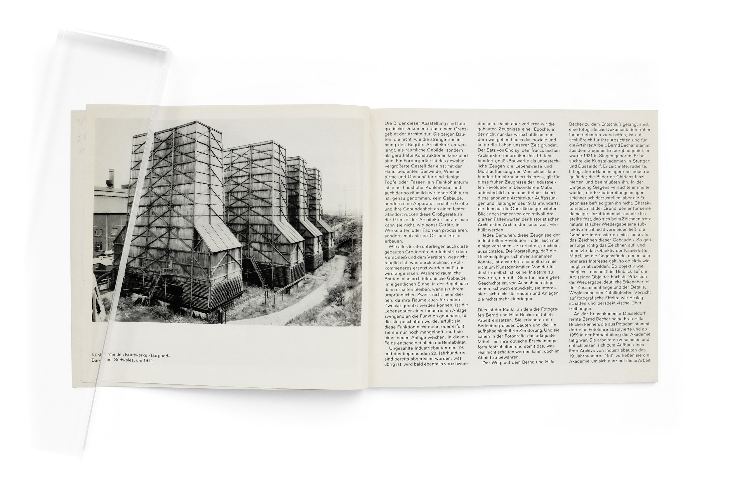
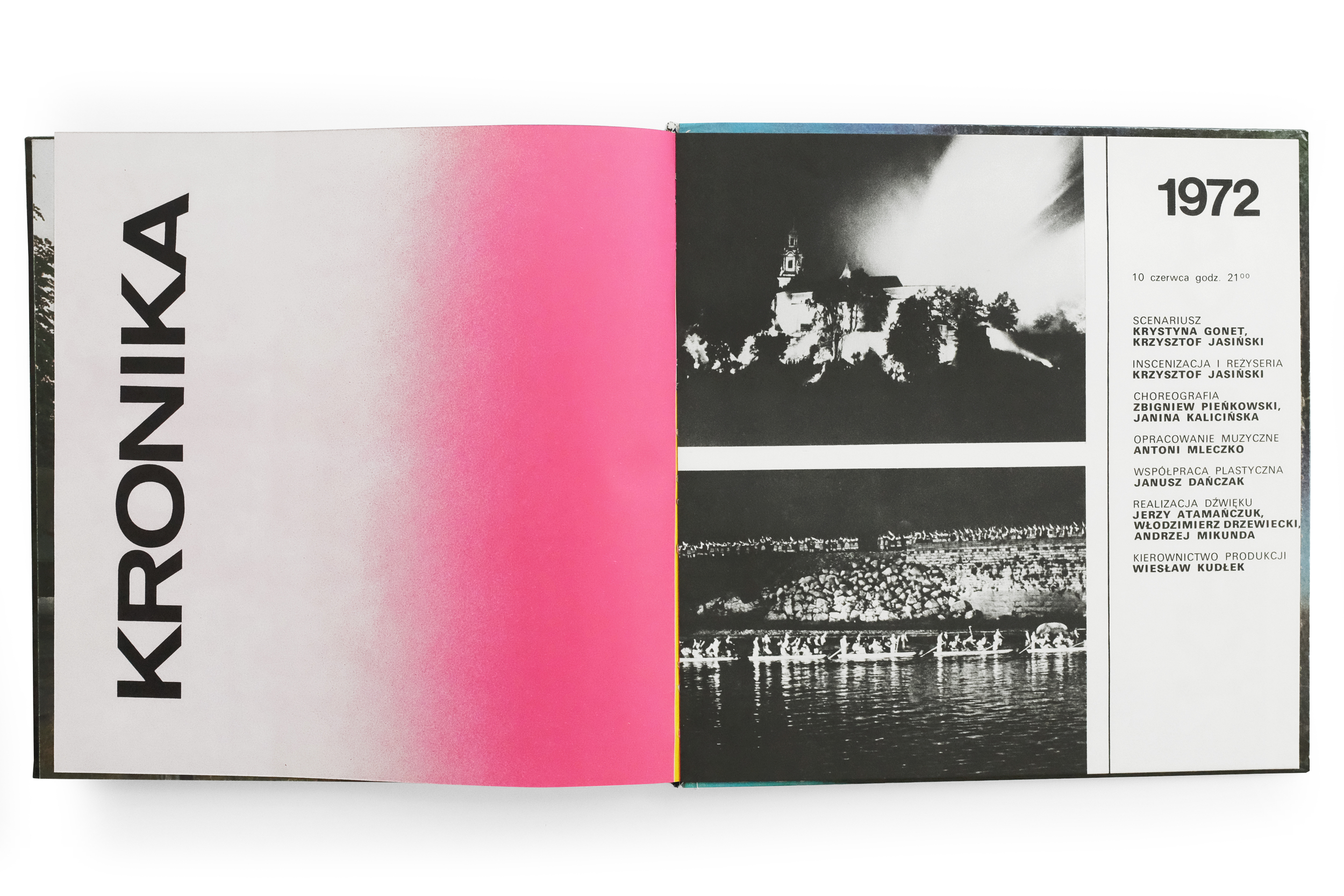
Some will remember my previous post highlighting the historic Becher catalog Industriebauten 1830­–1930 which documented their first exhibition ever. This publication holds similar historical weight as it marks the first show the Bechers ever had in Düsseldorf, their city of residence, and where they famously organized the Düsseldorf School of Photography within the Kunstakademie. In this post I’ll spare you a belabored introduction to the Bechers’ oeuvre along with my gratuitous enthusiasm for it. But I do recommend visiting that post for more background on their exceptional body of work if you’re unfamiliar. For now, I’ll simply focus on why I find this short, cheaply made publication so remarkable.

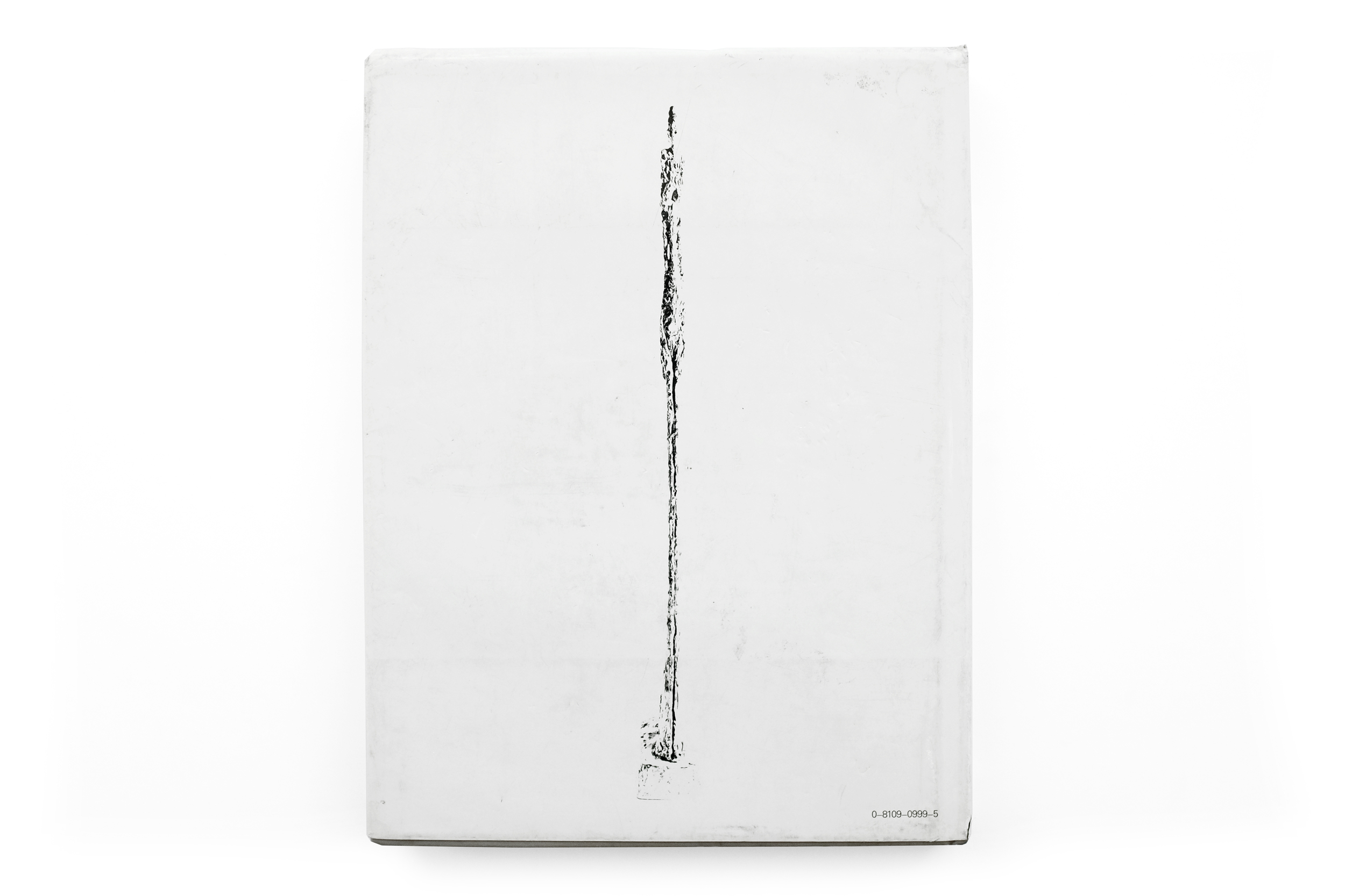
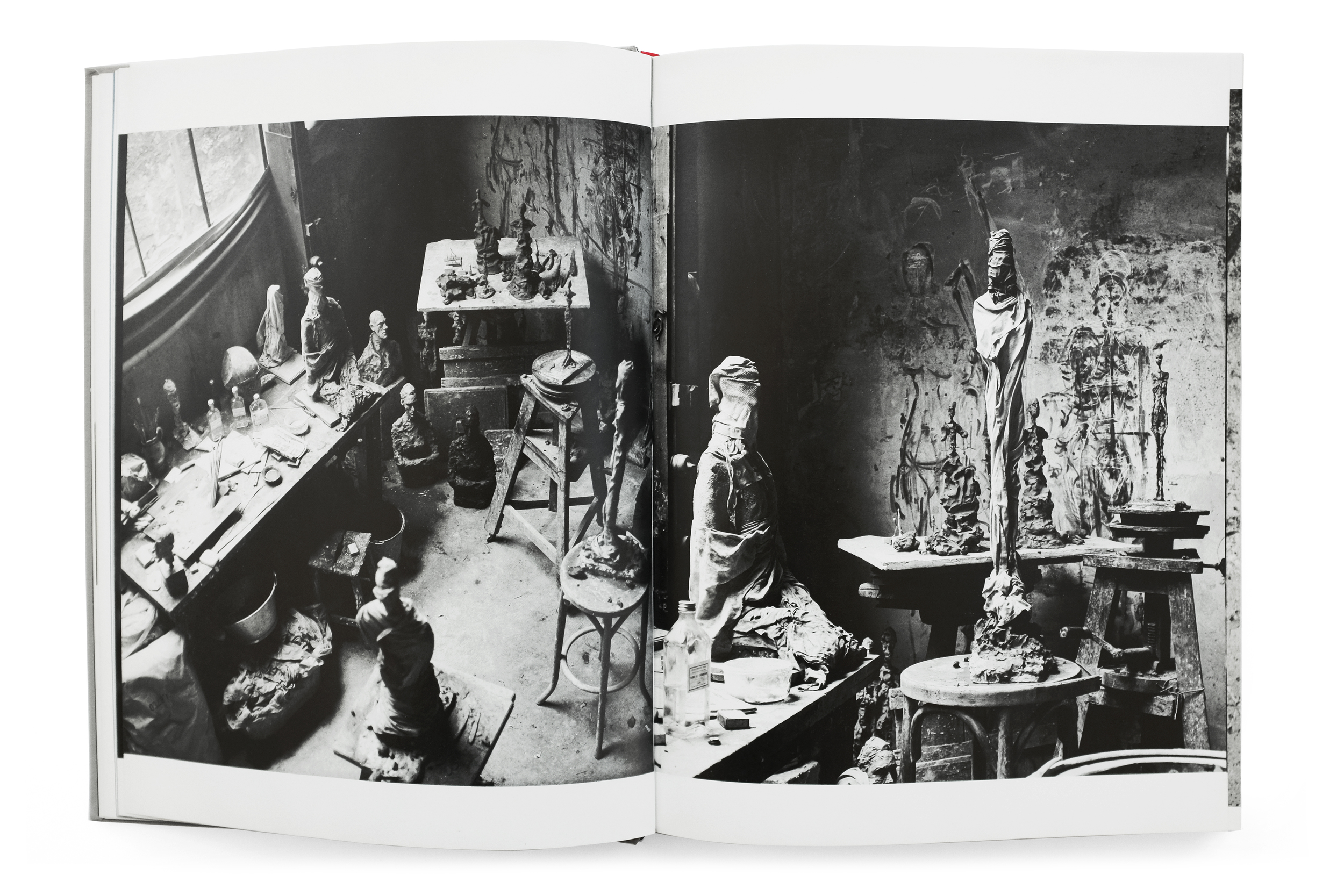
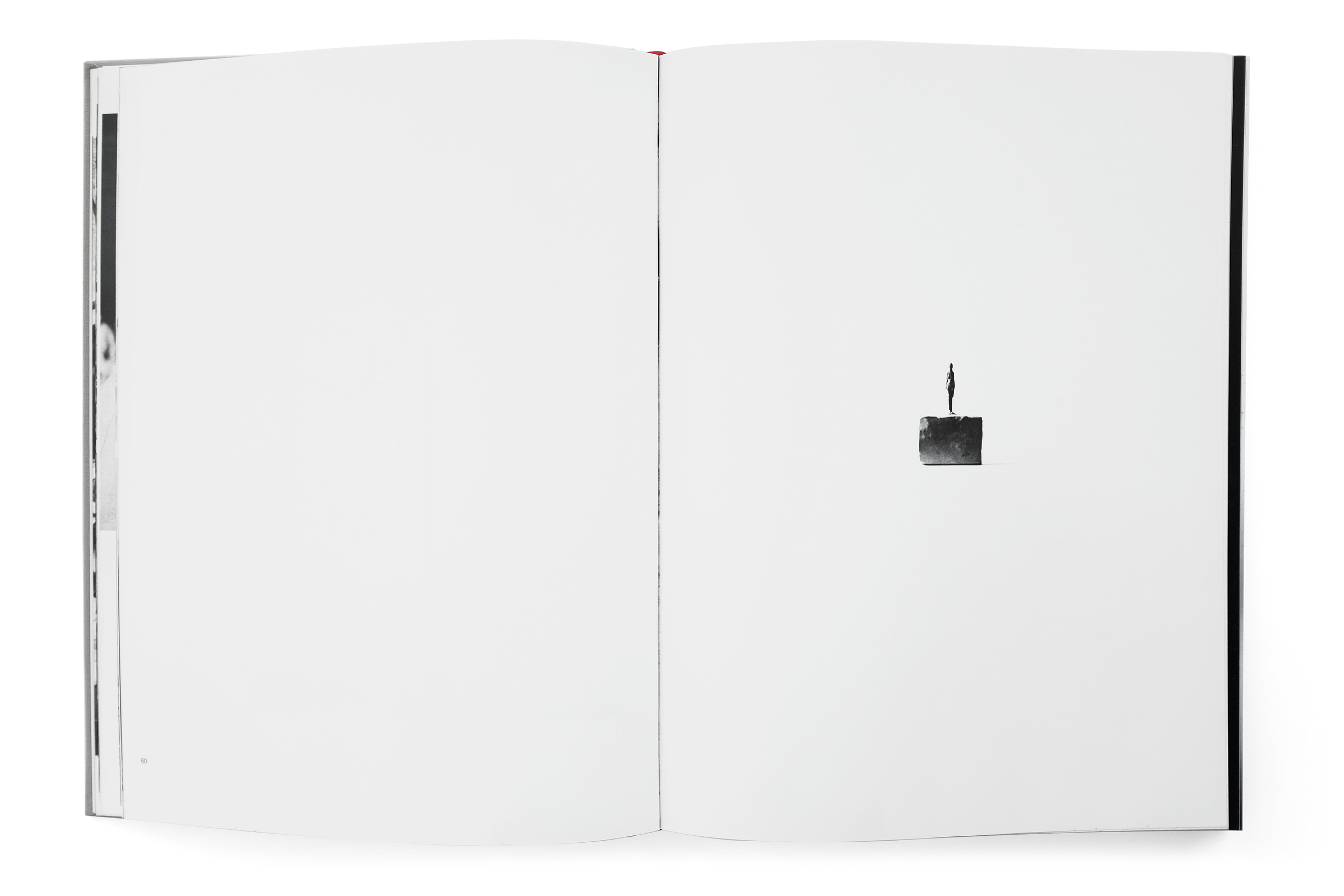
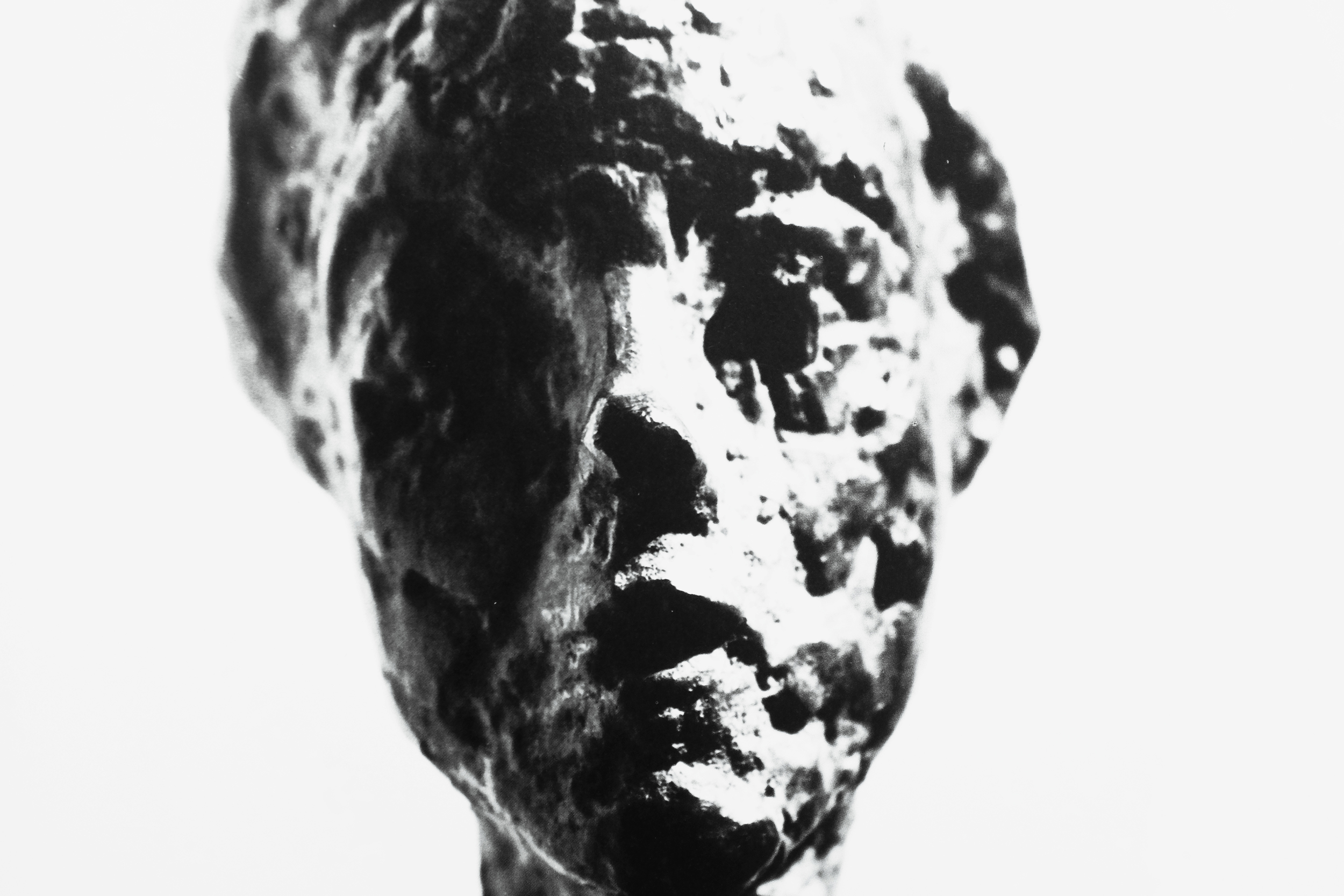
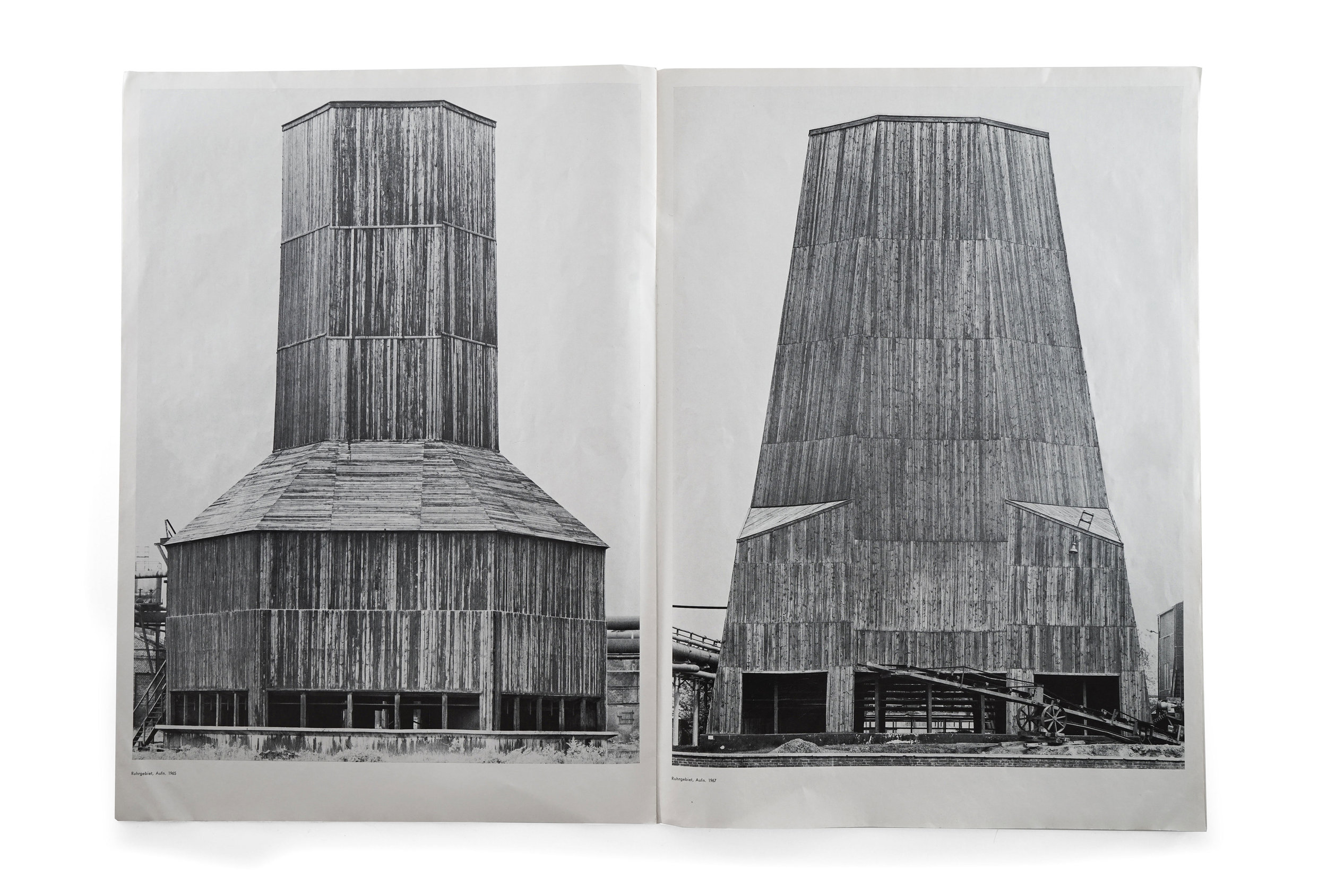
The first thing worth mentioning—and probably the book’s most striking feature—is its oversized proportion at 43cm tall, however, the photos regrettably don’t quite convey that scale. (As an aside, I am experimenting with video supplements for these photo-based posts which would document the books in a naturalistic setting, allowing readers to appreciate the materiality, scale, and pacing of a book as it is being flipped through.) In an atypical move, all of the Bechers’ contemporary monographs are nearly identical in size and measure about 29cm tall, making this publication the largest-ever produced on the Bechers’ work (to my knowledge.) This point may seem pedantic but the impact of such a shift is dramatic when you’re lucky enough to find yourself in front of it. The larger format is very flattering of the work, especially given the monolithic nature of the subjects.

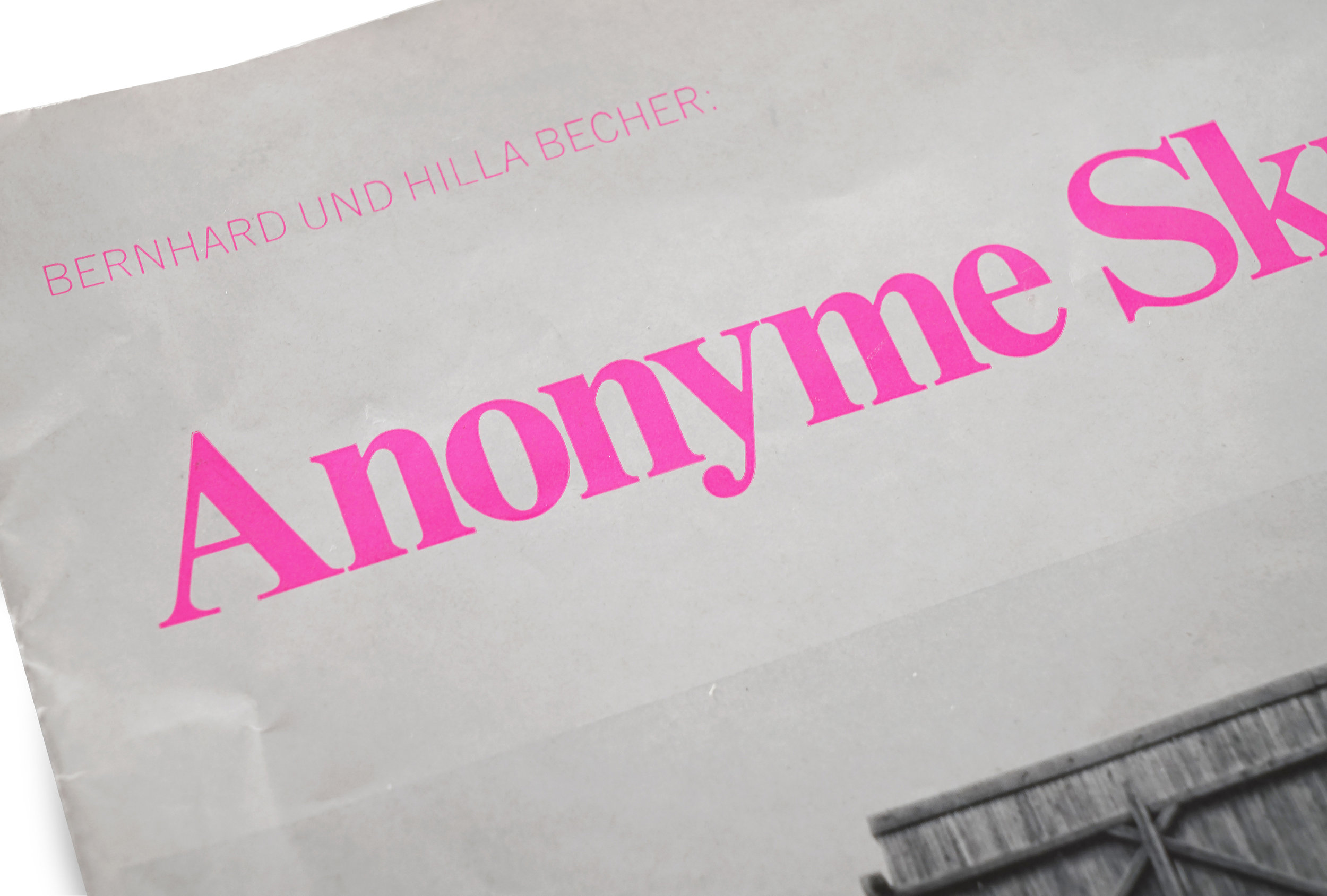
On the cover we find a tightly set Times New Roman flaunting an electric pink. It’s an irregular decision, which says nothing of the bizarre juxtaposition against the stark image of the cooling tower. And yet, it’s somehow perfect. The two elements conspire to create an arresting harmony that is utterly distinguished and entirely contemporary. I suspect only a sad, joyless soul could find fault with this pairing. 


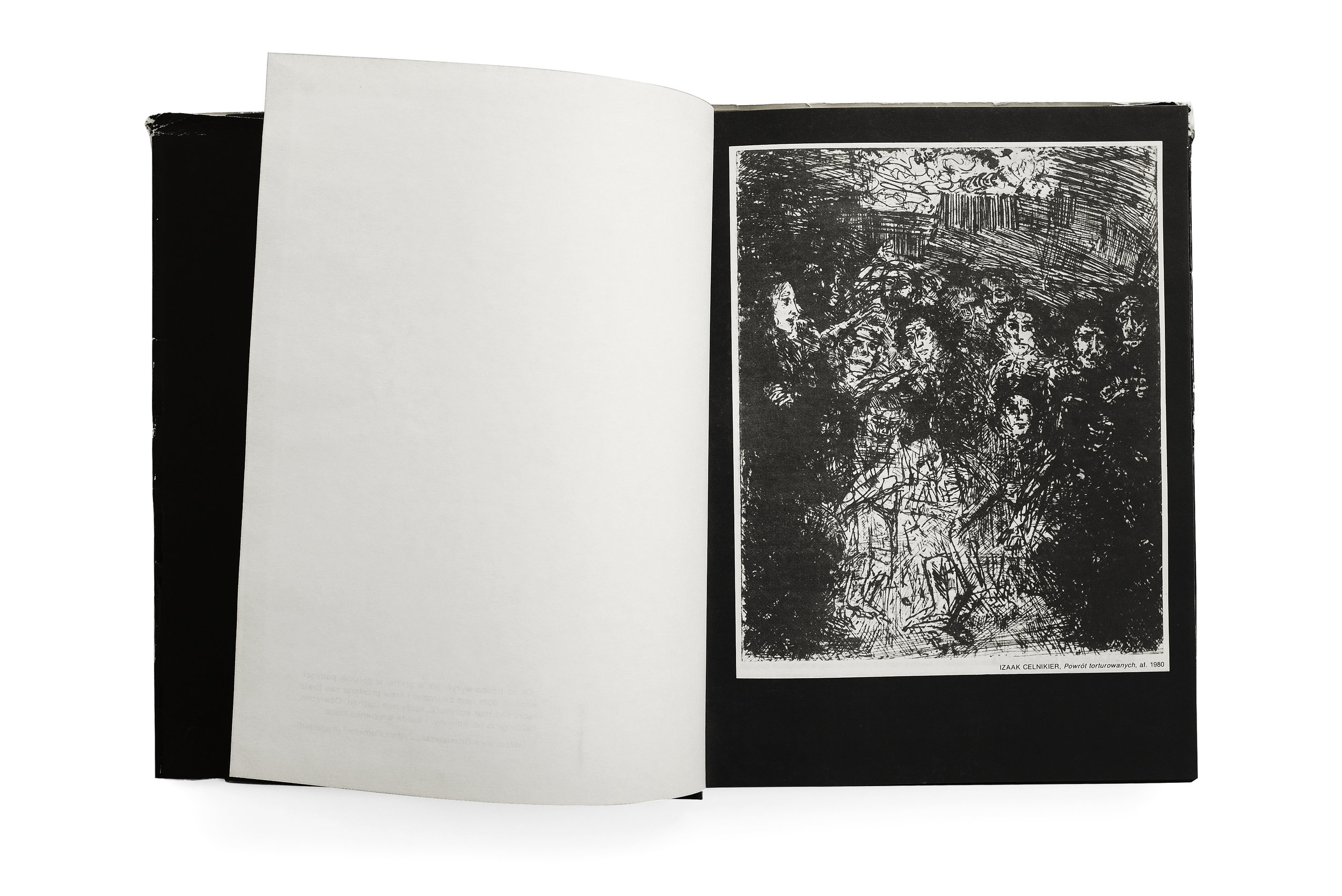
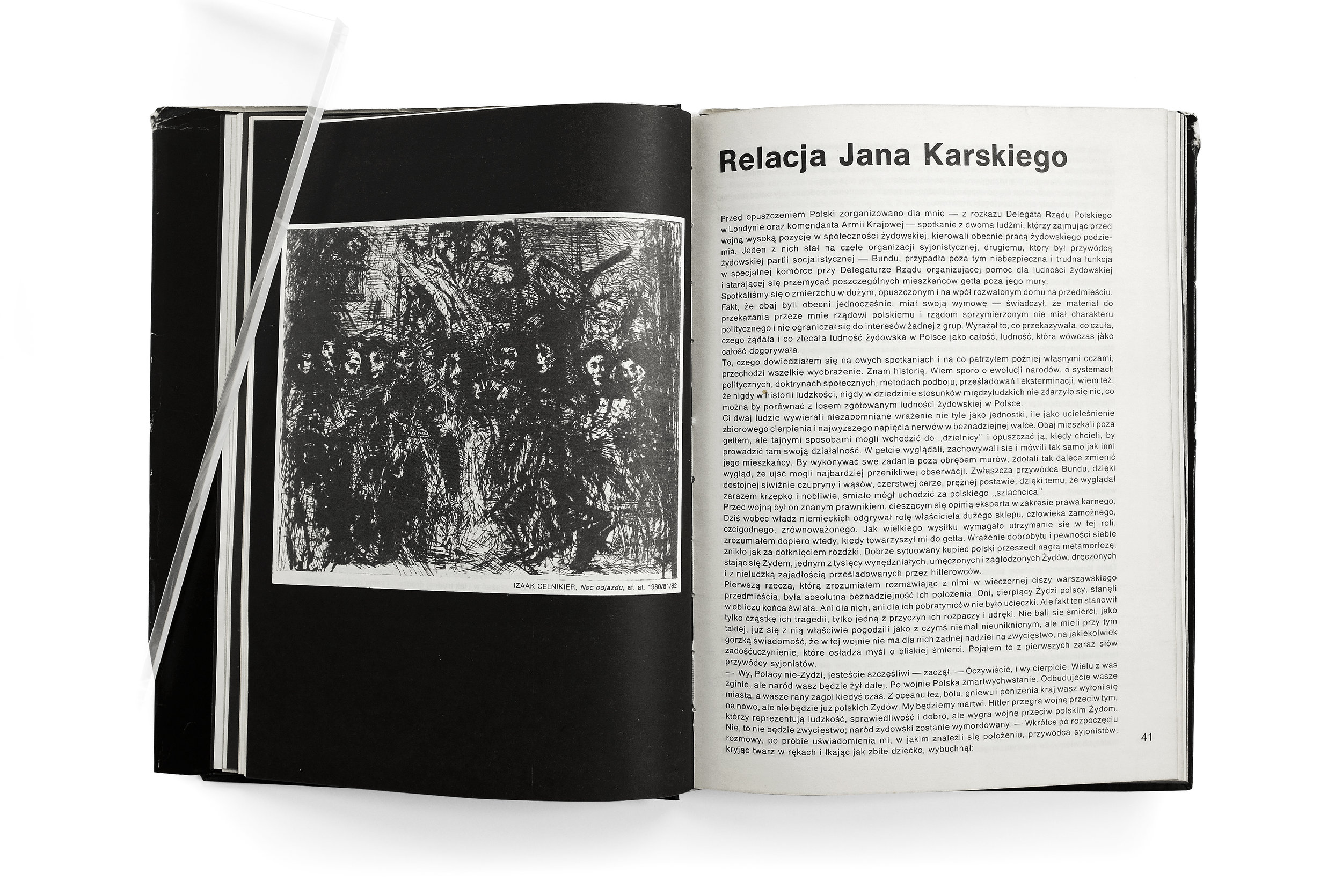
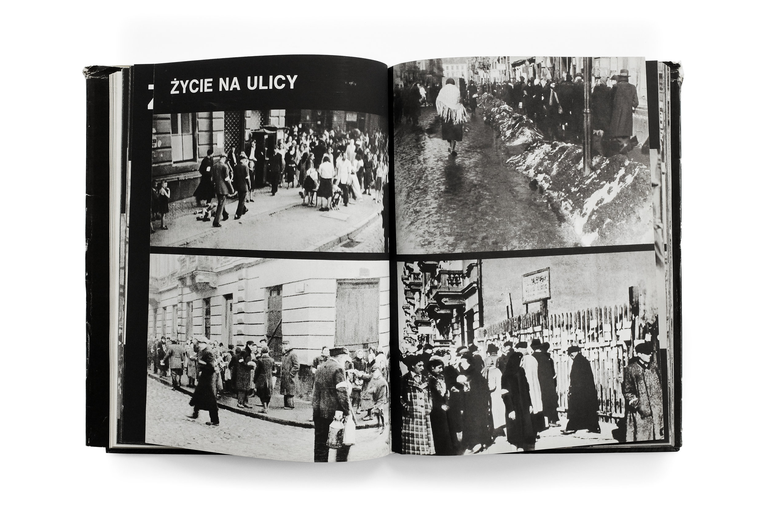
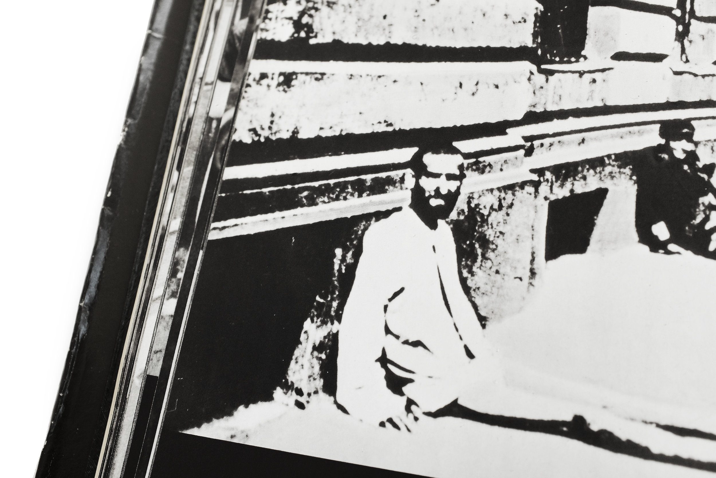
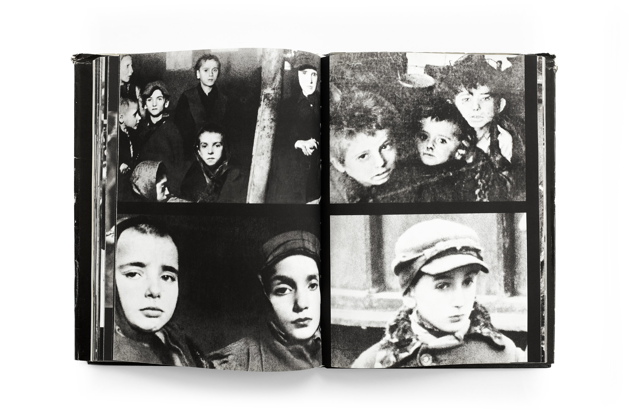
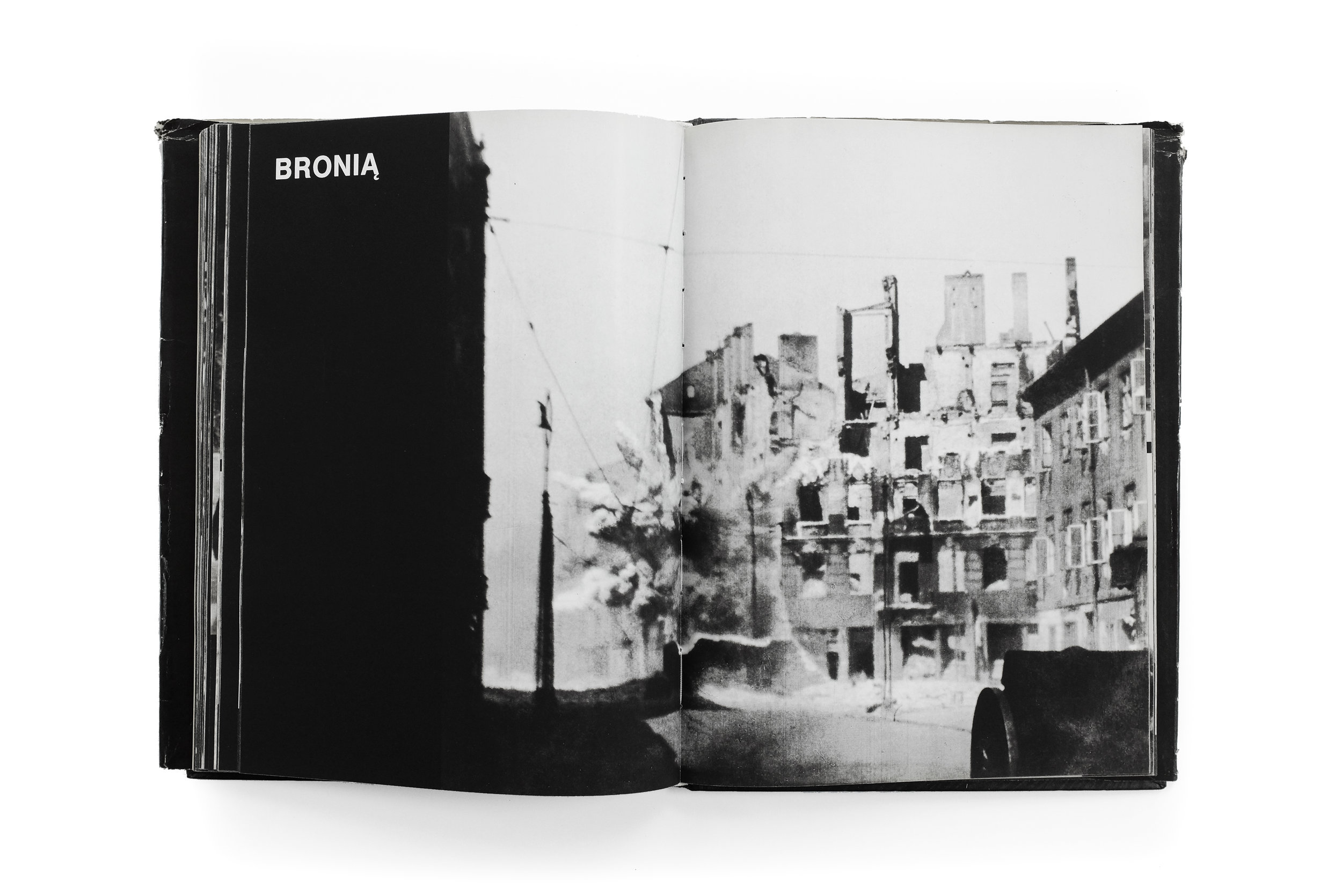
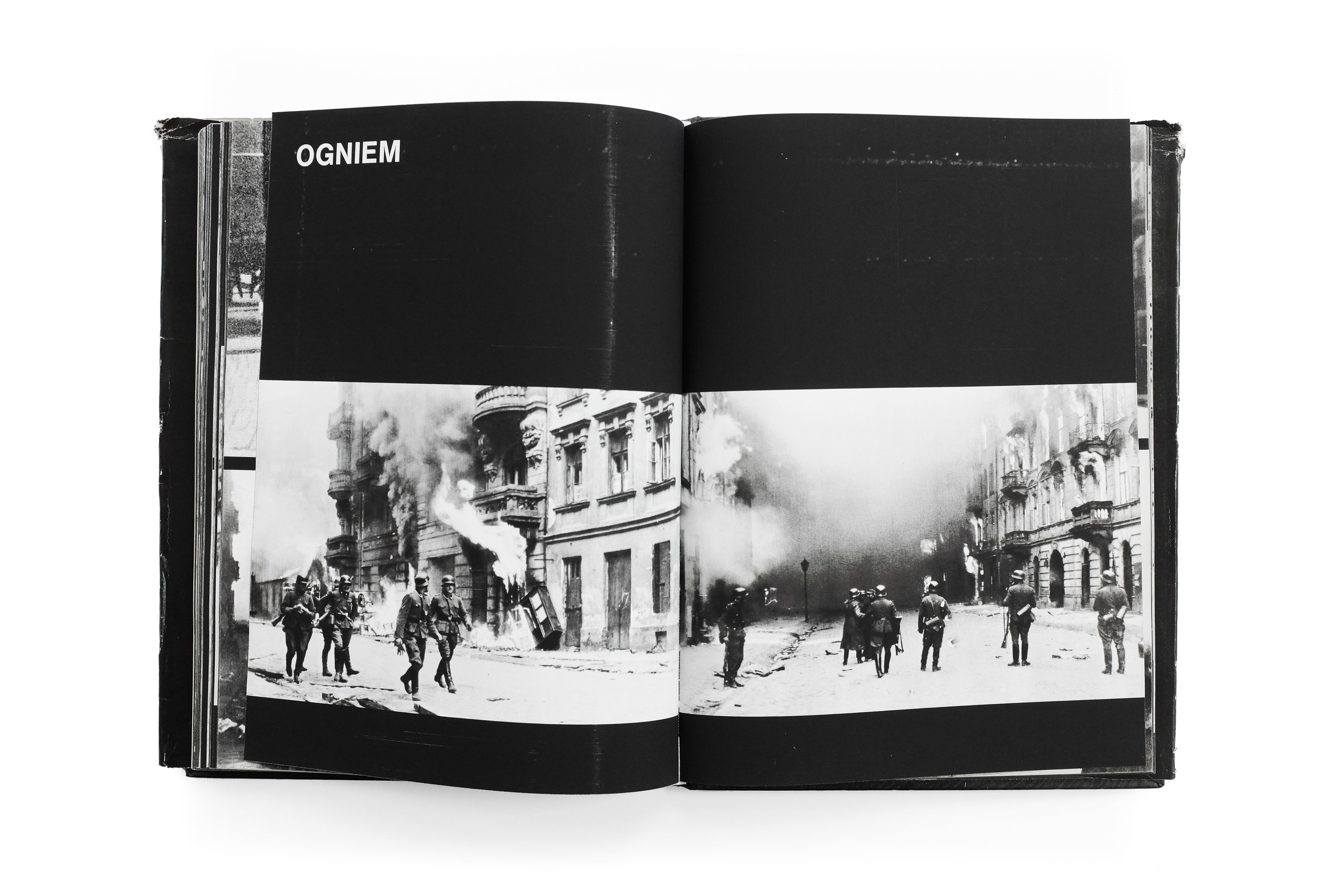
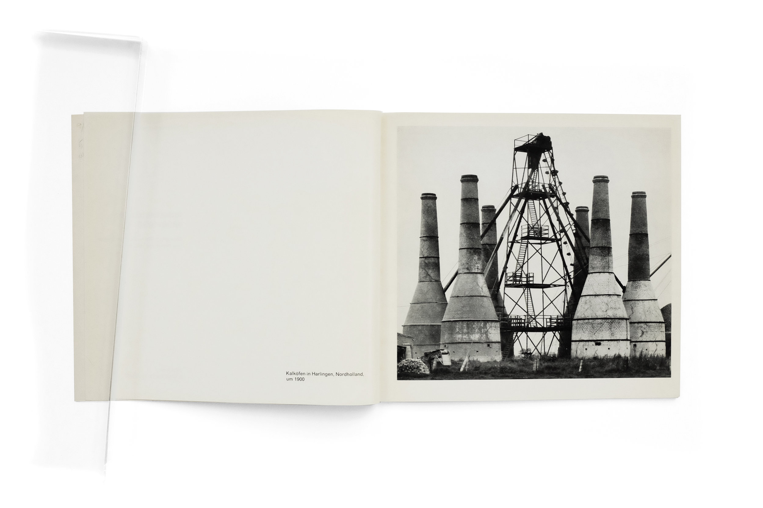
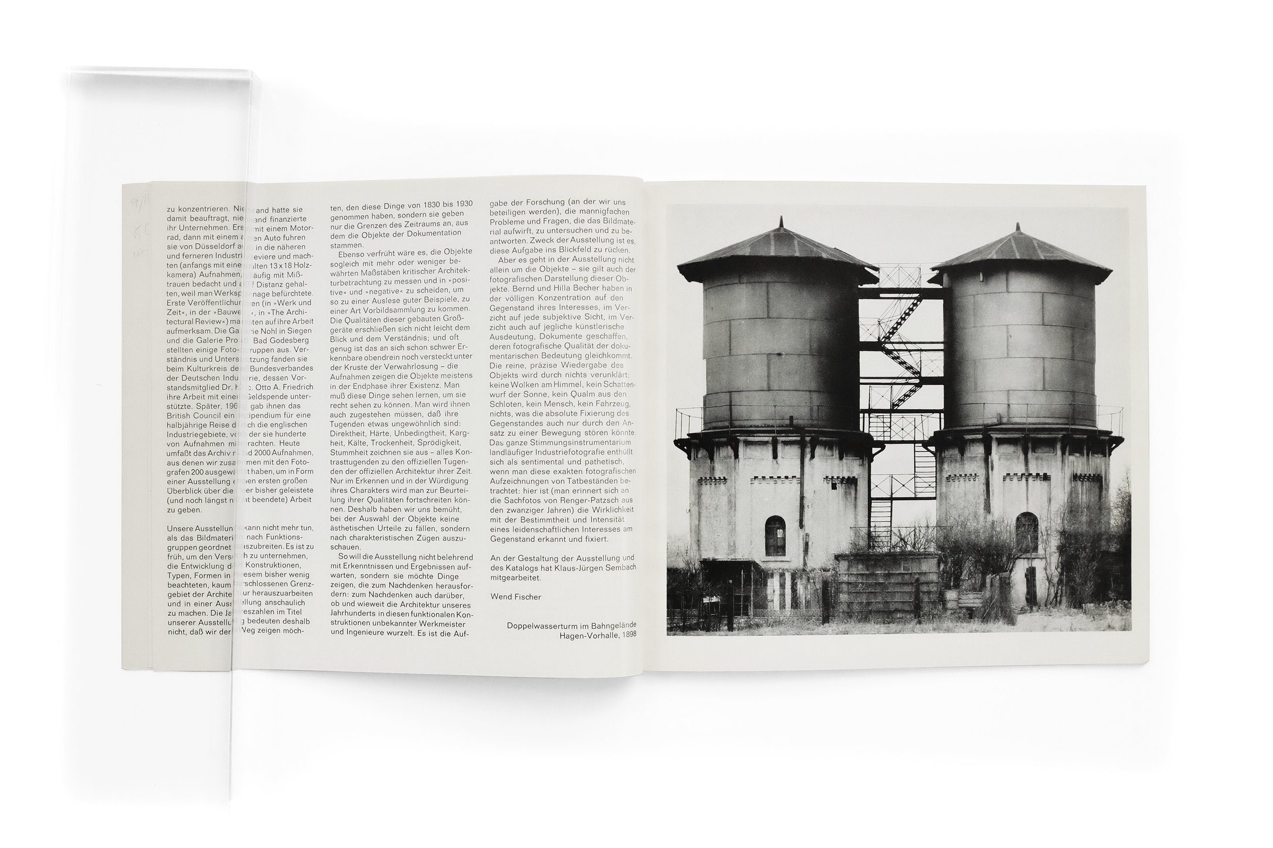
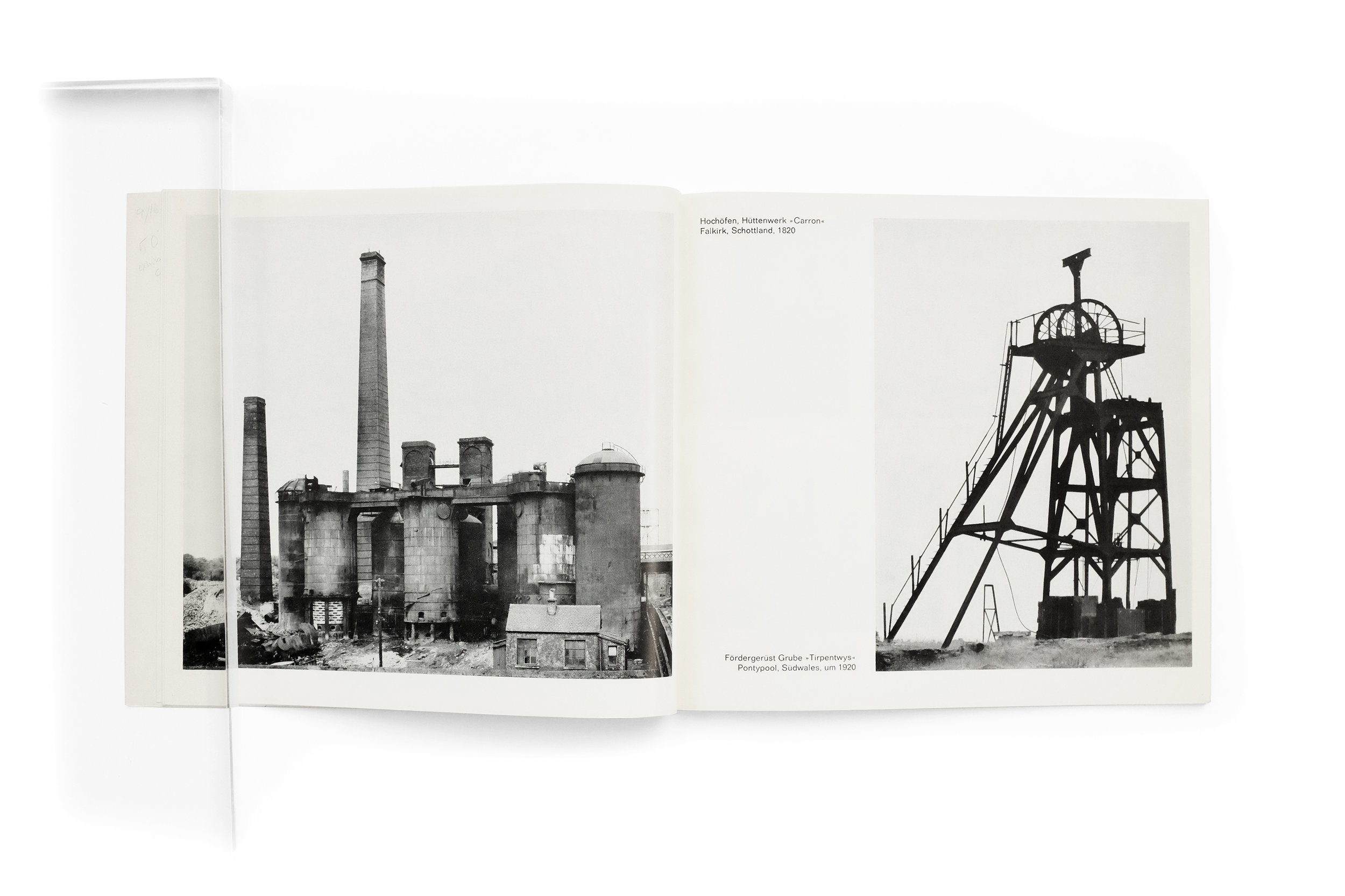
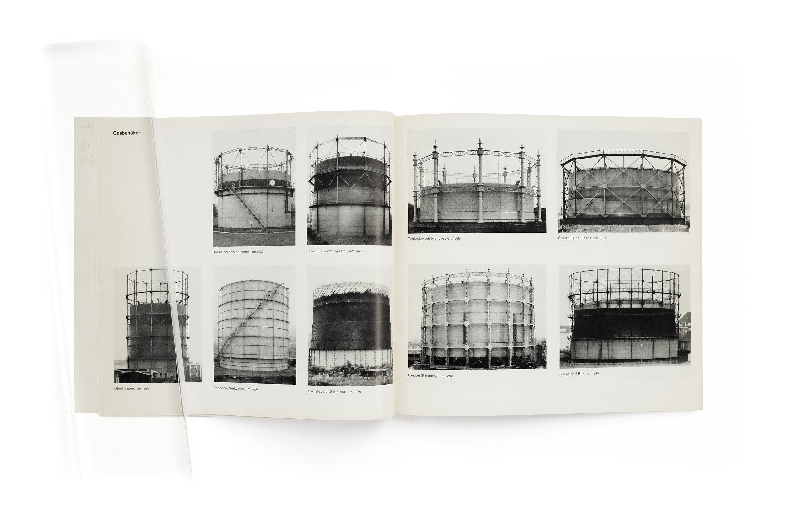
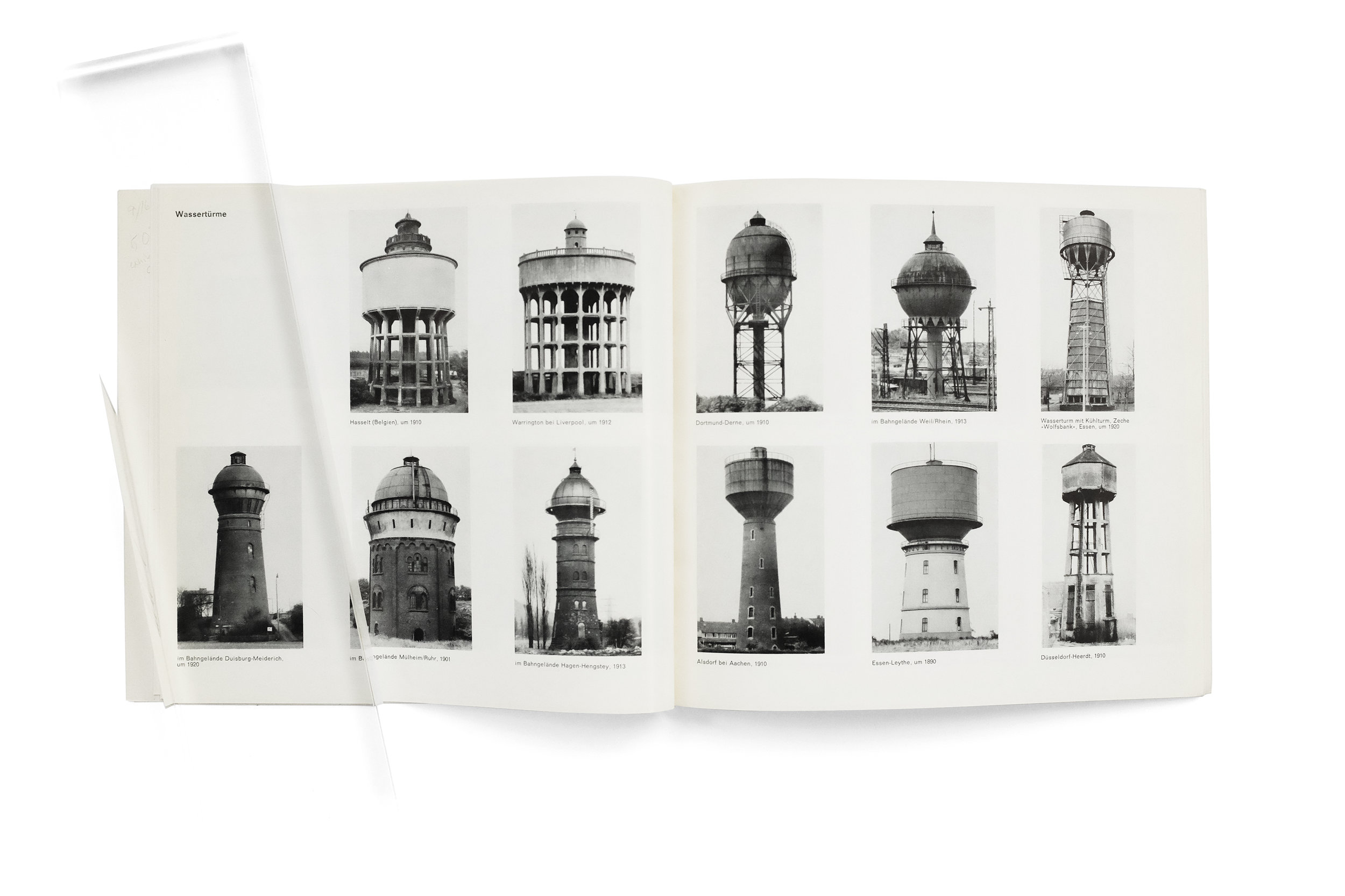
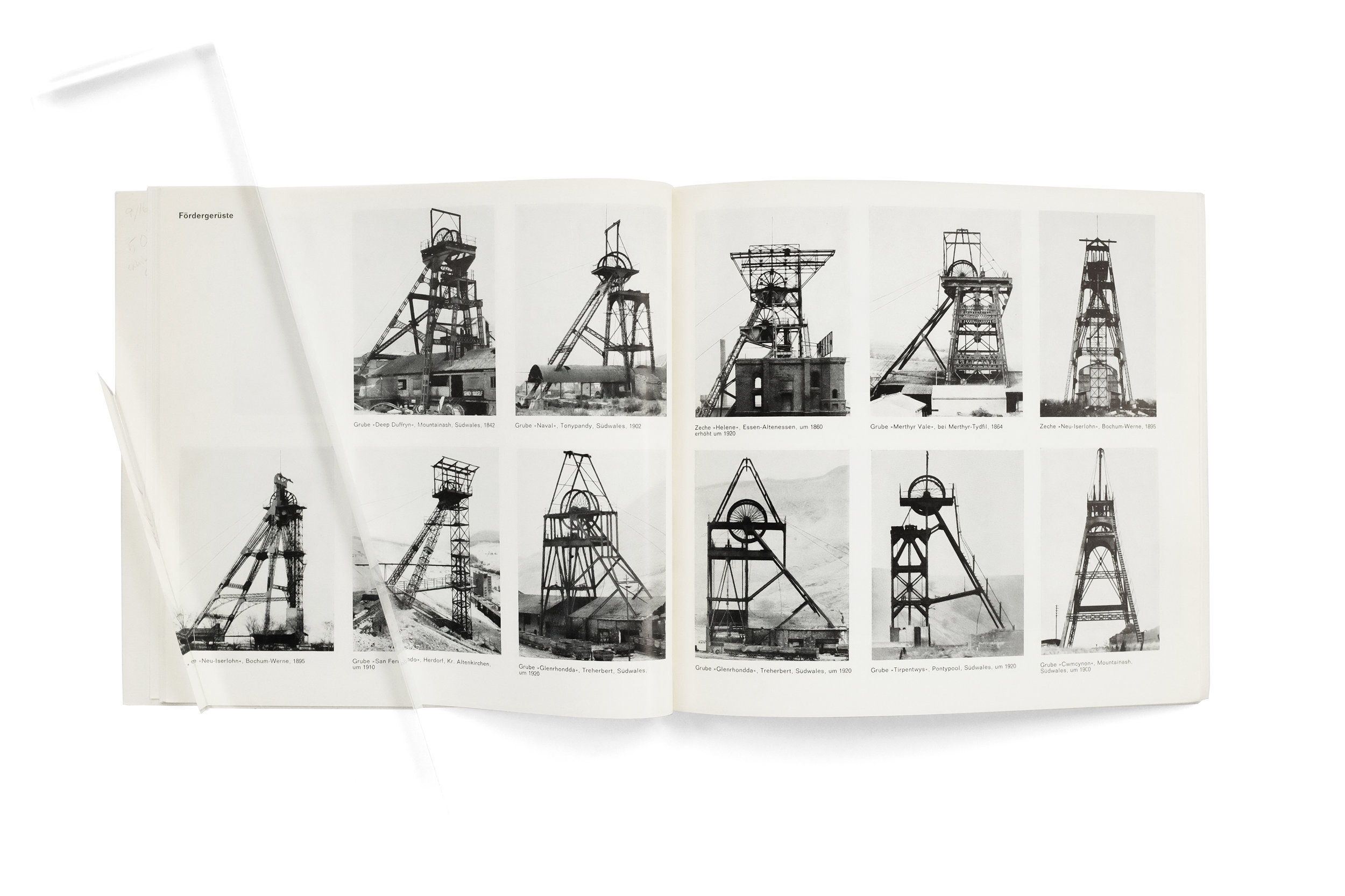
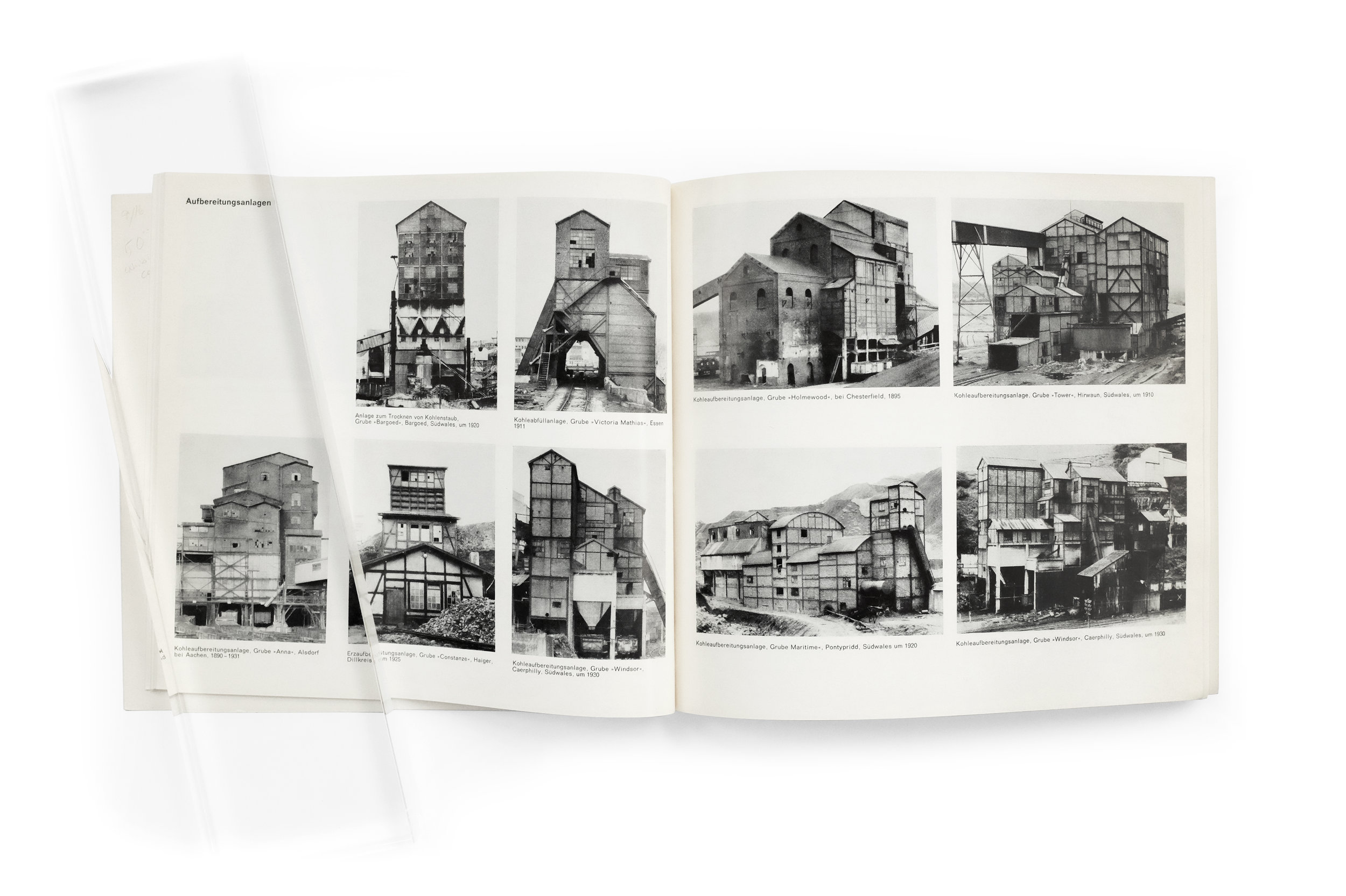
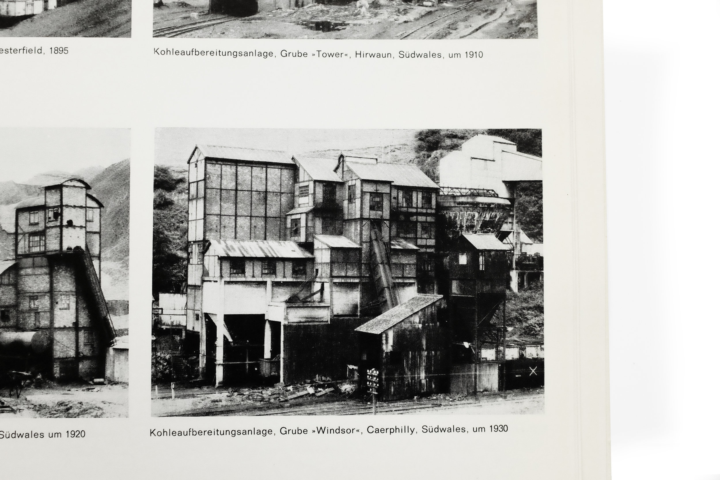
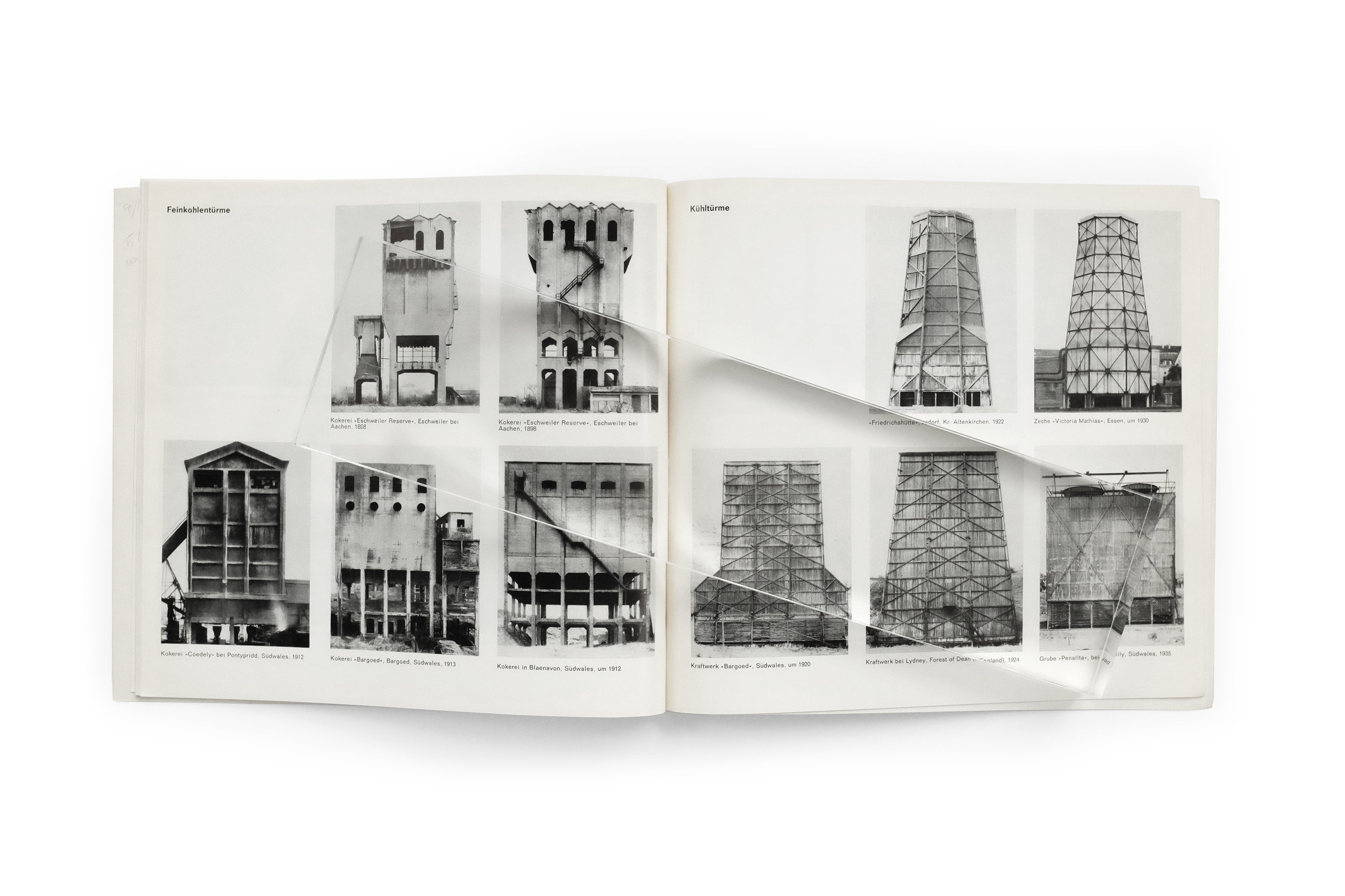
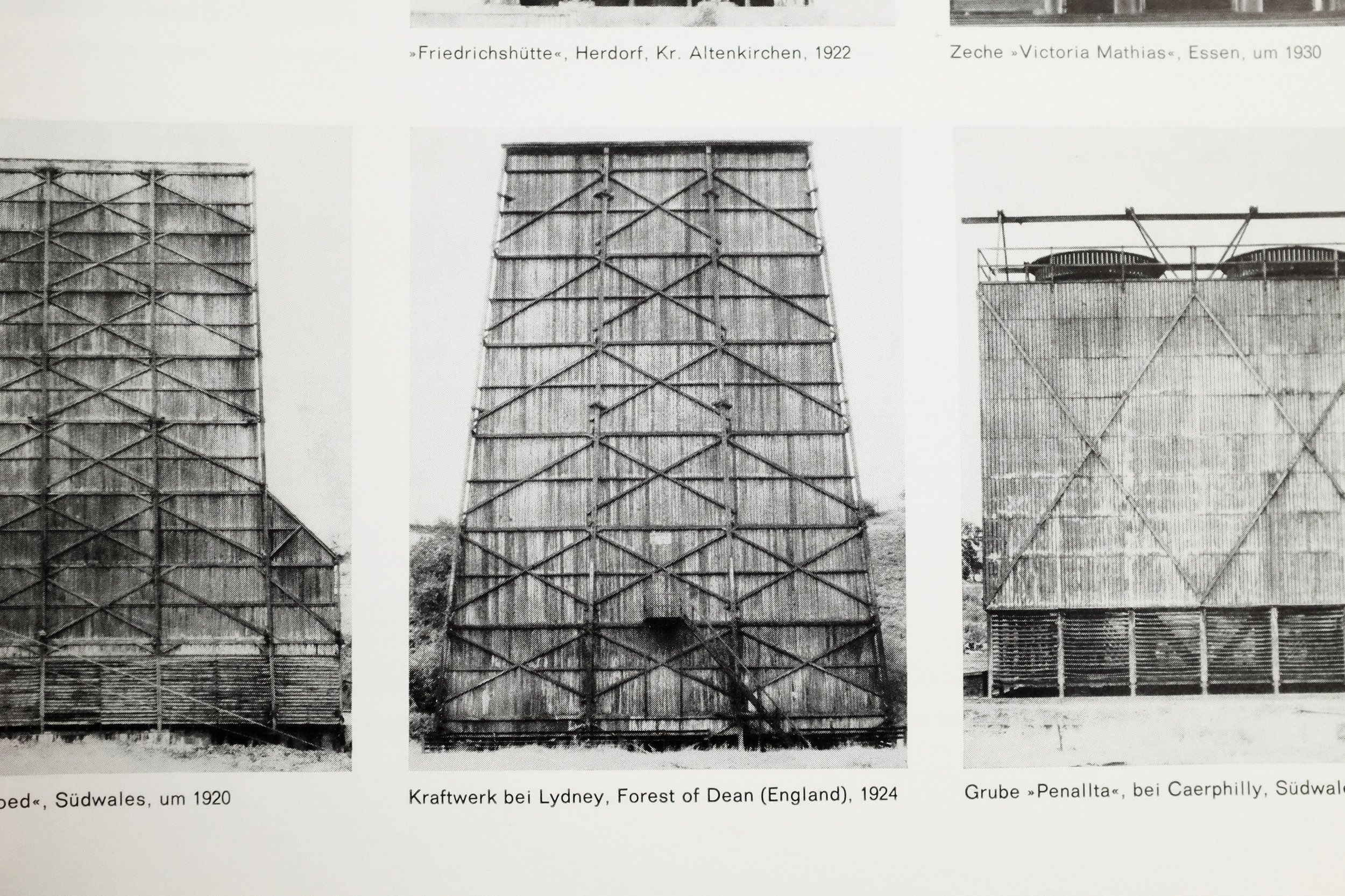
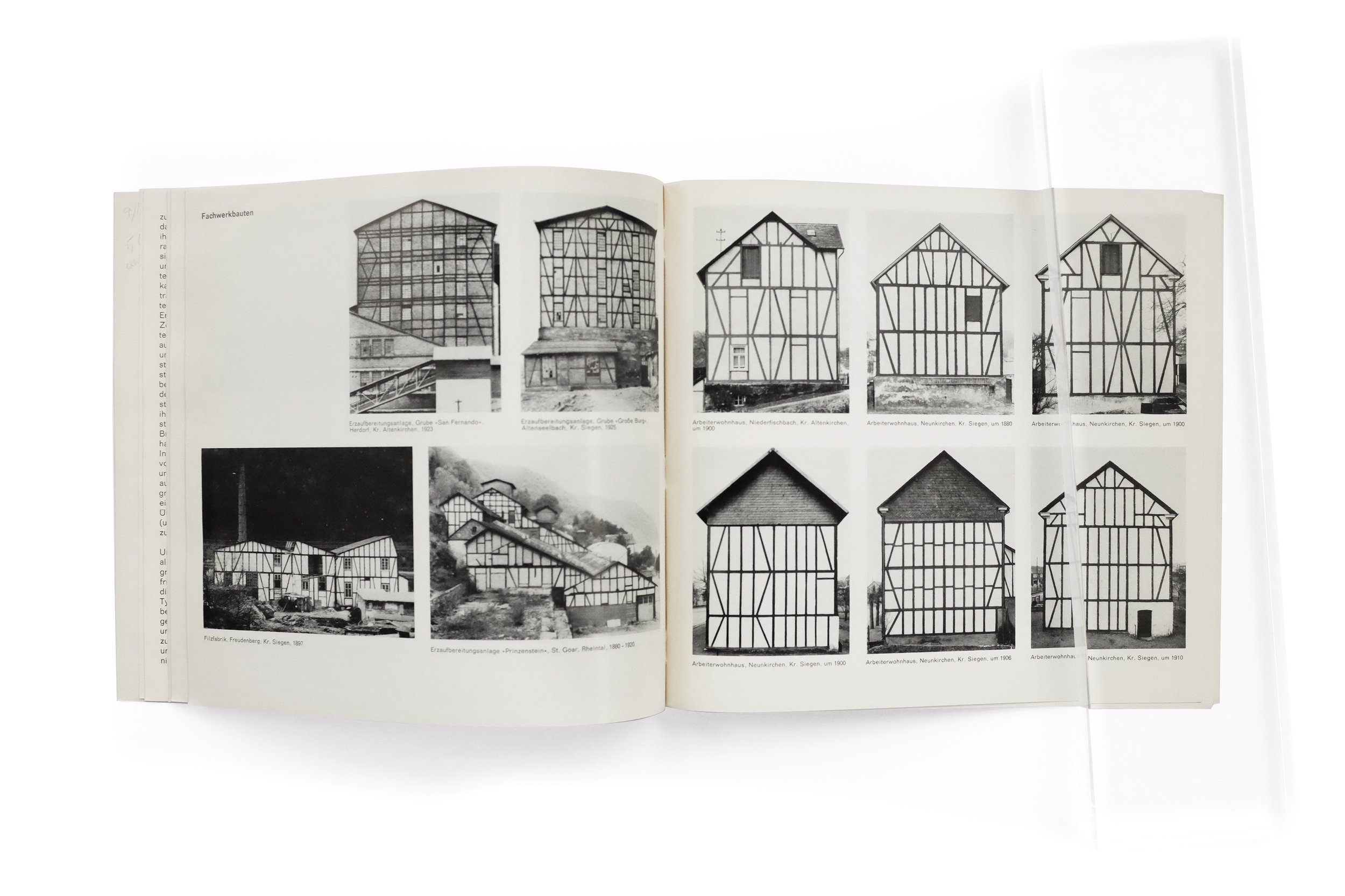
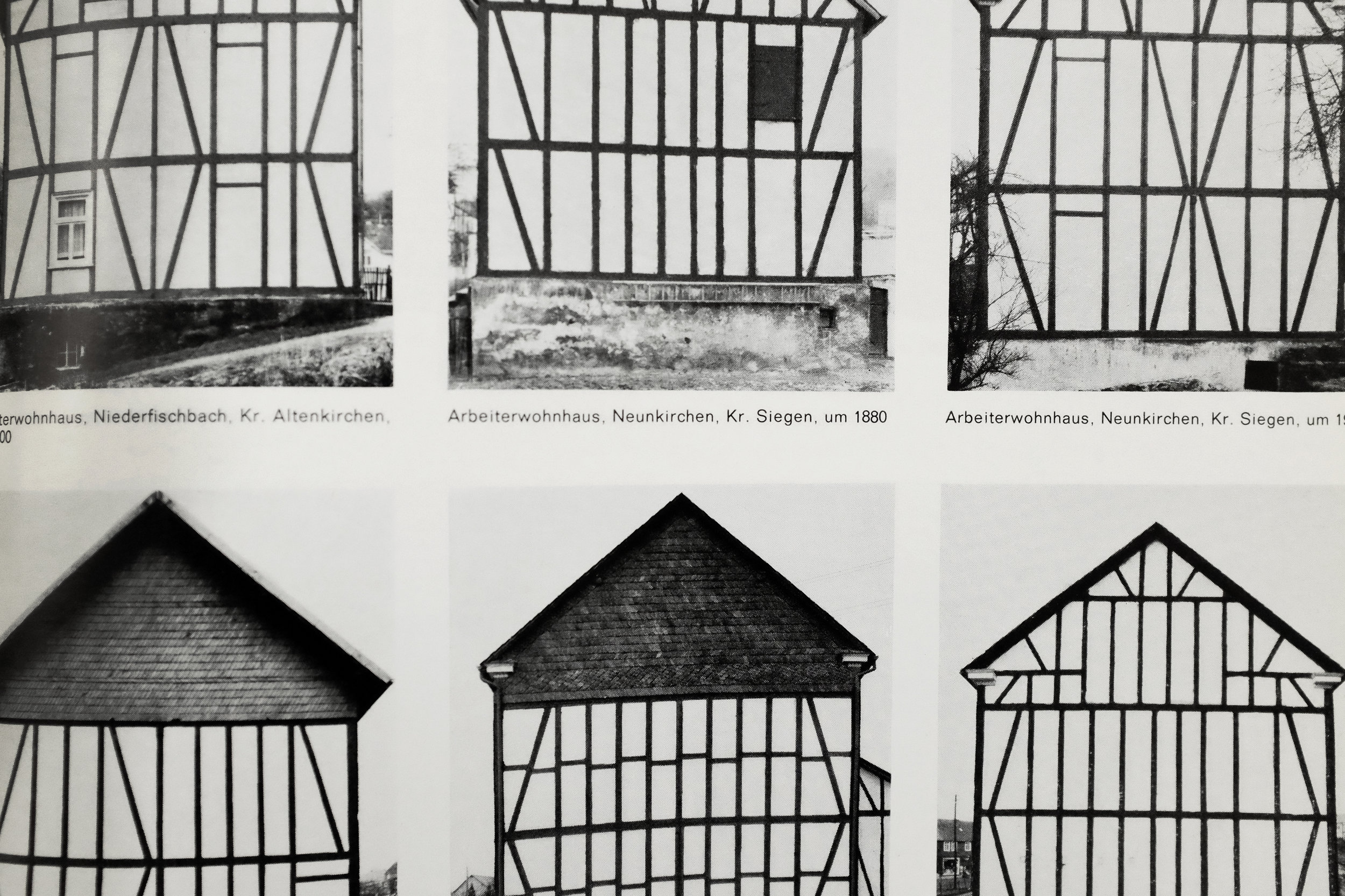
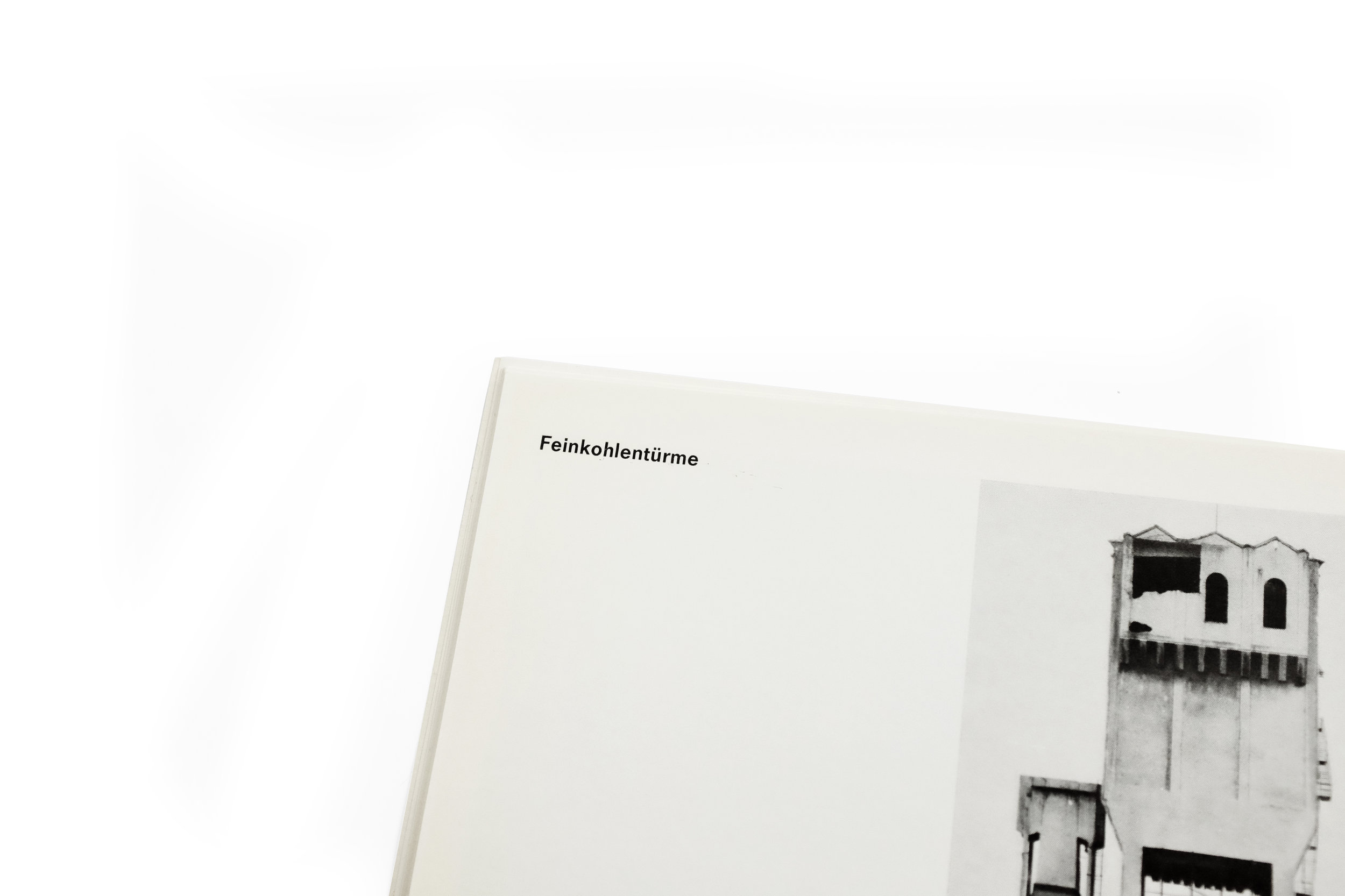
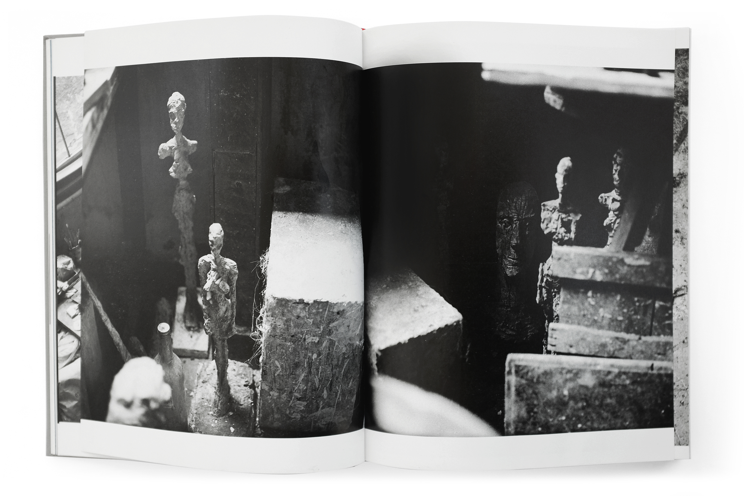
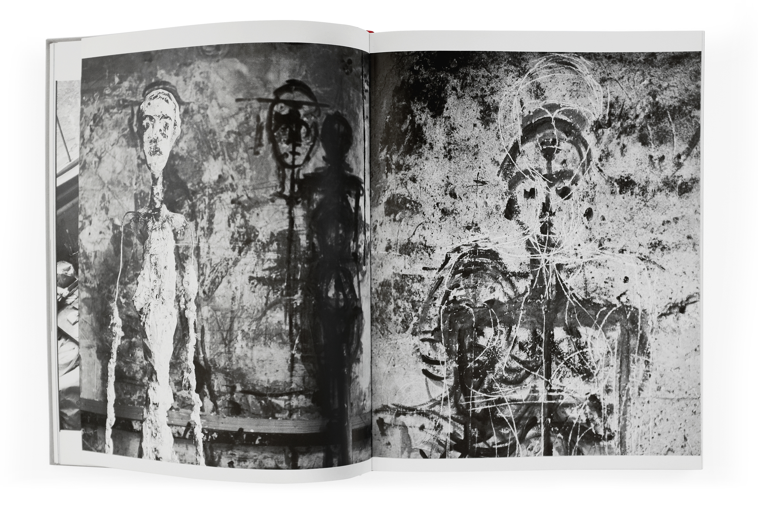
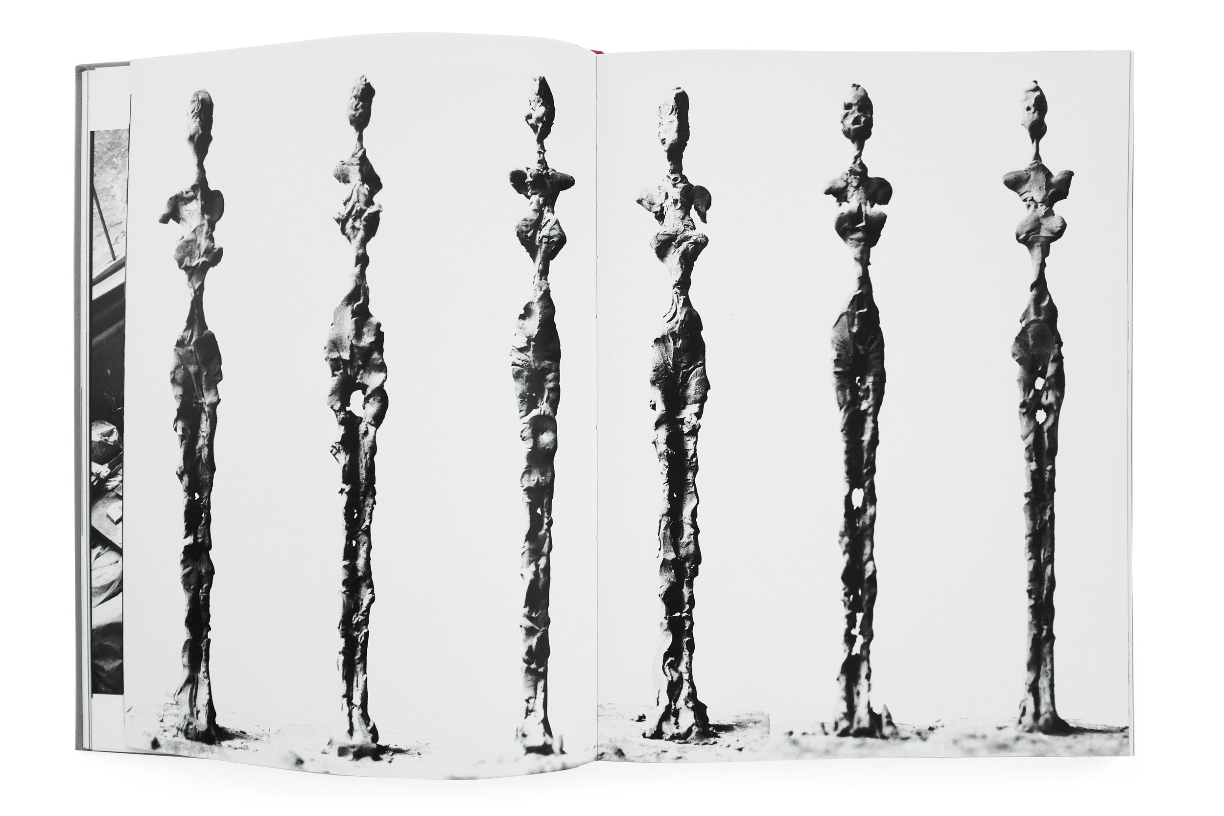
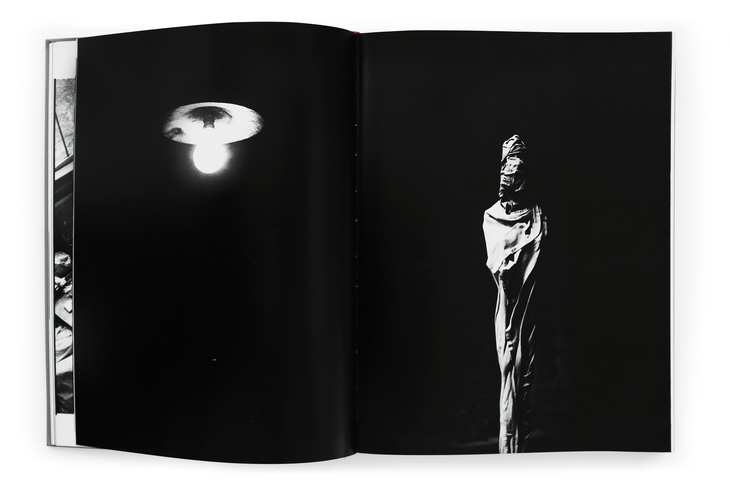
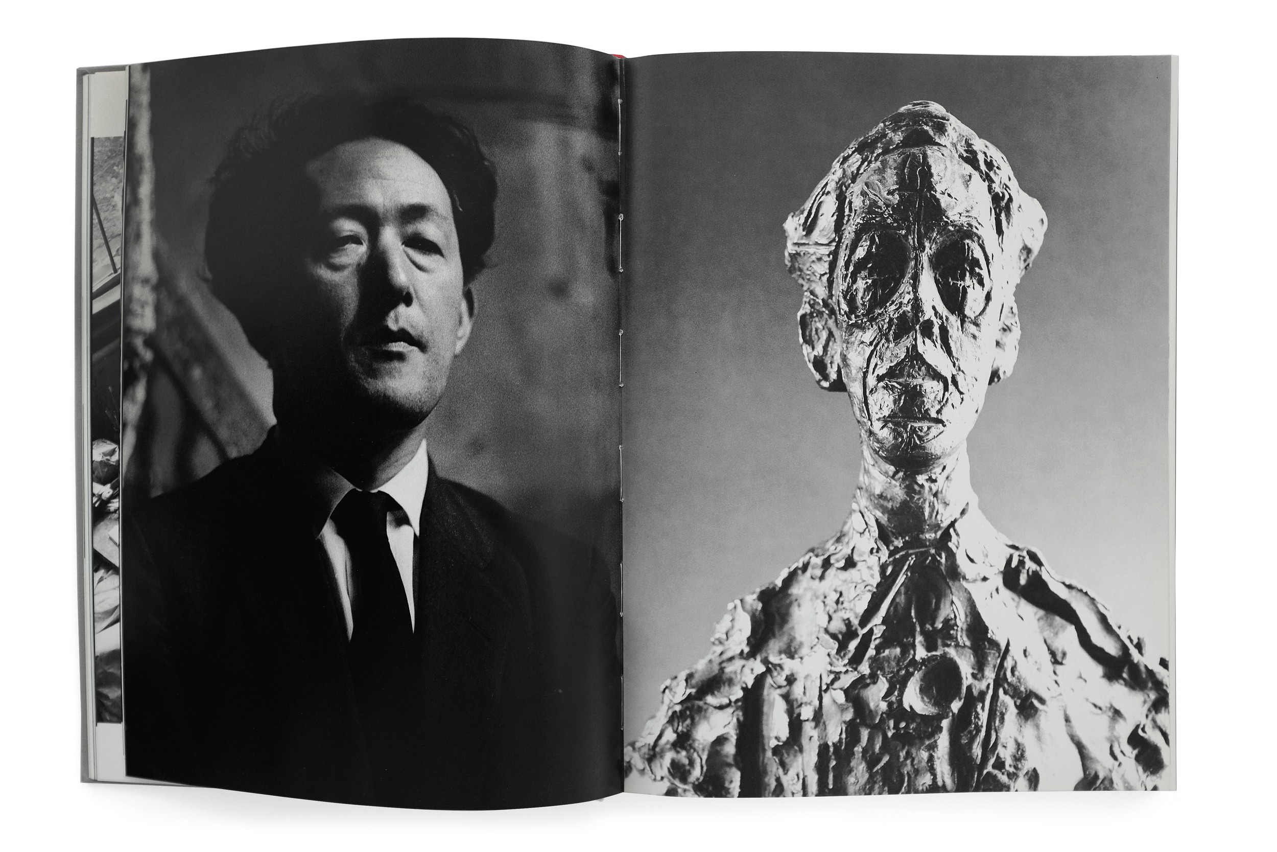
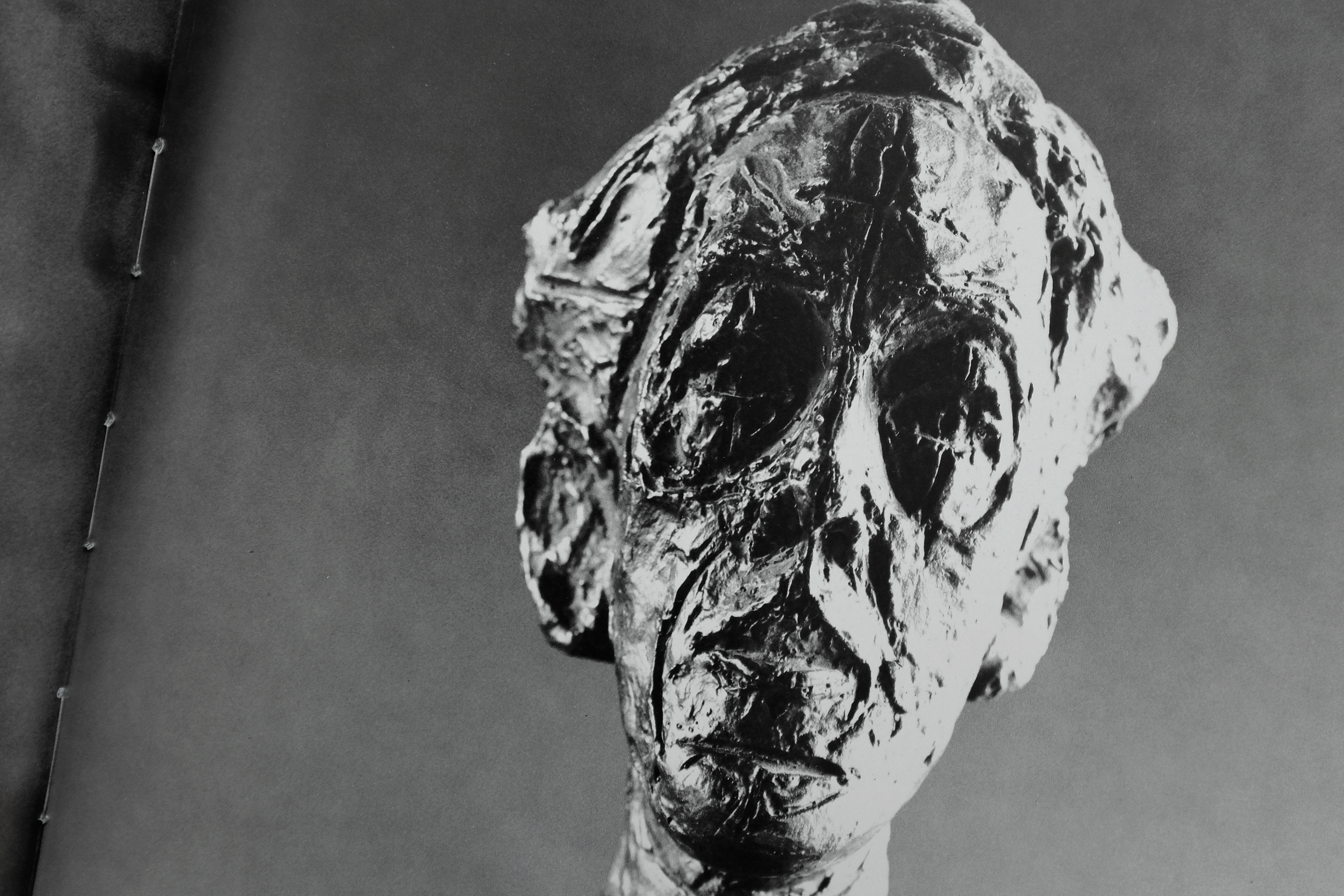
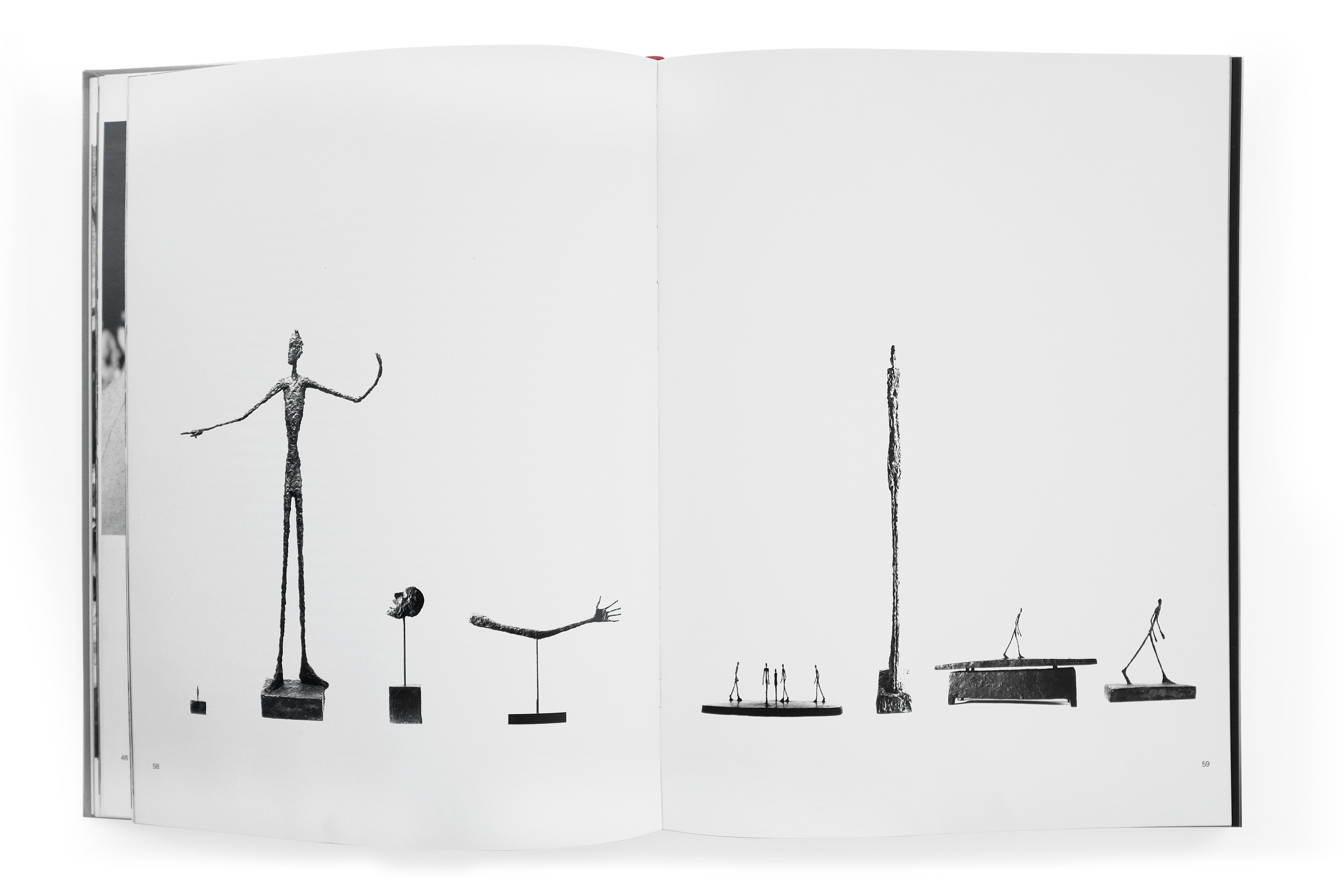
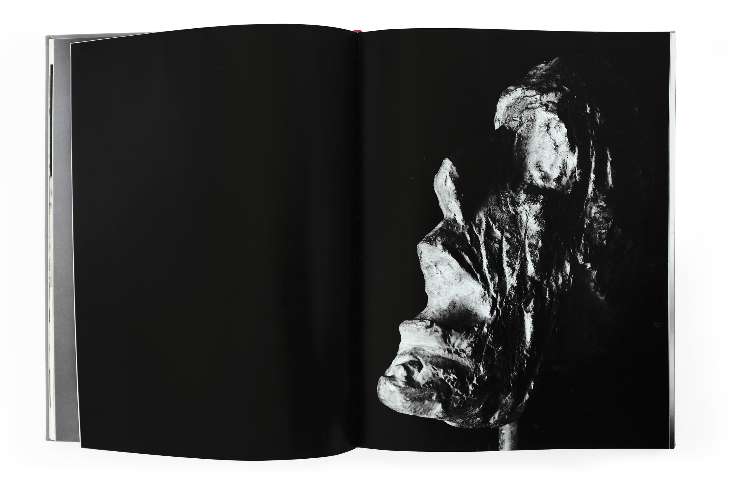
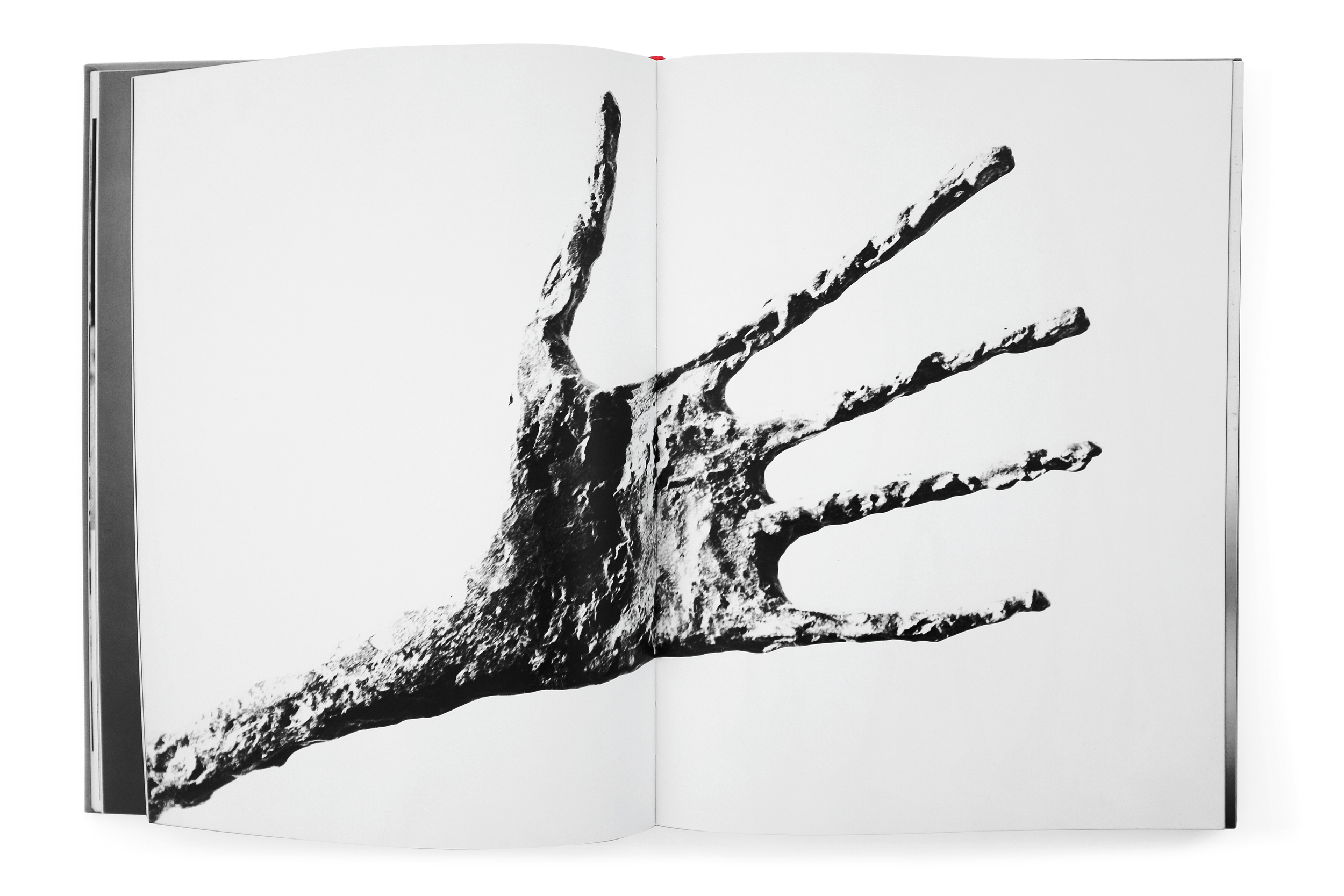
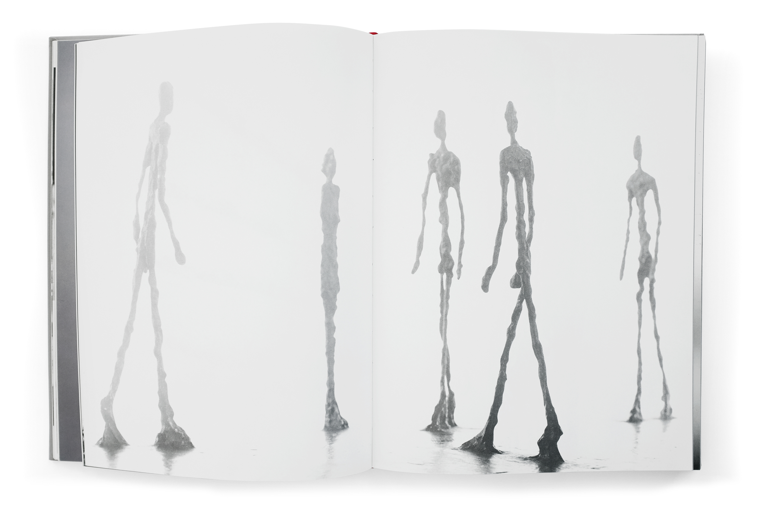
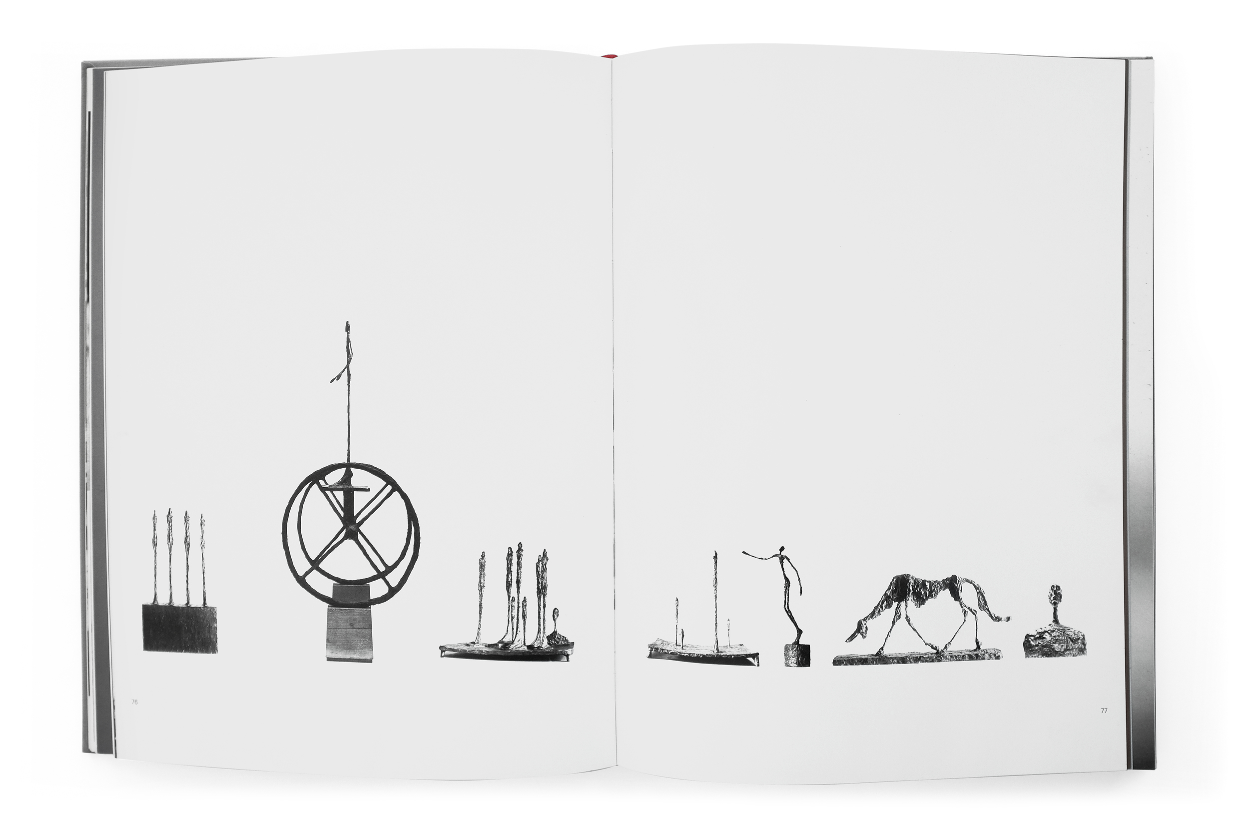
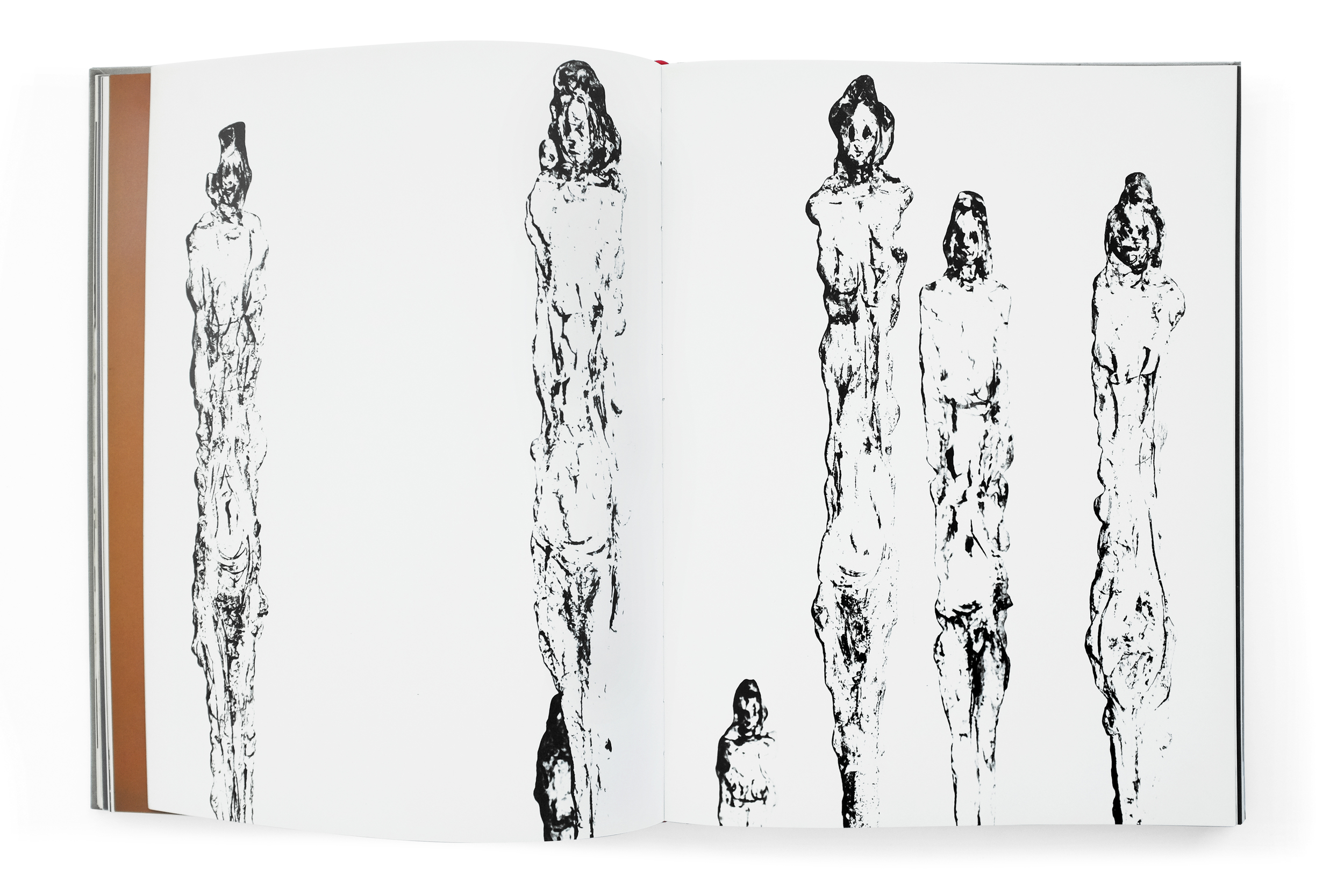
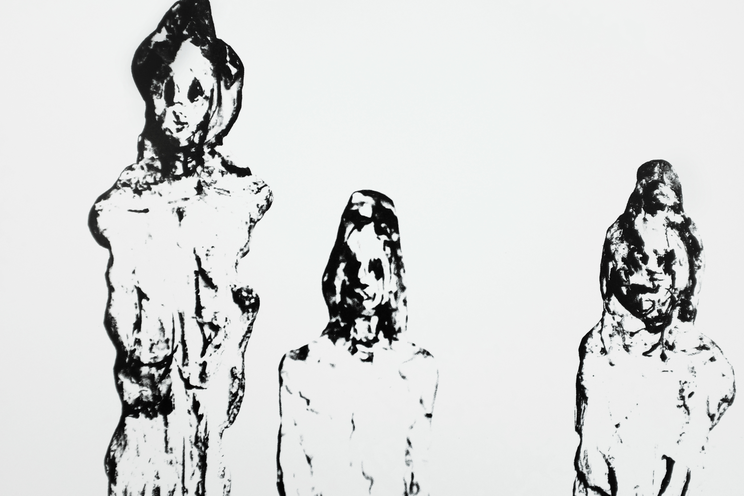
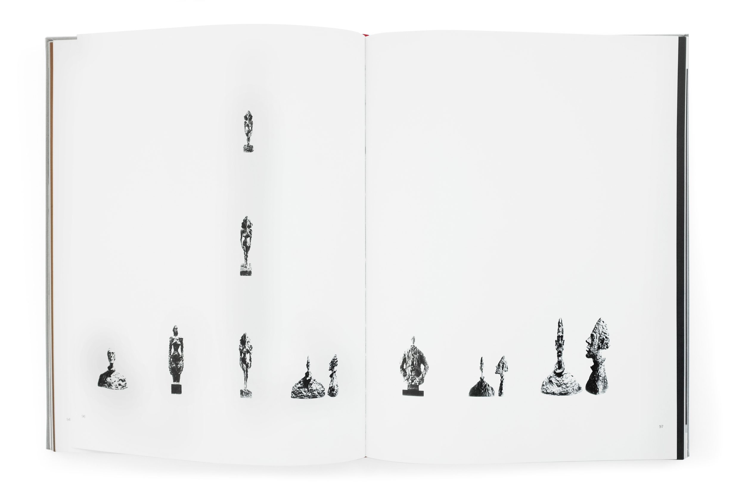
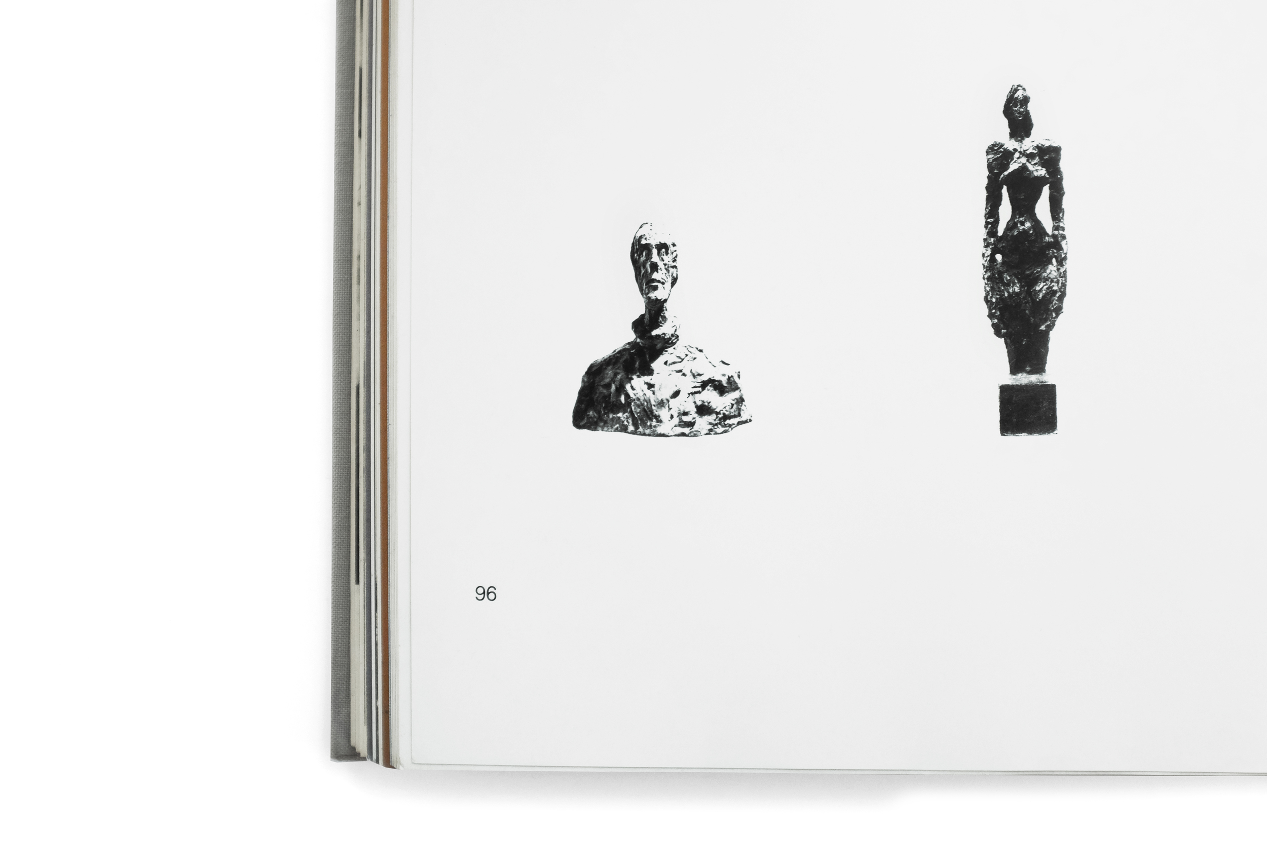
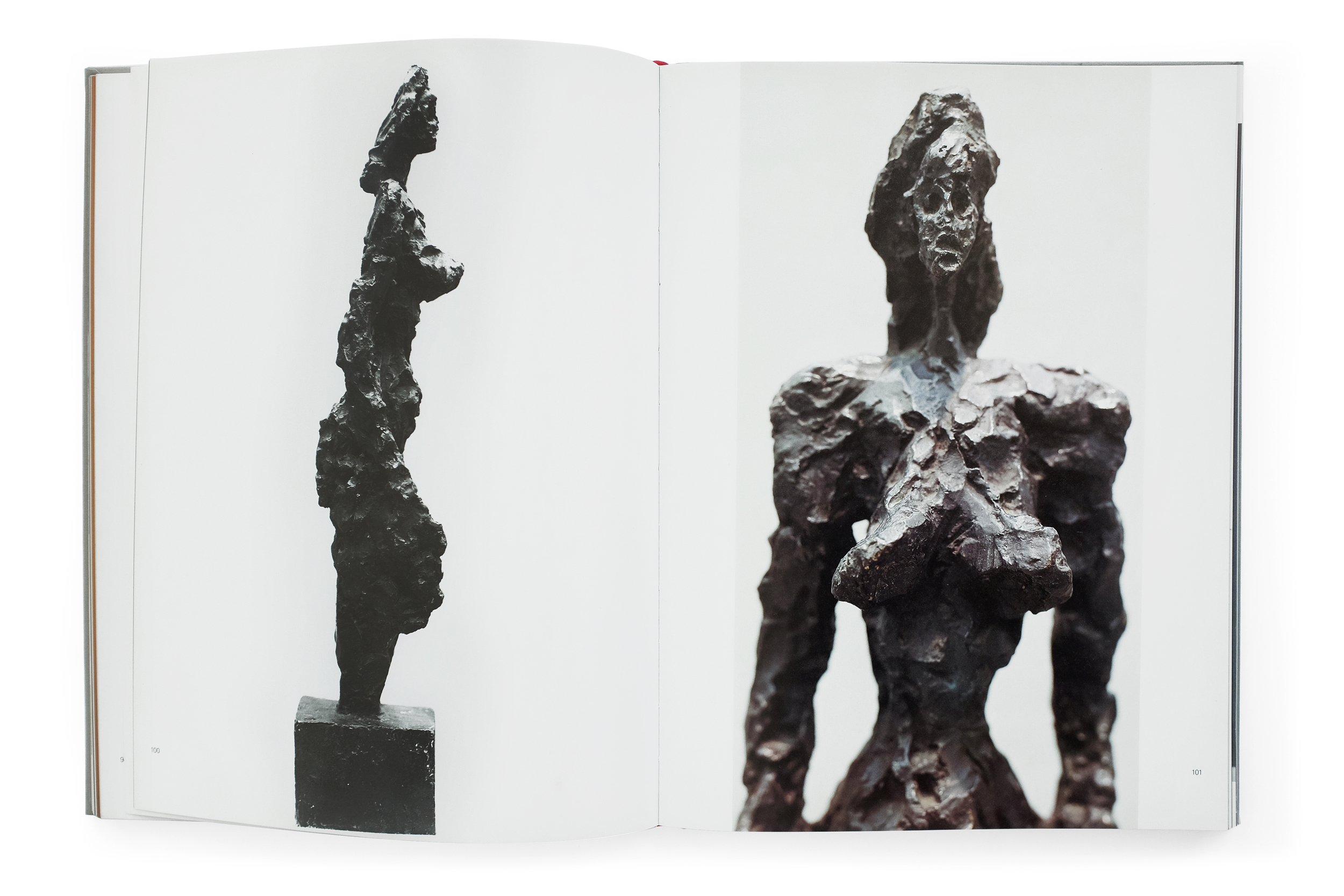
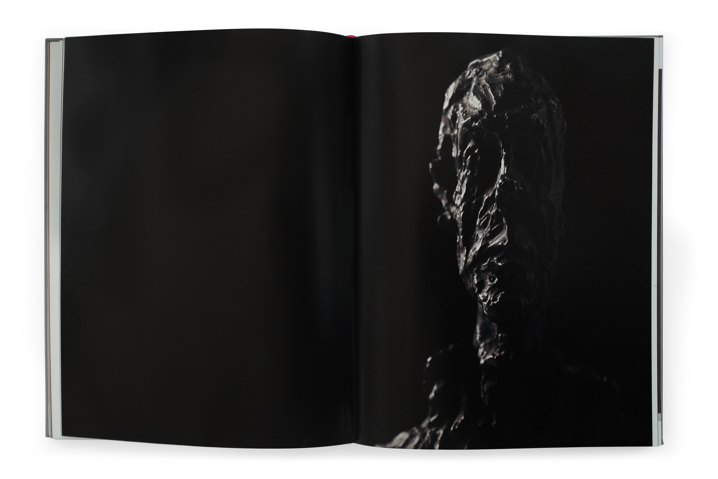
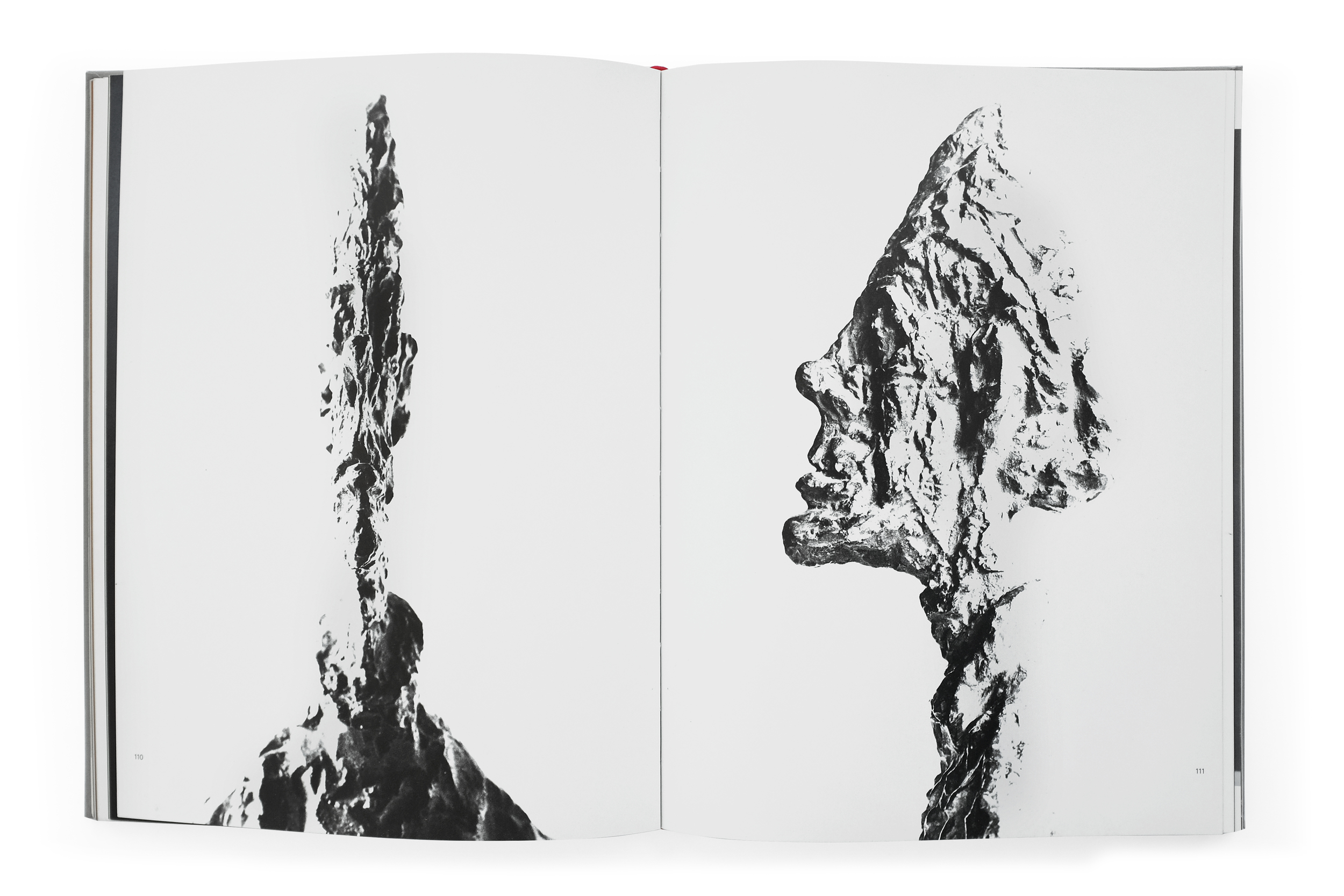
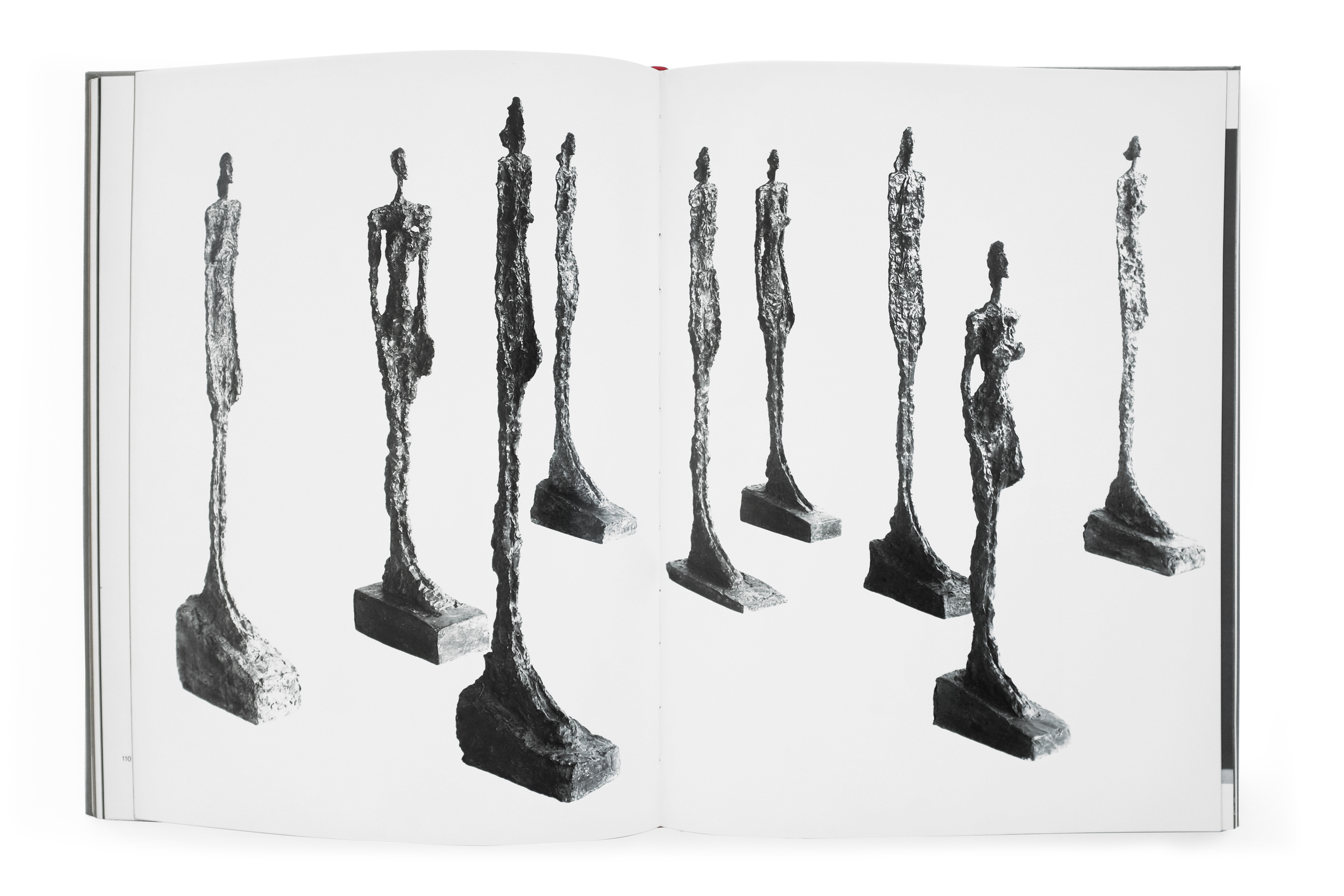
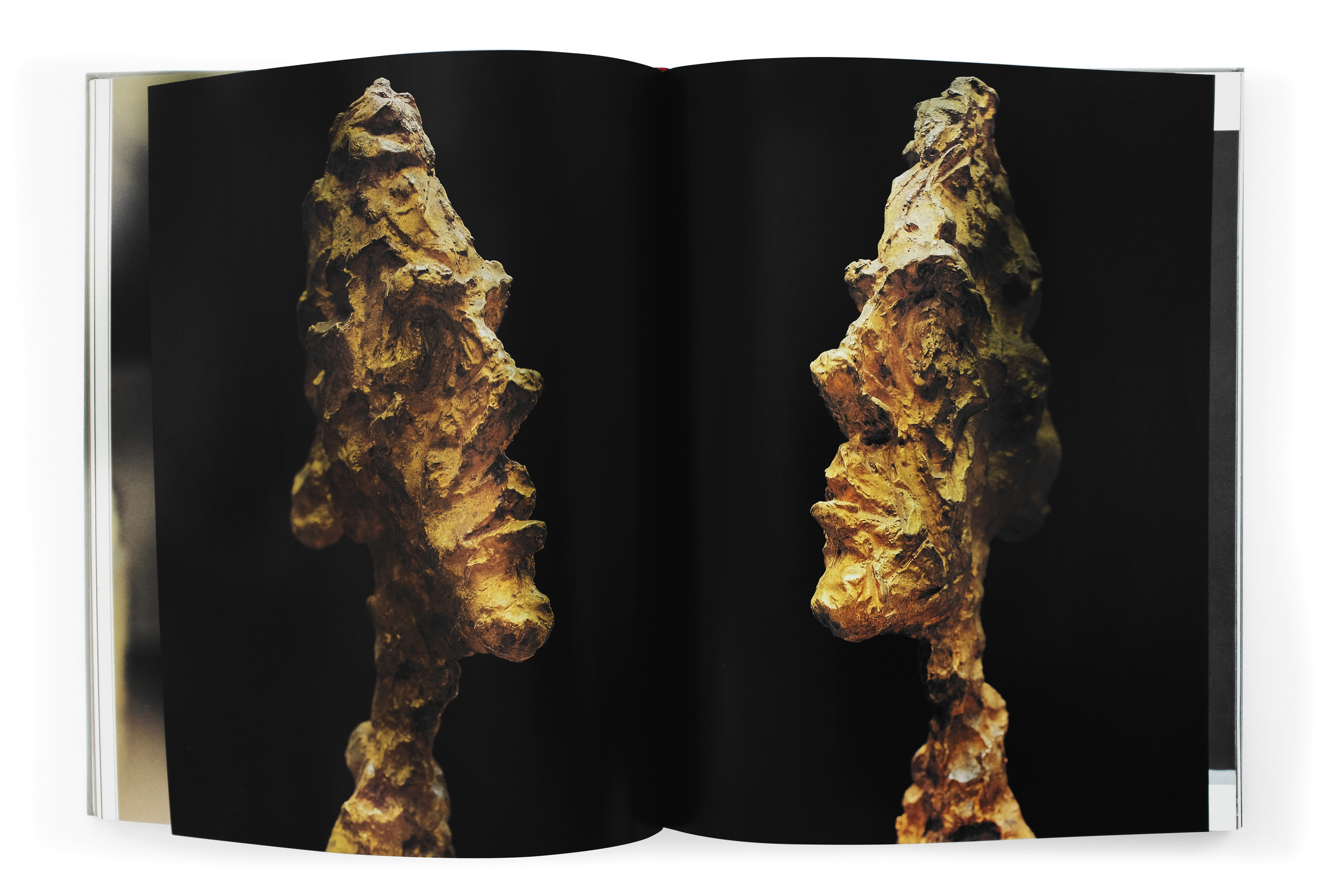
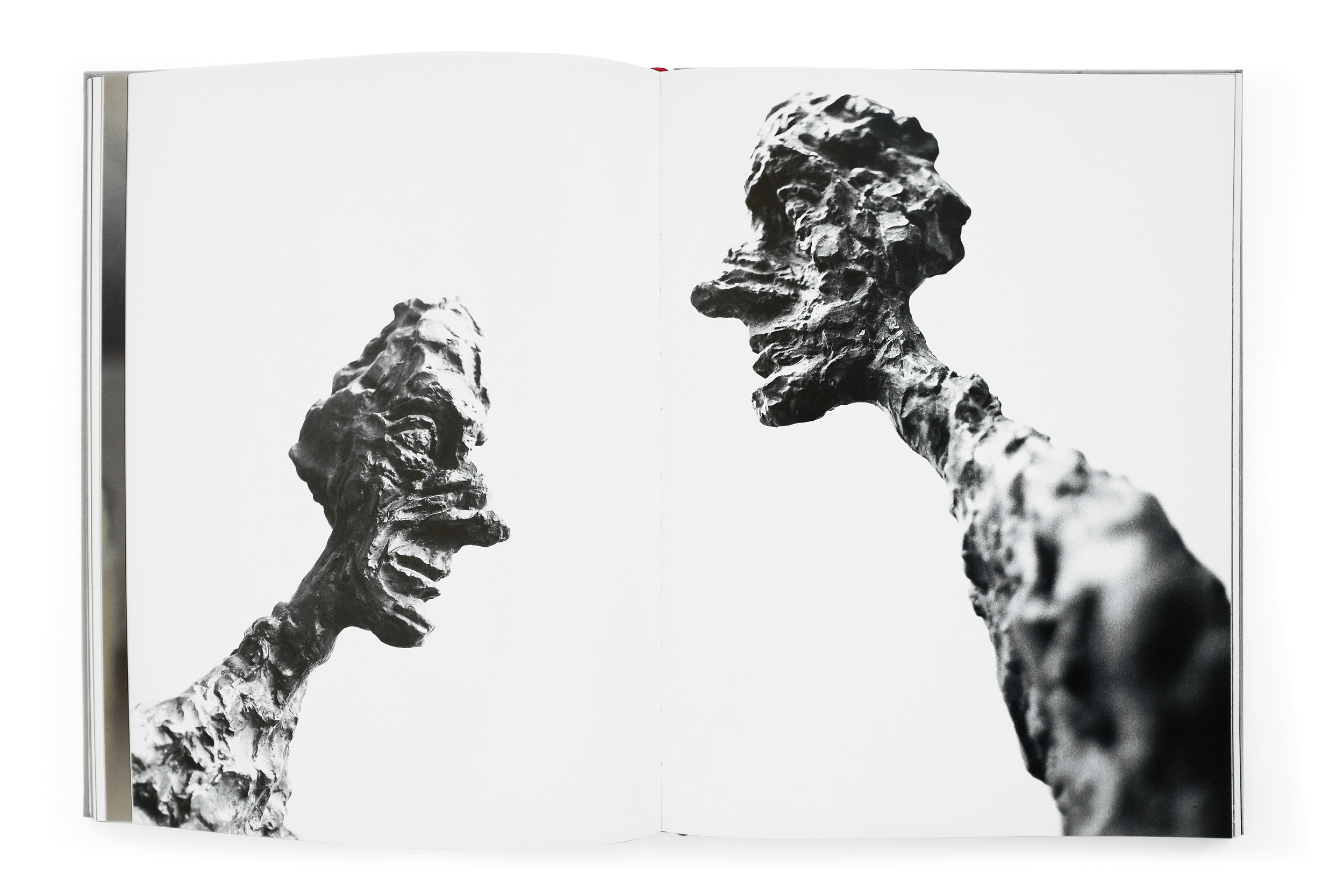
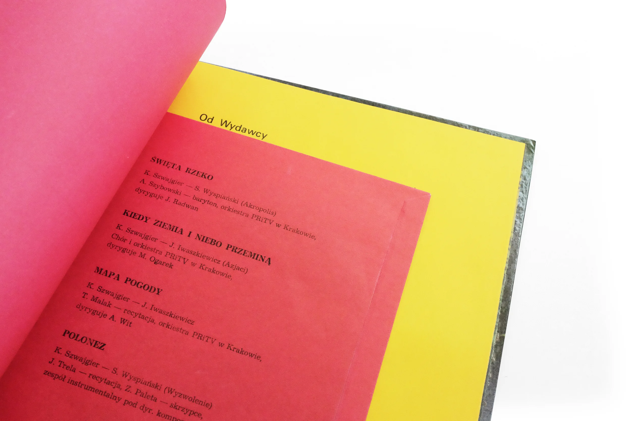
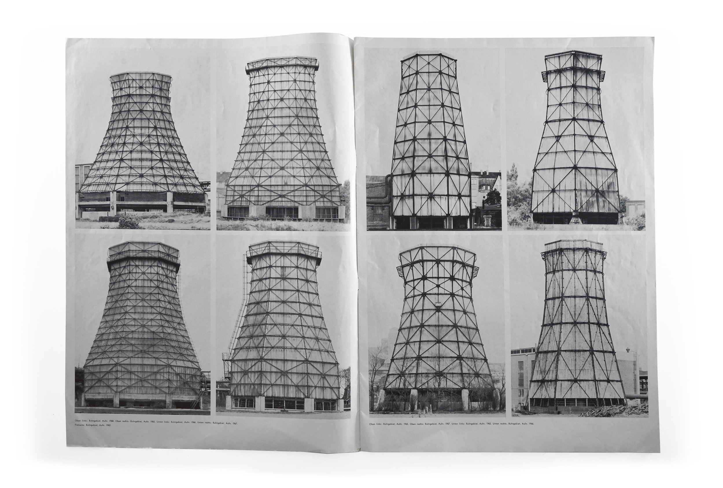
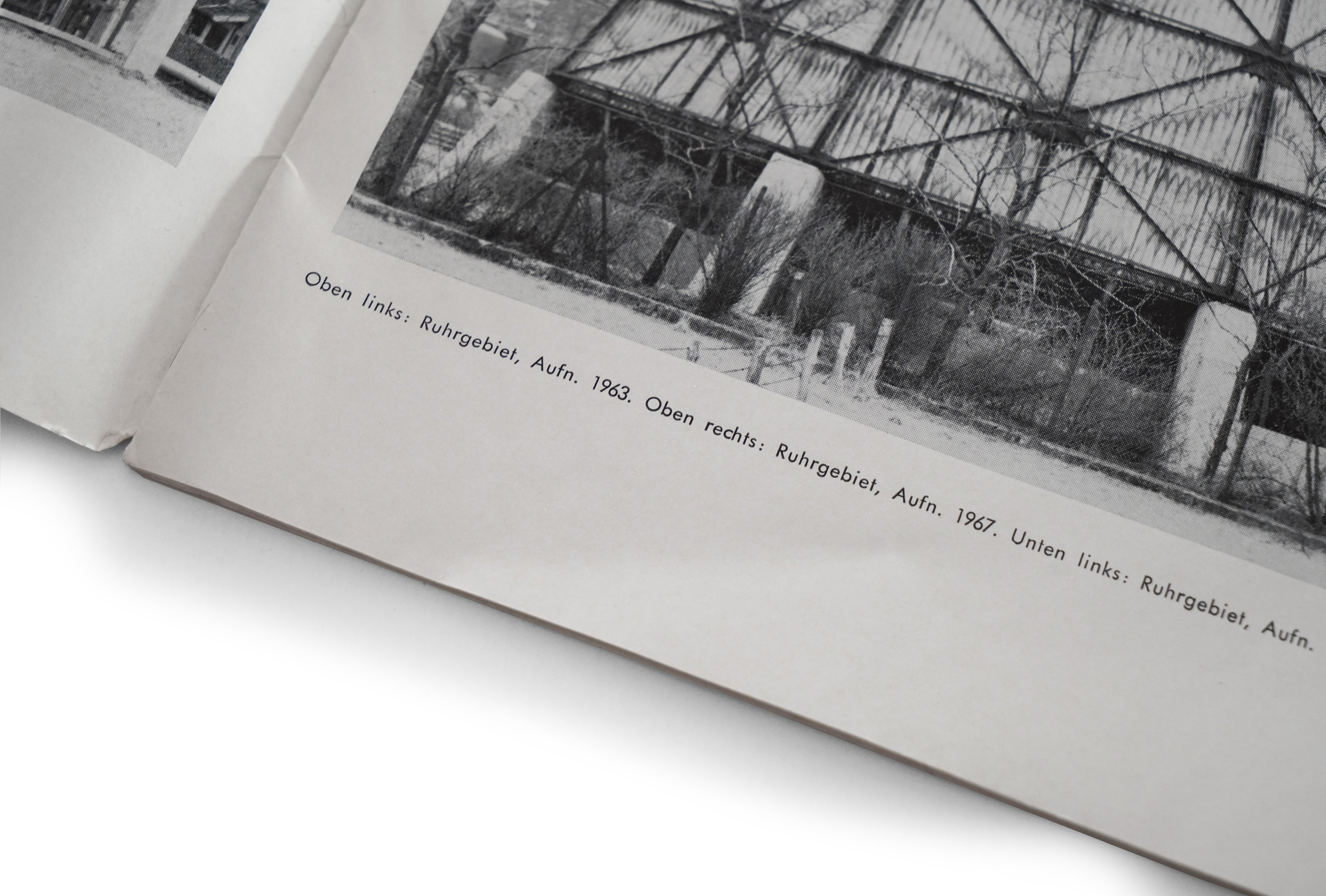
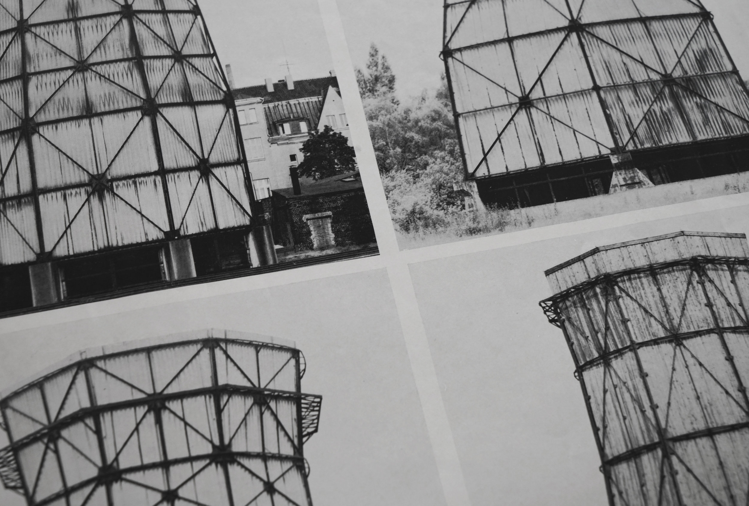
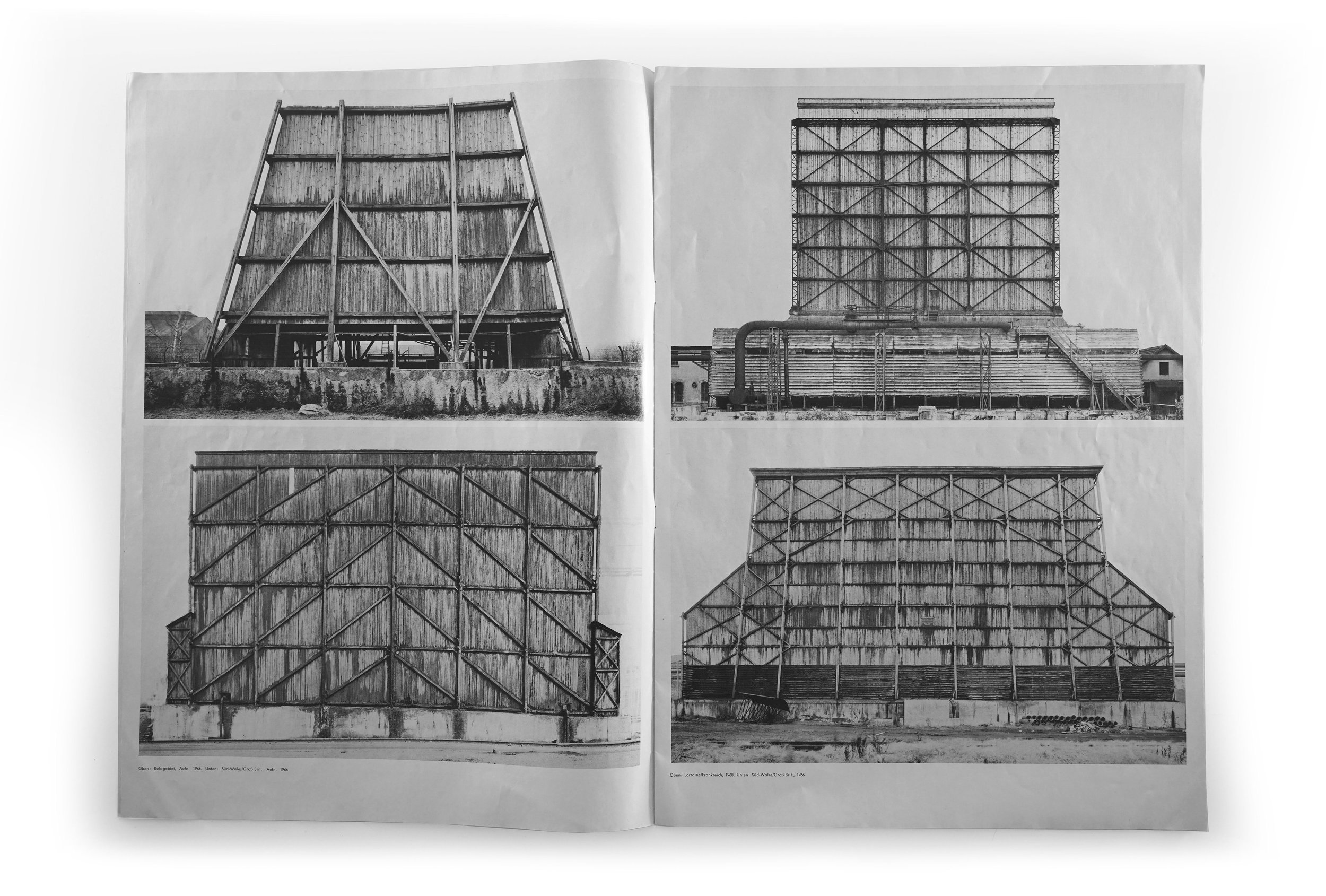
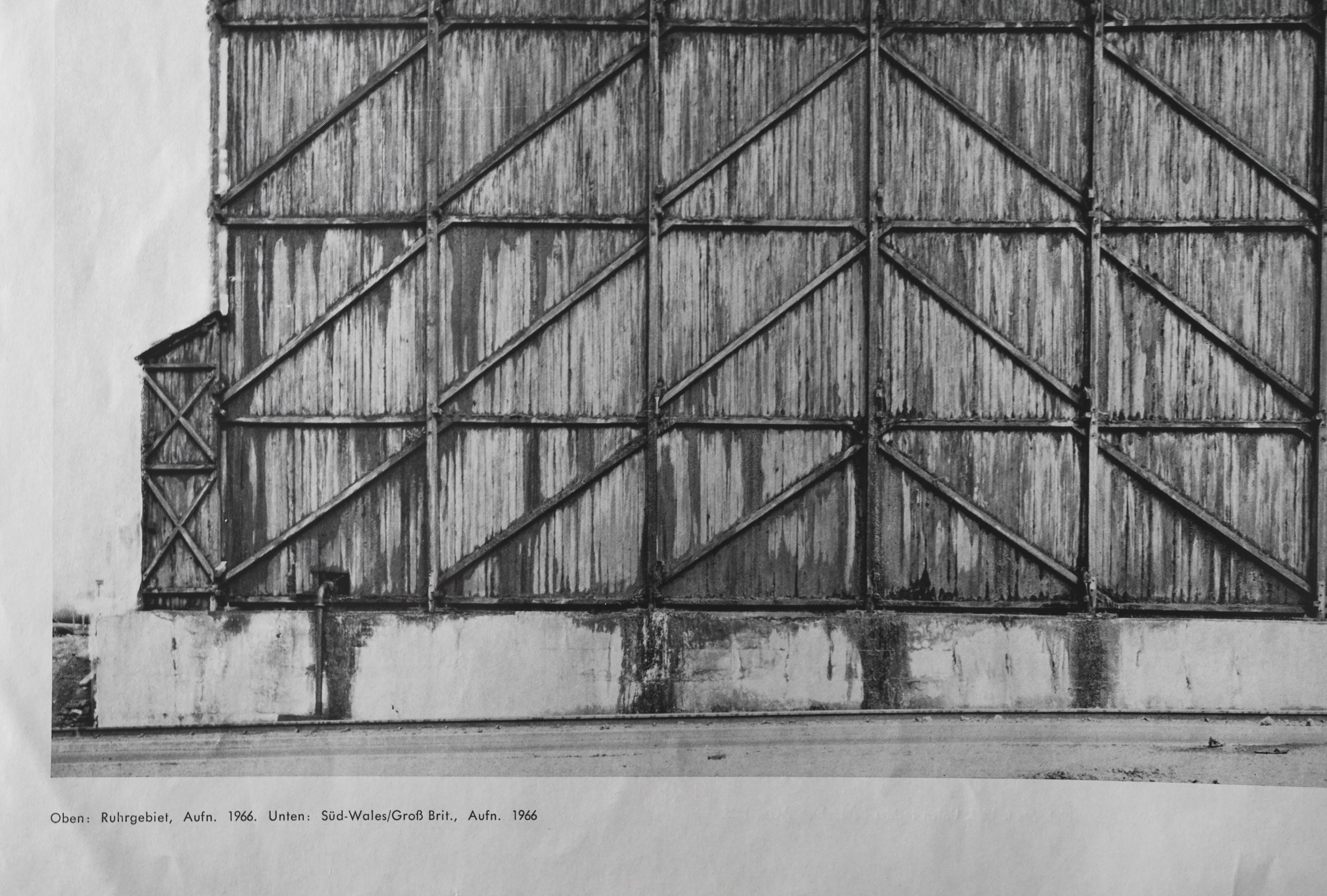
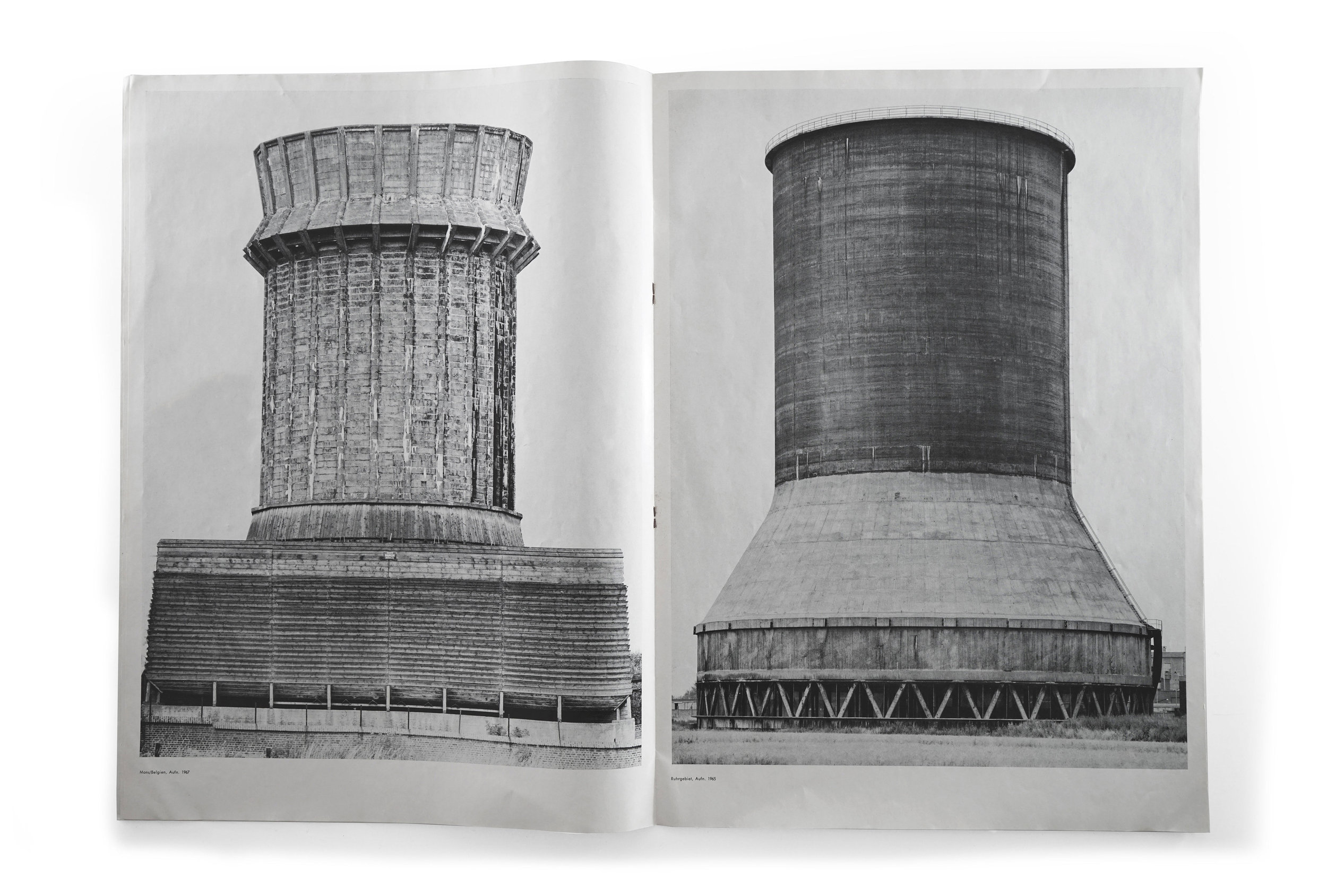
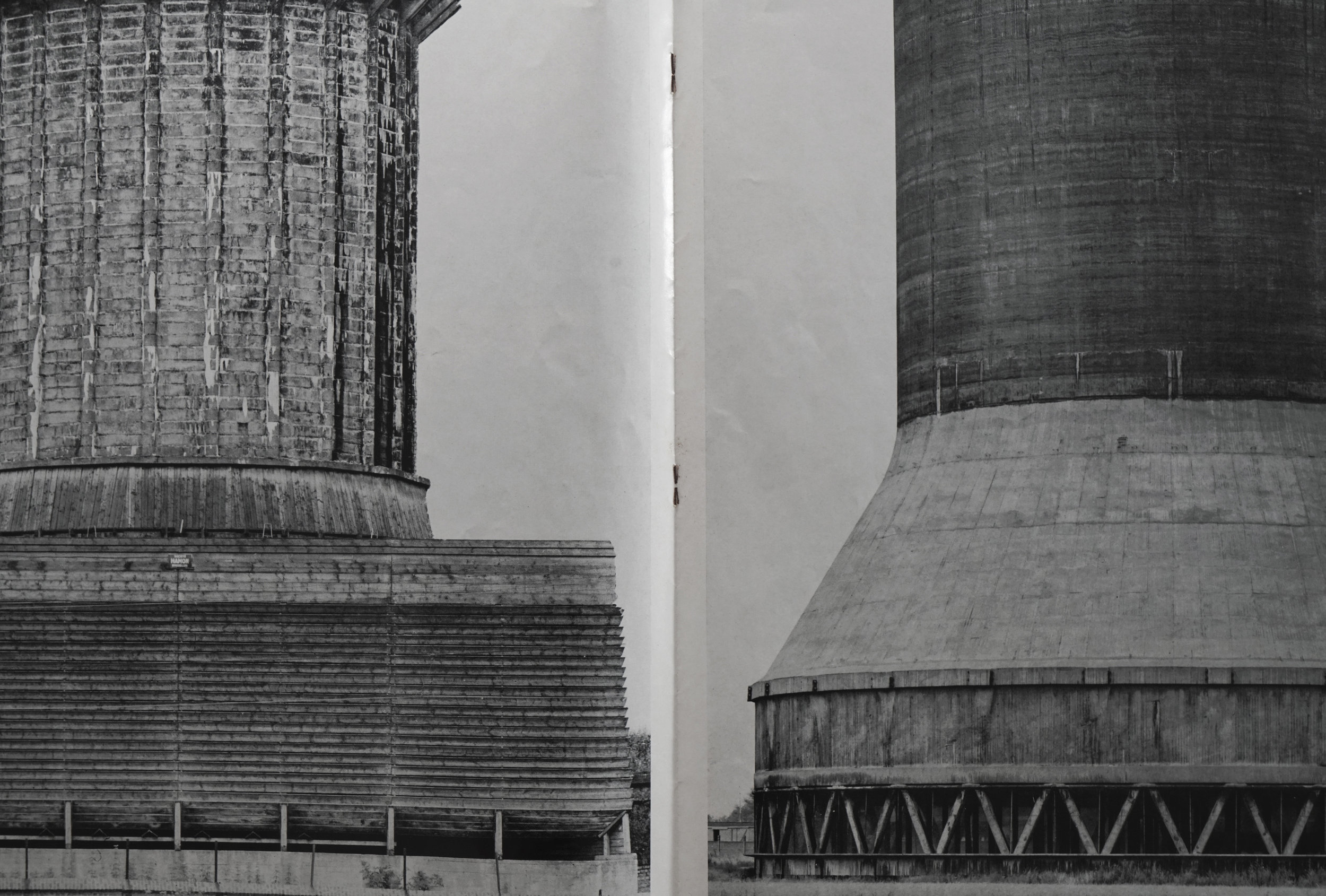
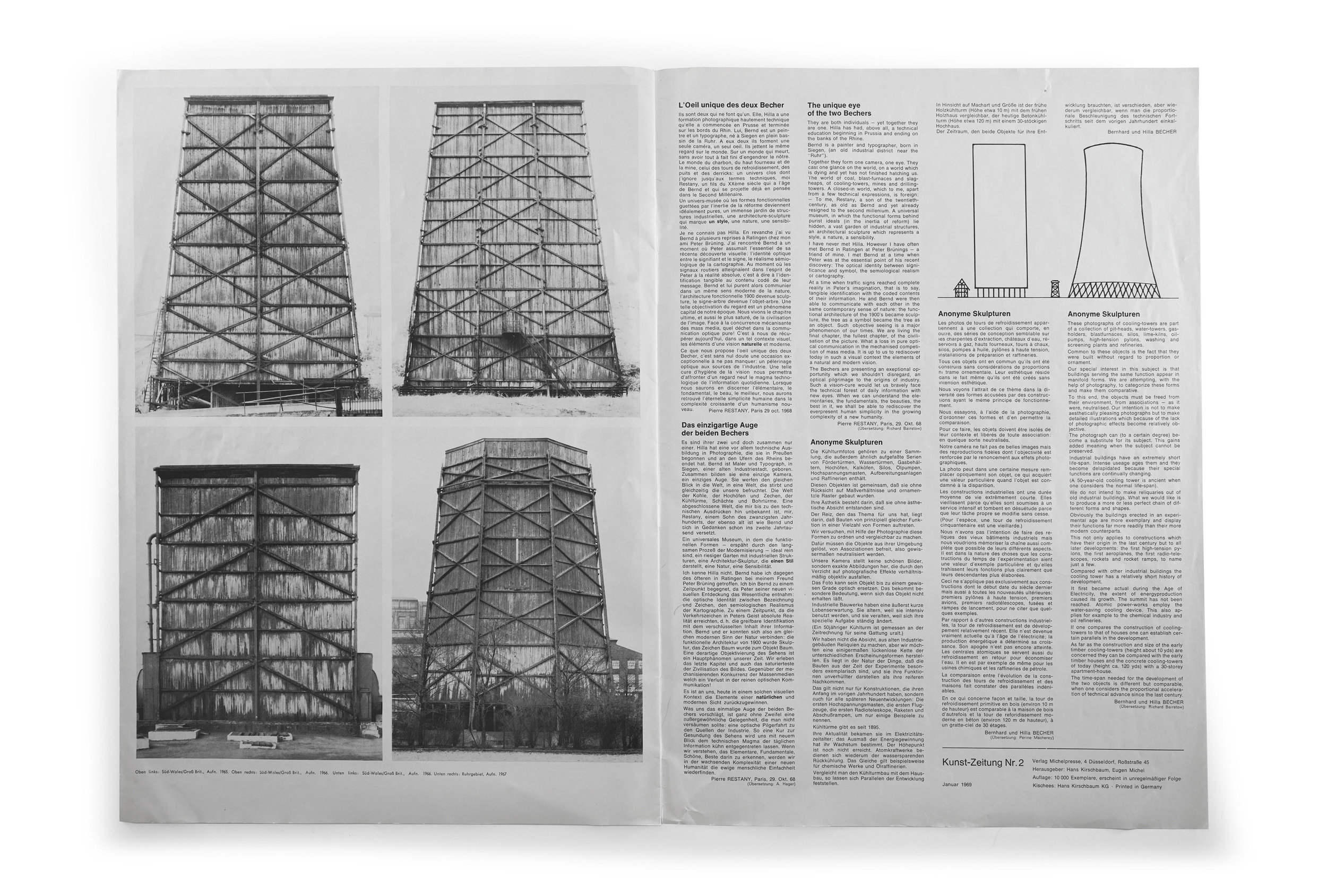
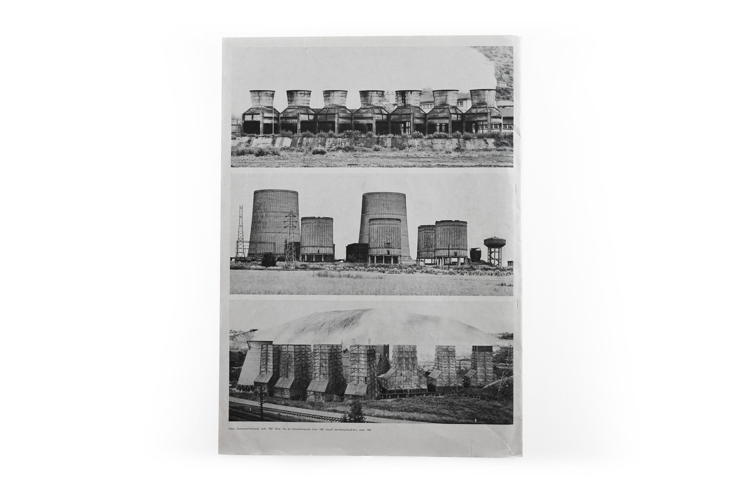
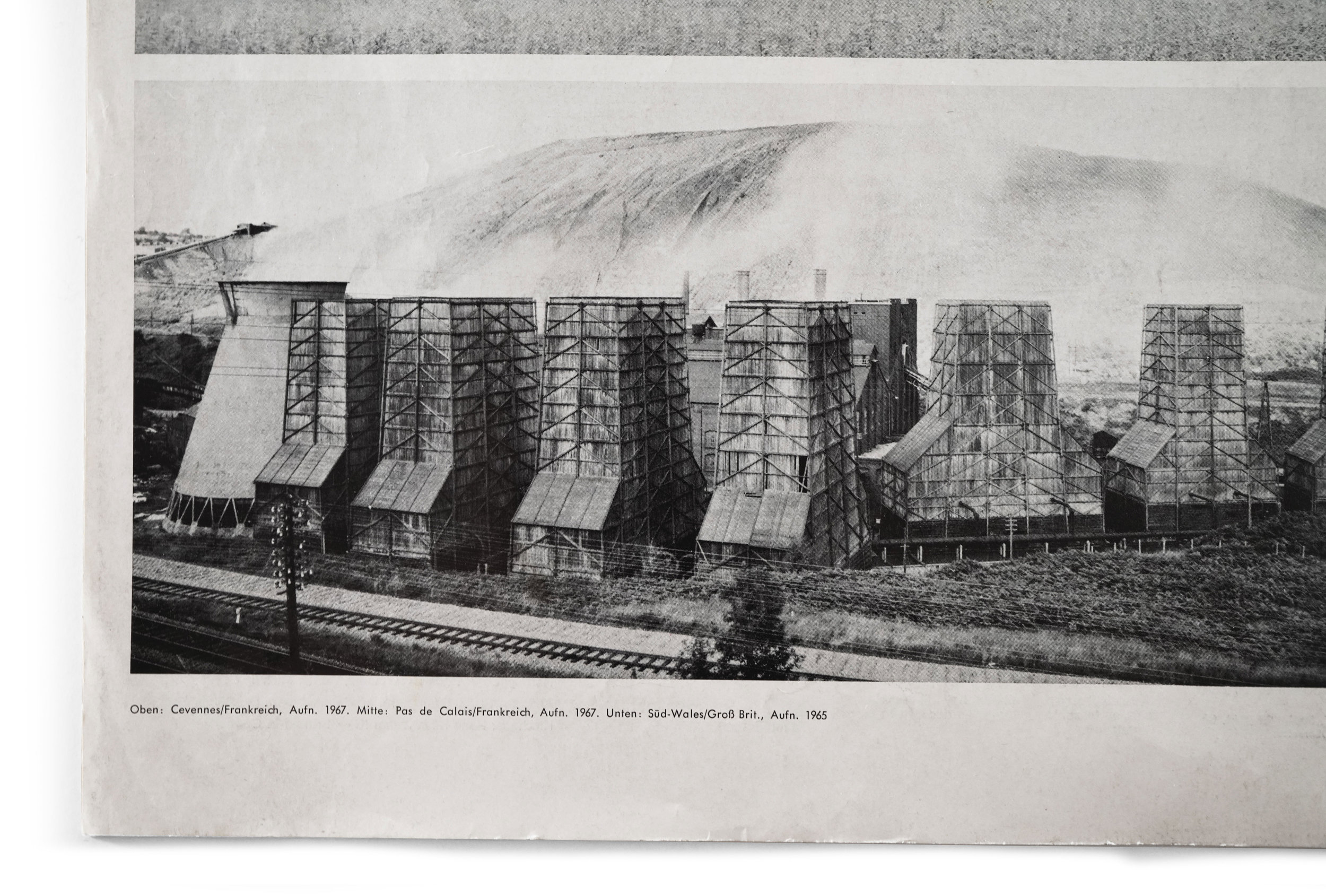
Continuing into the interior, the reader is presented with a pulse of gridded building typologies as they flip through the pages: first eight, then four, two, two, and again ending with four. The effect creates a brilliant rhythm as the size of each image shifts dramatically from page to page, but also allows the viewer to appreciate the seriality of the Bechers’ work. In this writer’s humble opinion, the pièce de résistance are the two spreads with single images on each. Again, the sheer scale of the towers allow their rich intricacies of texture and tone to be more fully studied and appreciated. The interior spreads are further complemented by another idiosyncratic yet equally pleasing decision to typeset the miniscule captions in Futura along with cavernous word spacing. The result are captions which read with the lightness of a musical score. The contrast between the towering photographs and the delicacy of the type serves to reinforce the beauty in one another. 

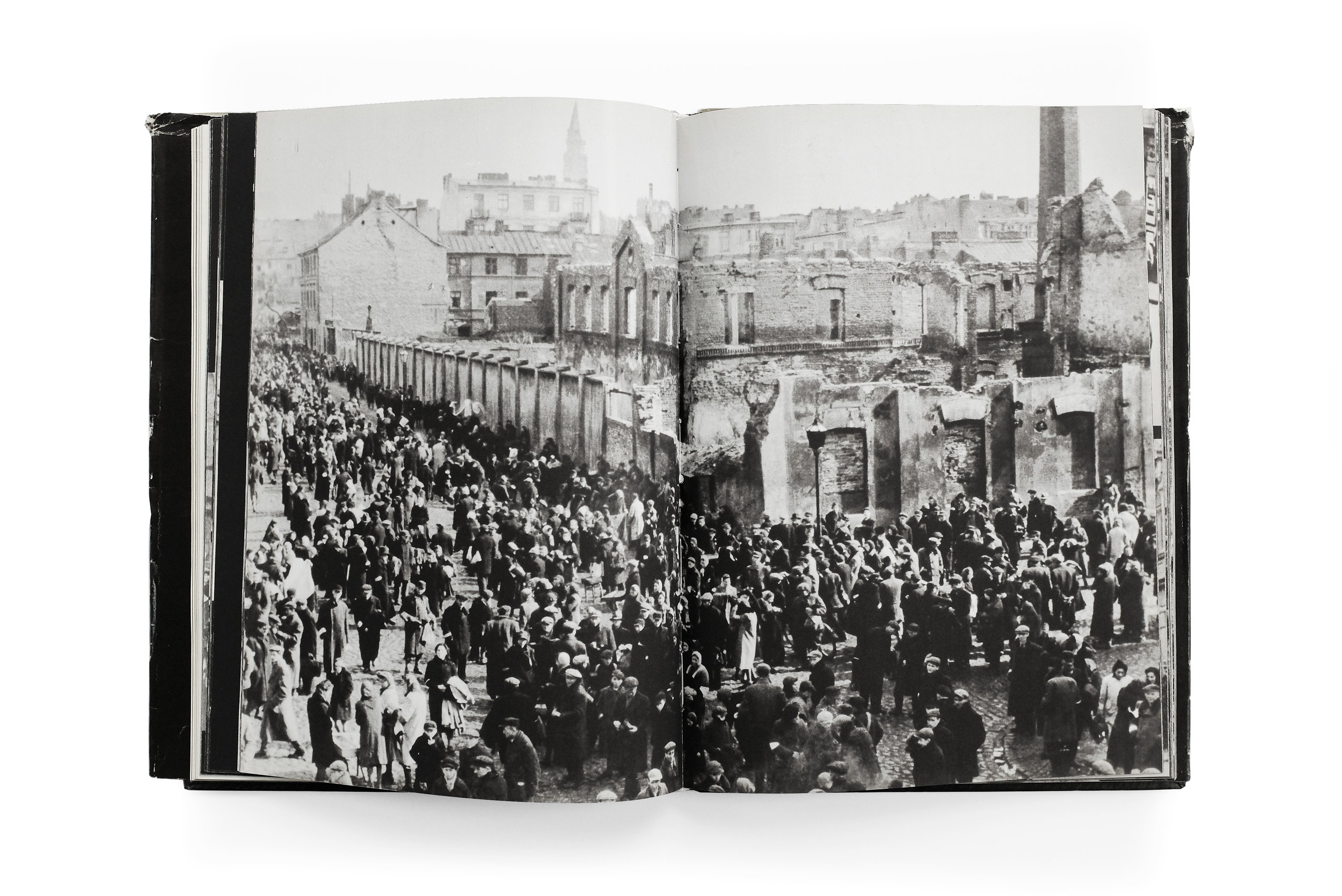
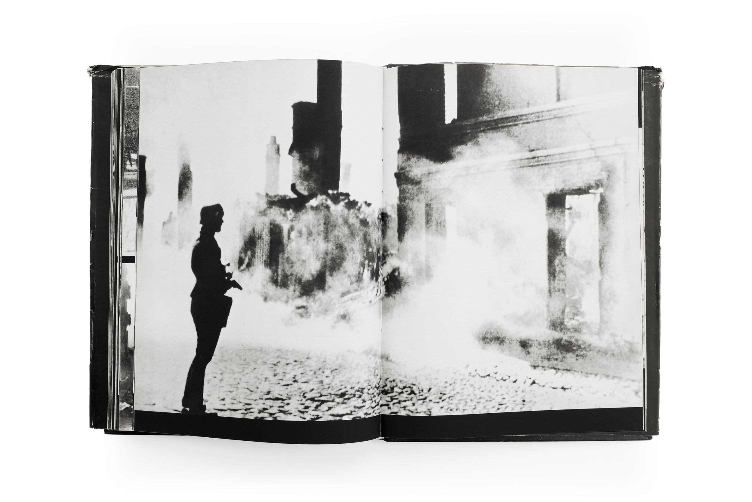
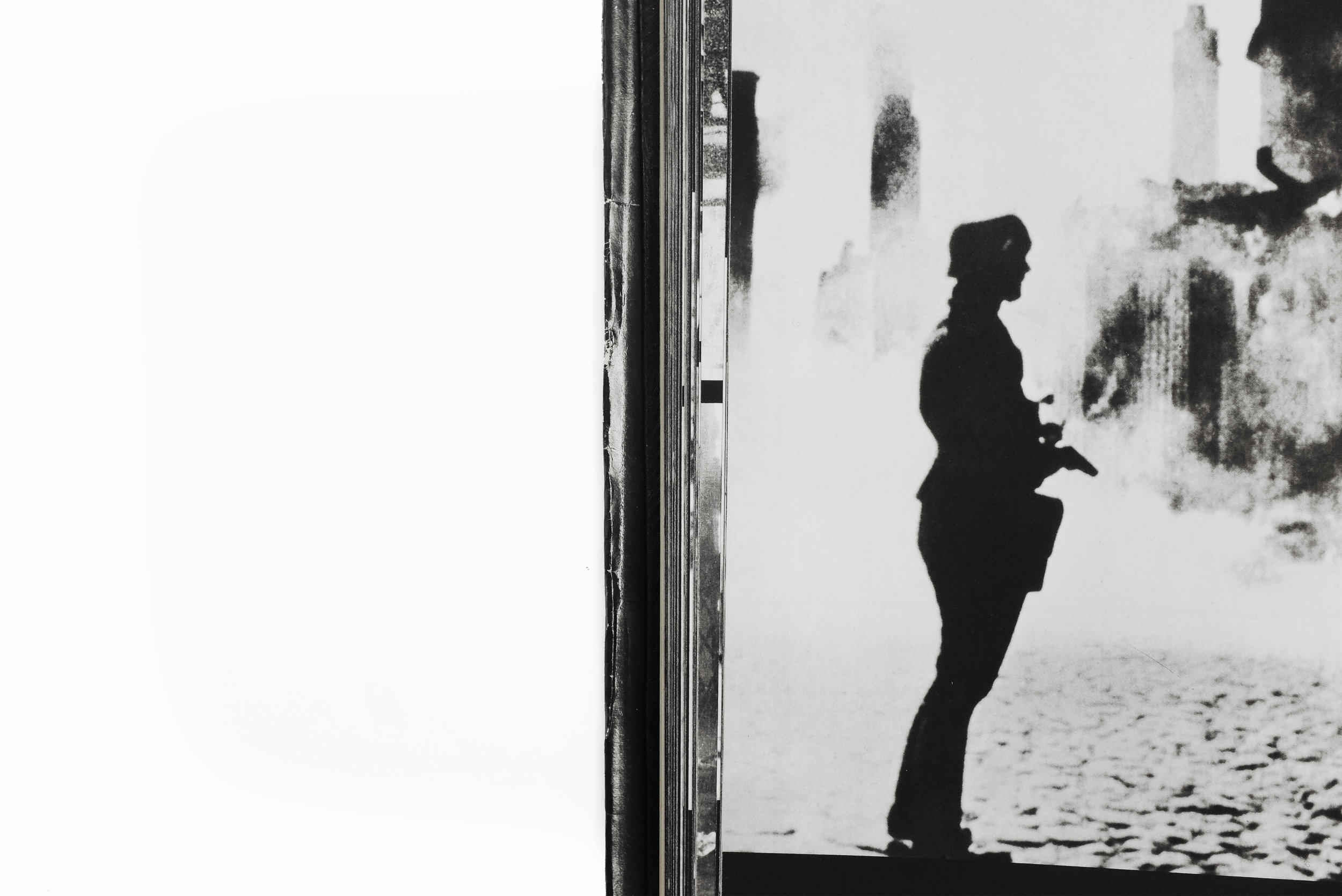
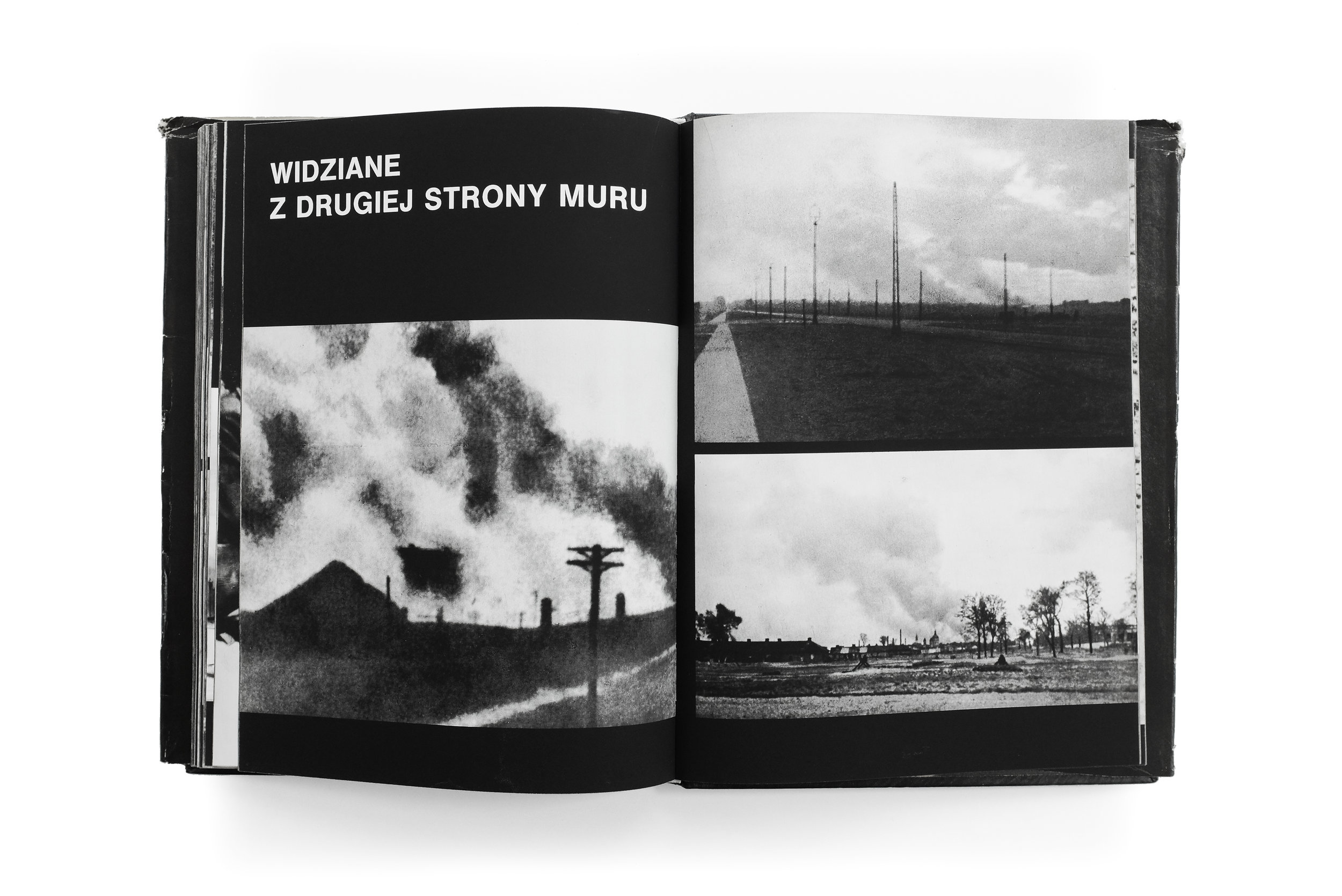
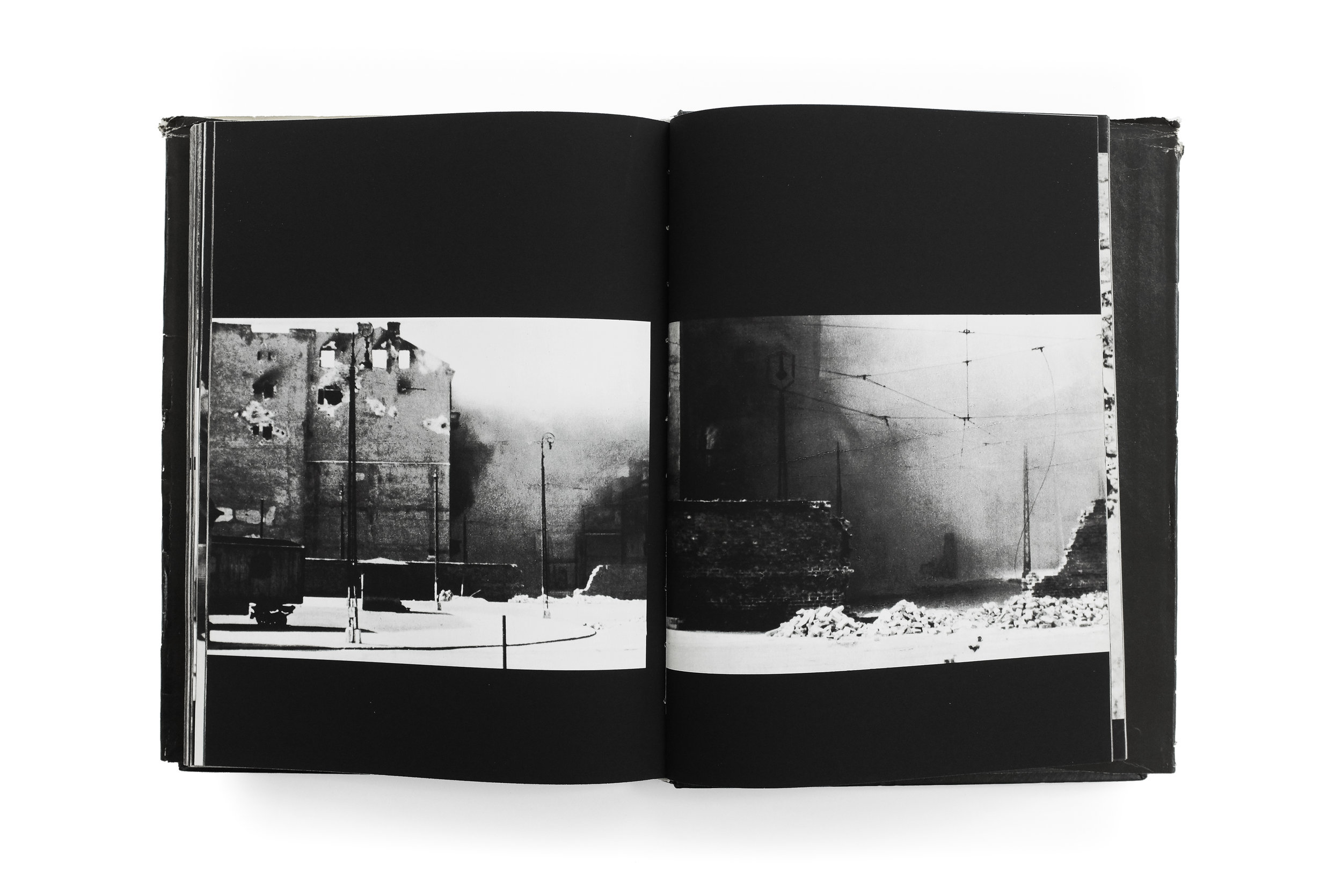
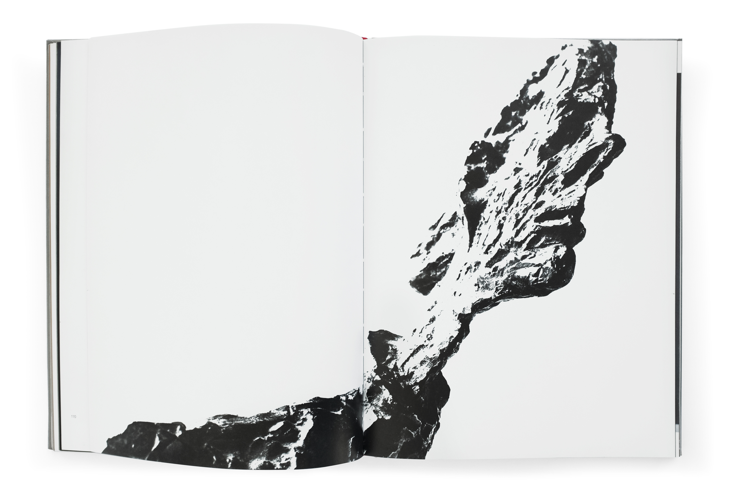
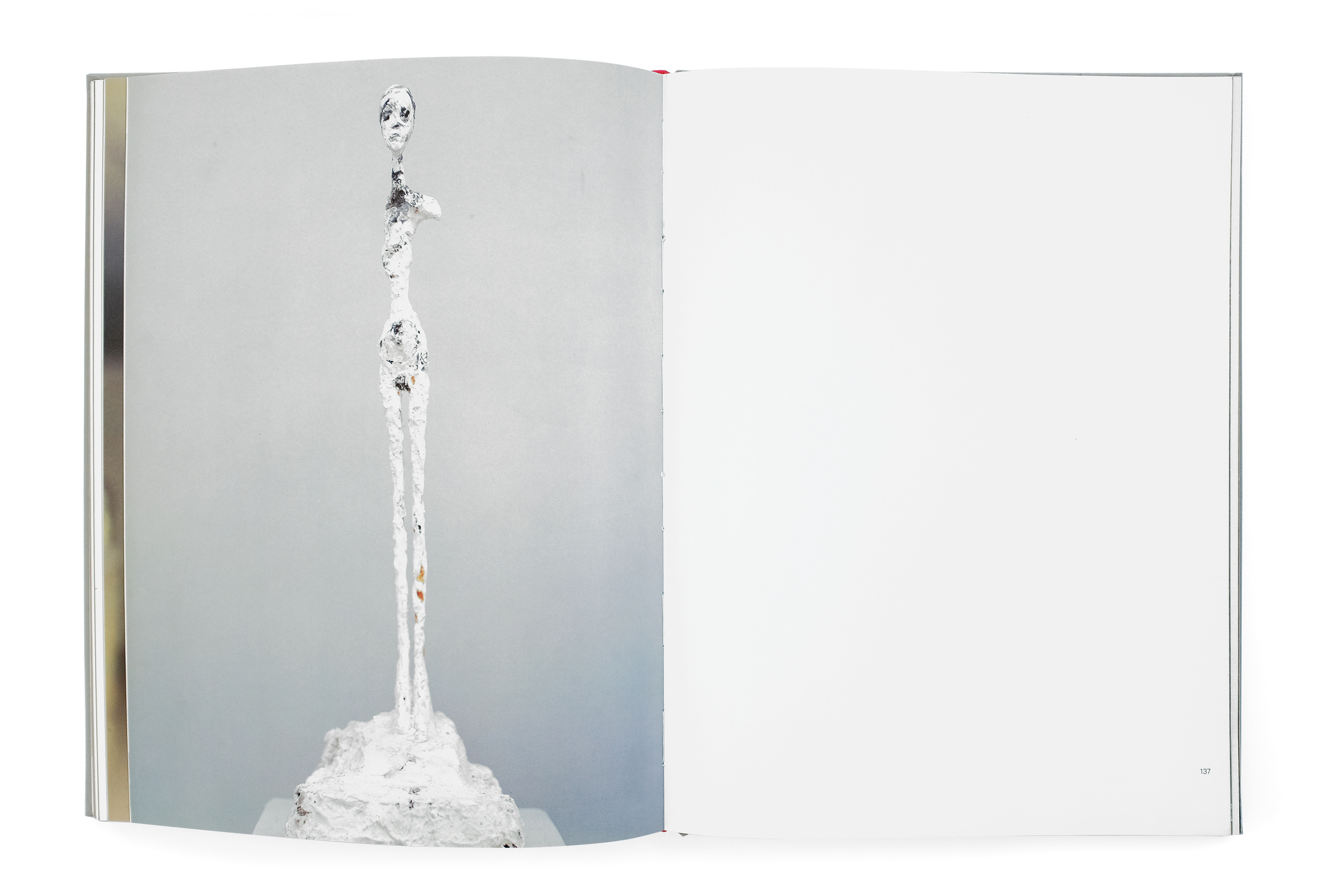
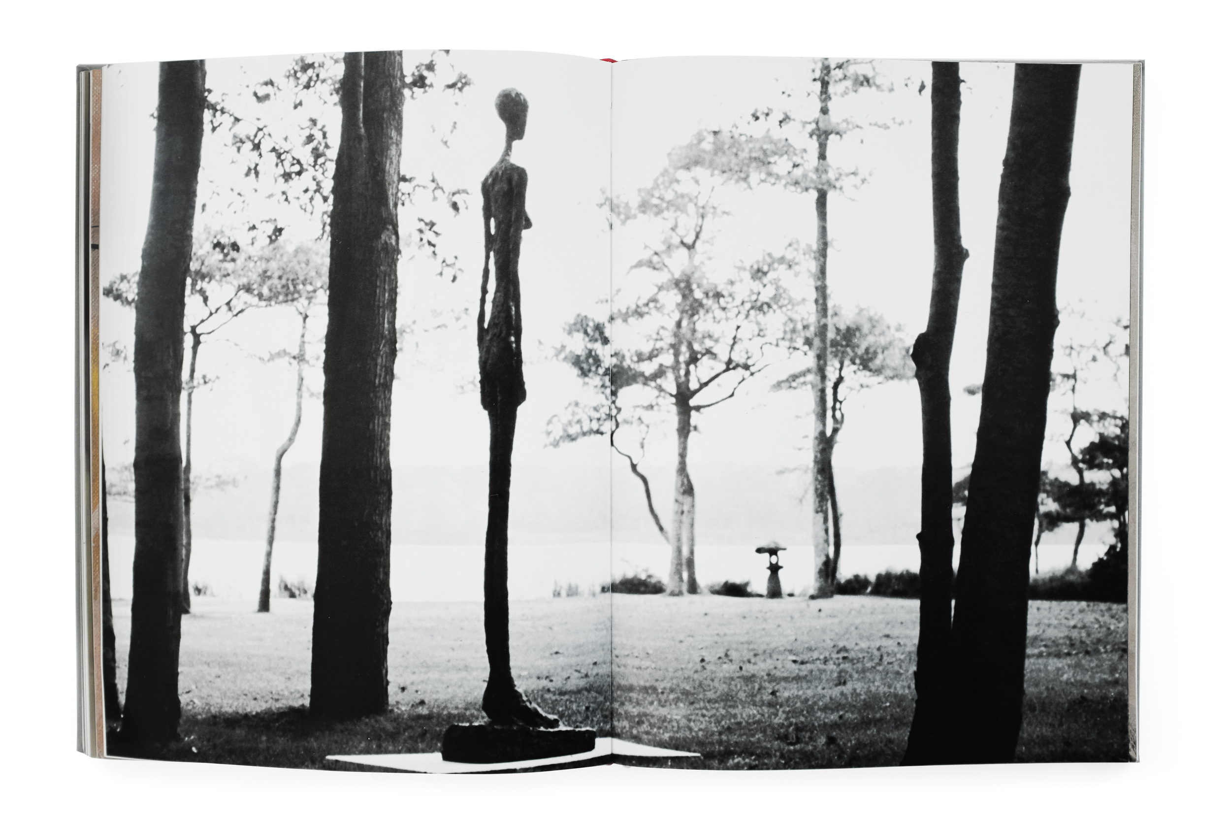
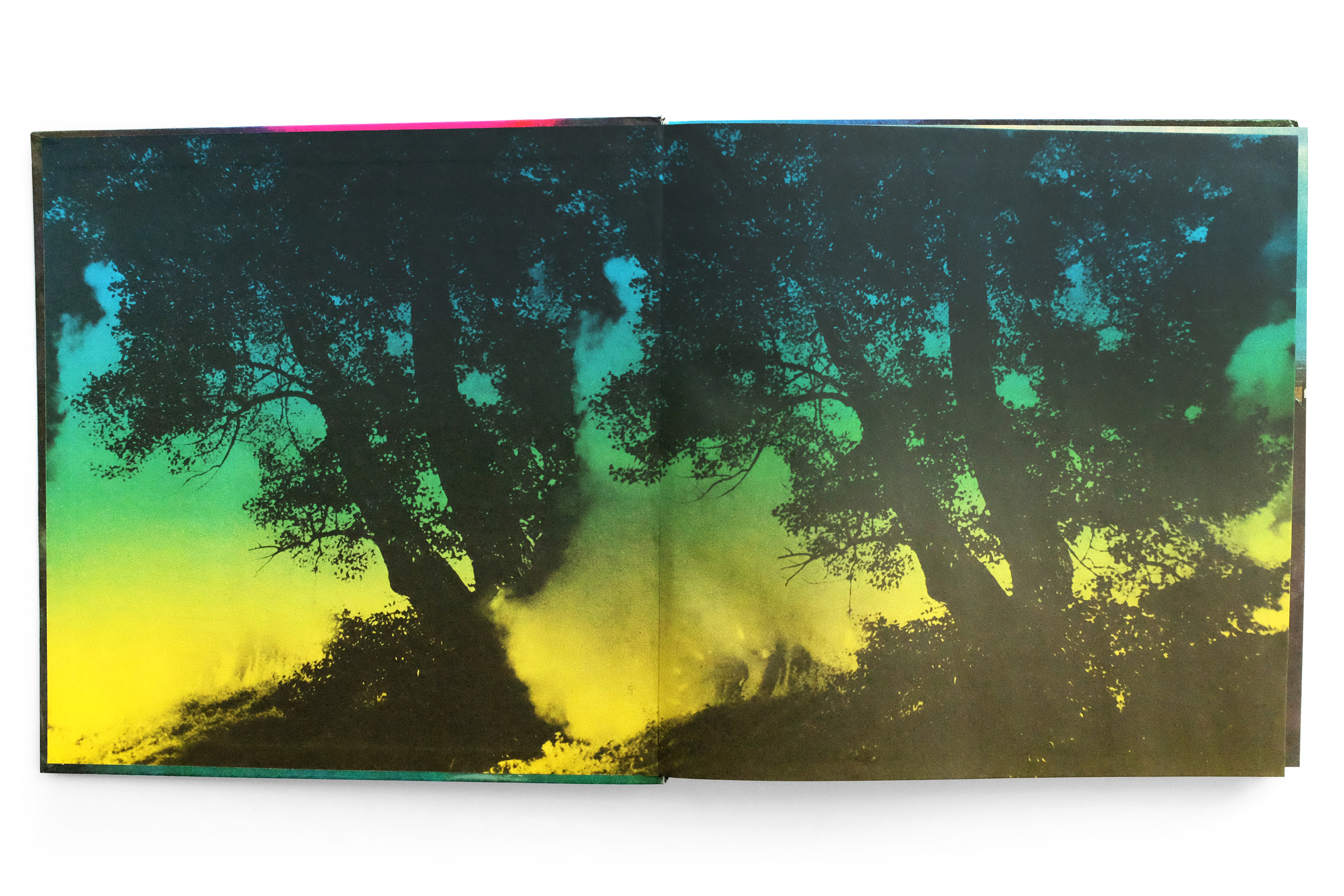
The short publication concludes with three tightly framed landscapes which are just as rare in the Bechers’ oeuvre as they are striking. Each panorama stretches across the page with a beautiful horizontal stress which contrasts the intense verticality of the entire book thus-far. Additionally, we’re granted the context of seeing these sculptures in dialogue with one another and their natural landscape. It’s a fitting end to a catalog which transcends the ephemeral nature of its origin. Indeed, Kunst-Zeitung had never issued this with posterity in mind. For instance, it is almost impossible to find a copy without one or two creases down the center as they had been crudely folded for easier packaging and mailing by the publisher. And it’s precisely this lack of pretense or formality which I find so refreshing and attractive here. The ease to which this value-engineered folio of just 12 pages might still be saved, cherished, and shared 50 years after its making is a testament to the incredible capacity of printed matter to endure and transcend the context and intentions of its time.


Warszawskie Getto


Warszawskie Getto
1988
Interpress

design by Hubert Hilscher
printed in Poland
 

After a sustained and regrettable hiatus, I’m returning to Other Library to share a powerful book deserving of close reflection for its sobering subject and remarkable design. In my mind it manages to overcome the difficult challenge of recording human suffering in a dignified and respectful way that avoids exploitation or minimization of the people involved. Warszawskie Getto is a haunting portrait of Nazi-occupied Poland, told through the lens of Polish photographers and released by the Polish publisher Interpress in the late 80s. This deeply affecting photobook depicts everyday life in the largest Jewish ghetto during World War II, culminating with the ultimate uprising against the Nazis and their lasting effects on the city.

Photos are divided into chapters, featuring everything from the quotidian minutiae of everyday life, to the violent fires and death that plagued the city. The book’s portrayal of these atrocities is unflinching, yet measured. Not once do the photographs veer into sensationalism nor do they fetishize or aestheticize the tragedy. Instead, the images are imbued with a profound humanity, capturing people with grace and dignity in the face of overwhelming oppression. It is a narrative lovingly told with empathy and remorse, seen through the eyes of the people who lived through the experience first-hand.

Given the solemn nature of the subject, the task of compiling and designing such a book no doubt required a nuanced approach and a sensitive hand. The Polish designer Hubert Hilscher responded with a book bereft of extraneous ornament or flourish. The typesetting, almost exclusively Helvetica, is applied in a crude and unadorned fashion. The photographs don't occupy a delicate, consistent place on the page. Instead, they spill out across each spread, shifting in size and shape to best accommodate the subject. Consequently, there is an incredible cadence to the pacing of the photography, with some spreads densely packed with claustrophobic, tiled portraits, while the following page can open up to an expansive single image of a cityscape. The result is a document that breathes with life, charged with a dynamism that is unpredictable and evocative. Another powerful element of this book is the intense, void-like matte black of its pages which brings additional gravity to the imagery.


I struggle to put into words how or why I believe the sum total of Hilscher’s decisions, carefully applied and masterfully sequenced, equate to this salient and respectful portrait of Warsaw and its people. But I know for a certainty that he has managed to avoid common tropes I’ve seen too many designers fall victim to when the subject of a design is human suffering or oppression. An immediate example which comes to mind is the work of Pentagram partner Harry Pearce who attempted to commemorate the bombing of Hiroshima and Nagasaki with a poster featuring his blood photographed in the shape of an atom bomb explosion. The design, along with the process of its making and its subsequent reception, felt as though Pearce had flippantly used the horrific tragedy as a prop to explore an “interesting” design execution or worse, focus attention on himself rather the victims. If you’d like, you could read my deeper analysis of the poster, but my point is to draw a stark contrast between both works of design. Where Pearce’s poster focuses almost entirely on execution, craft, aesthetics, and “Smile in the Mind”-cleverness, Hilscher’s book is a poignant and dignified glimpse into the victims of a horrific tragedy that eschews visual tricks and gimmicks in deference to its subject.

I hope I’ve managed to present this book in a thoughtful and respectful way. Even the task of photographing its pages was at times difficult. I’ve had to largely avoid some chapters and imagery, particularly that of the dead, because it felt inappropriately voyeuristic and simply too painful to feature. However, I’ve tried to balance that anxiety with the strong belief that these stories need to be told. And it’s important to celebrate the work that manages to do so with an elegance and humanity such as this.


Industriebauten 1830–1930


Industriebauten 1830–1930
Bernd and Hilla Becher
1967
Die Neue Sammlung
34pp.

printed in Germany

At the risk of sounding unbearably cheesy, I'll say that this book has been one of my more emotional acquisitions. The catalog is the very first book published on the photography duo Bernd and Hilla Becher, who would go on to fundamentally alter the nature of postmodern photography. Those who know me will be familiar with my respect for their work and practice. And it's a privilege to have a piece of their history, documenting their first exhibition long before they attainted their historic status.

The Bechers dedicated their lives to capturing the post-industrial landscape of Europe and later America. Where others saw worthless artifacts from a bygone era, they found beauty in the incredible invention of form stemming from practical considerations dictated by the various functions of each structure. They studied these abandoned and dilapidated buildings with undying precision and care using a rigid methodology for composing a shot. In fact, you can compare any two photos taken across the decades in which they worked and they would look exactly the same (save for improvements in the technology). 

Aside from creating a massive body of inspiring work which alone sits above most in the history of modern photography, the Bechers also had a rich pedagogical career, founding the Dusseldorf School of Photography and teaching an entire generation of world-renowned artists working in the Becher's tradition of photographic objectivity such as Thomas Struth, Candida Hofer, and Andreas Gursky to name but a few. 

The book itself is printed cheaply and is very brief at only 34 pages long. The design, however, is quite striking. Its cover stuns, demonstrating a remarkable sensitivity for space and type, somehow making the photograph feel larger than life. The unnamed designer does well to let the photography breathe in the upfront section of the catalog. But once the essay has concluded, the book organizes the collection of works by function, grouping like with like and allowing the viewer the ability to easily analyze and compare the architectural forms which reveal intricate variations on a theme. This indexing method has been employed by the Bechers their entire career to great effect. 

Although I have nine other Becher catalogs, all featuring high-quality reproductions of their work, this tiny catalog remains my favorite. It marks a humble beginning of two incredible artists who married exceptional vision with a loving passion for their craft.


Alberto Giacometti


Alberto Giacometti
1987
Abrams
224 pp.

design by Herbert Matter
printed in Japan

This is a powerful book documenting an uncompromising view of Giacometti's work through the eyes of the esteemed Herbet Matter. Giacometti himself said that Matter had captured his works in their purest form, celebrating the photographs as a masterful achievement. This book captures the total series in a publication also designed by Matter. It opens with beautiful view of Switzerland—Giacometti and Herbert Matter's home country. The next section delves into Giacometti's cluttered studio, capturing it in a dramatic light, imbuing the space with a kind of poetic nostalgia for the quintessential artist atelier of that era. 

The final photographic section is a sprawling study of Giacometti's sculptures, drawings, and paintings. They capture his monolithic figures trapped between a kind of monumental awe and crushing fragility. Matter (and to the credit of the phenomenal publisher, Abrams) gives these photographic works the time and space they need to breathe and imprint a lasting impact on the viewer. The book is both massive in scale and length, never once feeling rushed or tedious. The variety of scale, light, color, and form create an entrancing experience navigating it. If there was ever a book that comes close to capturing the stirring and poignant experience of looking at a Giacometti in person, it is this.


Pieśń Wawelu


Pieśń Wawelu
1980
National Publishing Agency of the Workers' Publishing Cooperative Prasa-Książka-Ruch, Kraków
180 pp.

design by Sławomir Lewczuk
printed in Poland

I’m skeptical that I can adequately write anything about this book. For one, I understand very little about what it is documenting. I believe it highlights a famous Polish riverside performance featuring an amalgam of pyrotechnics, theatrical puppetry, and music conducted by the Polish United Workers’ Party over multiple years in the 70s. Secondly, much like the occasion itself, the design of the book is wholly irregular in a fantastical, surreal, and psychedelic way which I doubt I can justly describe. And lastly, I’m also a bit drunk.

The book is a beautiful photographic essay unlike anything I’ve seen before. Everything from the use of the ungainly extended Akzidenz Grotesk to the pure CYMK coloration feels radically unique and without pretension. The low-quality, offset printing of the time has created a wonderfully bizarre rendering of Adam Bujak’s photographs while the bold floods of cyan, magenta, and yellow abruptly break the rhythm of the images. 

Even many of Bujak’s black and white photographs are printed in monochrome shades of alternating colors, furthering the surrealistic effect. The book also comes with a record featuring music from the event. It is packaged unceremoniously in an off-kilter red sleeve that vibrates against the somewhat garish combination of the spread’s magenta and yellow pages.

The book was originally derided as a cheap fever dream, showcasing a famed event through a kind of slipshod cacophony of various technical and budgetary limitations, or otherwise inexplicable choices. But the result today is an absolutely beautiful contemplation on the radical design of that era. It transcends its original constraints to create an otherworldly portrait of a bygone event. This is easily one of my most prized books in my collection, not for its value but its exceptional design. Rarely do I come across a work that feels as uninhibited as this.