L'art Vivant Aux Etats-Unis

L'art Vivant Aux Etats-Unis
1970
Foundation Maeght
164 pp.
design by Hannes M. Anrig and Jacques Jouffroy
printed in Switzerland
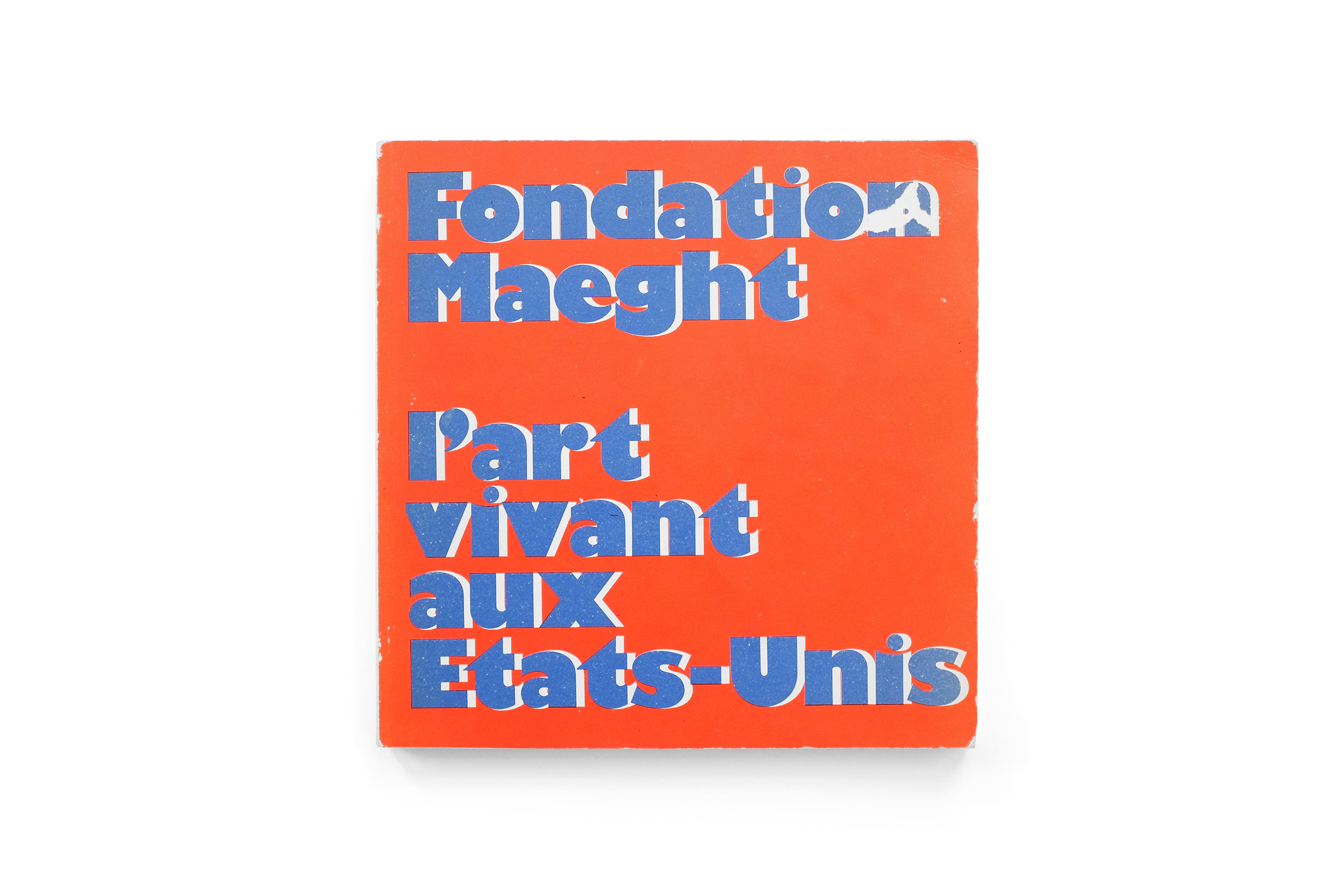
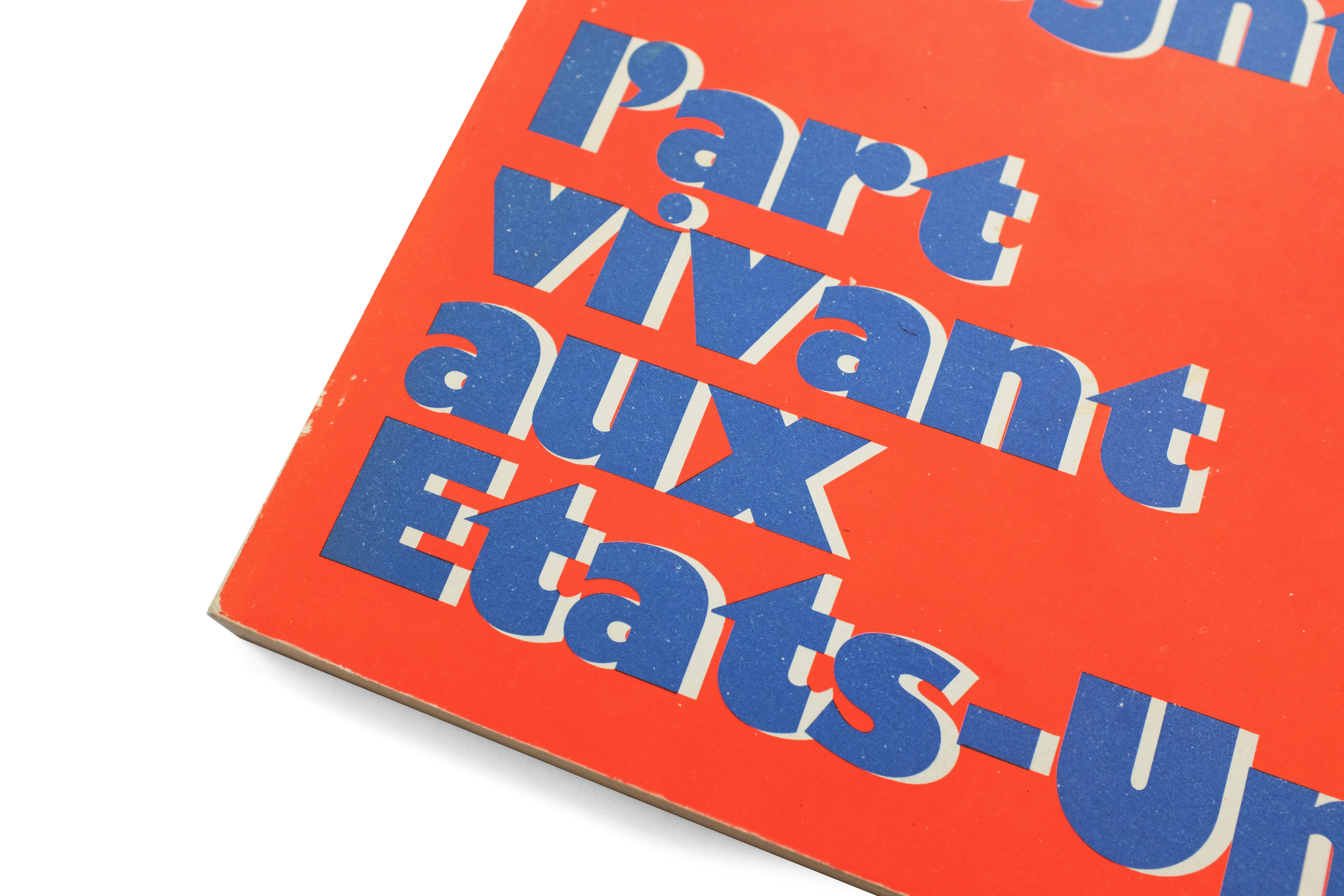
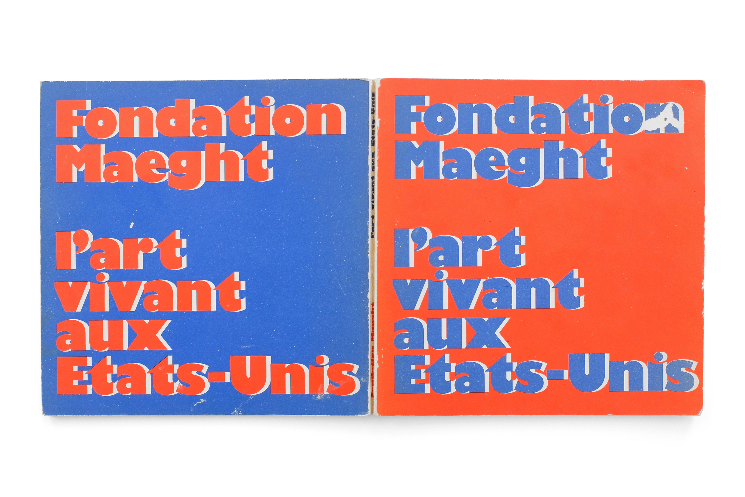
I love a strong front and back cover relationship. This book uses Gill Kayo (the chosen font for the foundation throughout the period) to great effect here. Sitting on a kind of reverse-shadow of itself, the title is reflected on the back with an inverse relationship of the vibrant red and blue as on the front, creating an optical effect that is nothing short of arresting (and somewhat at odds with the formatting inside). Within, the tone is immediately quieted with a comparatively austere and airy preface typeset in Univers which is handsomely used throughout the rest of this exhibition catalog.
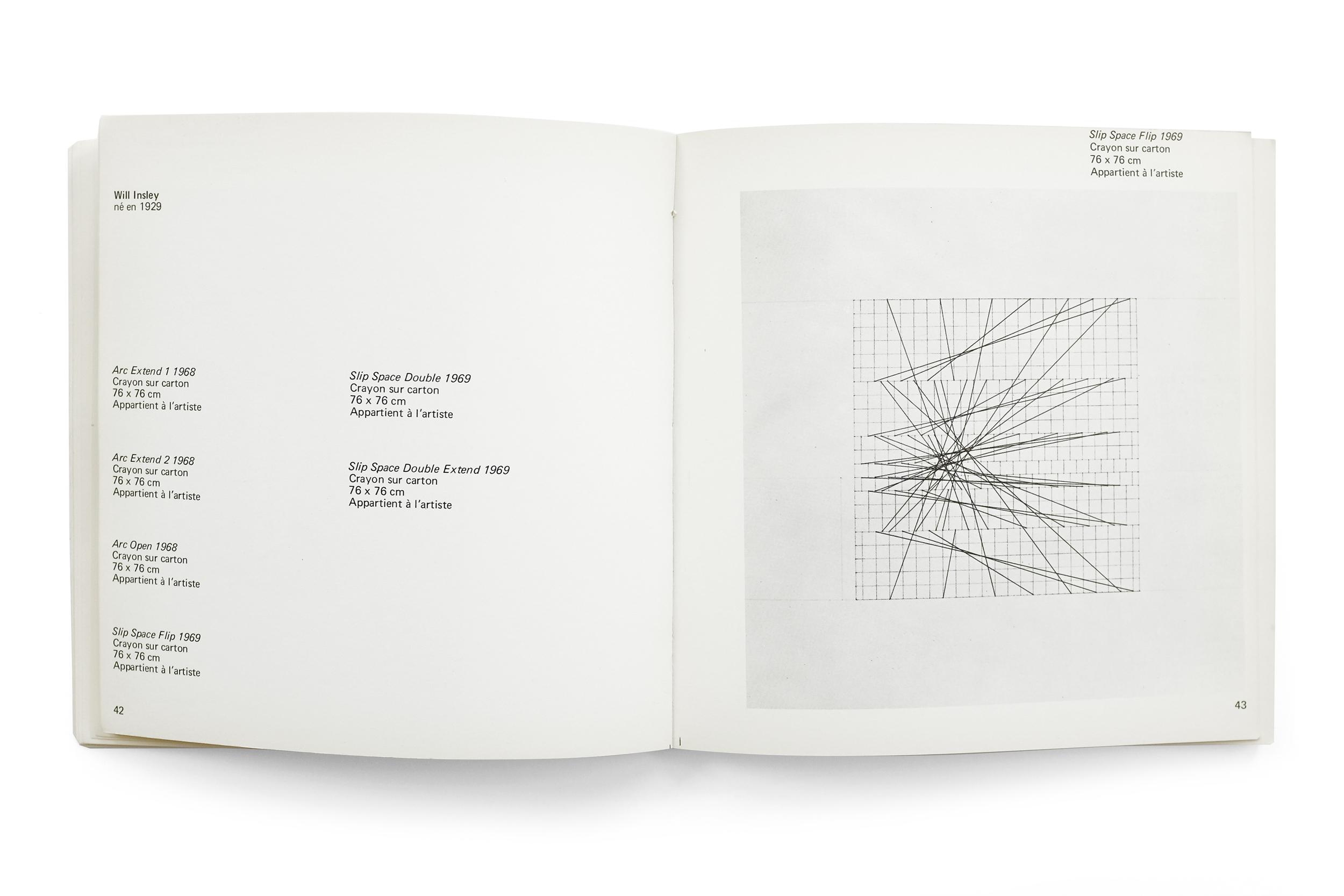
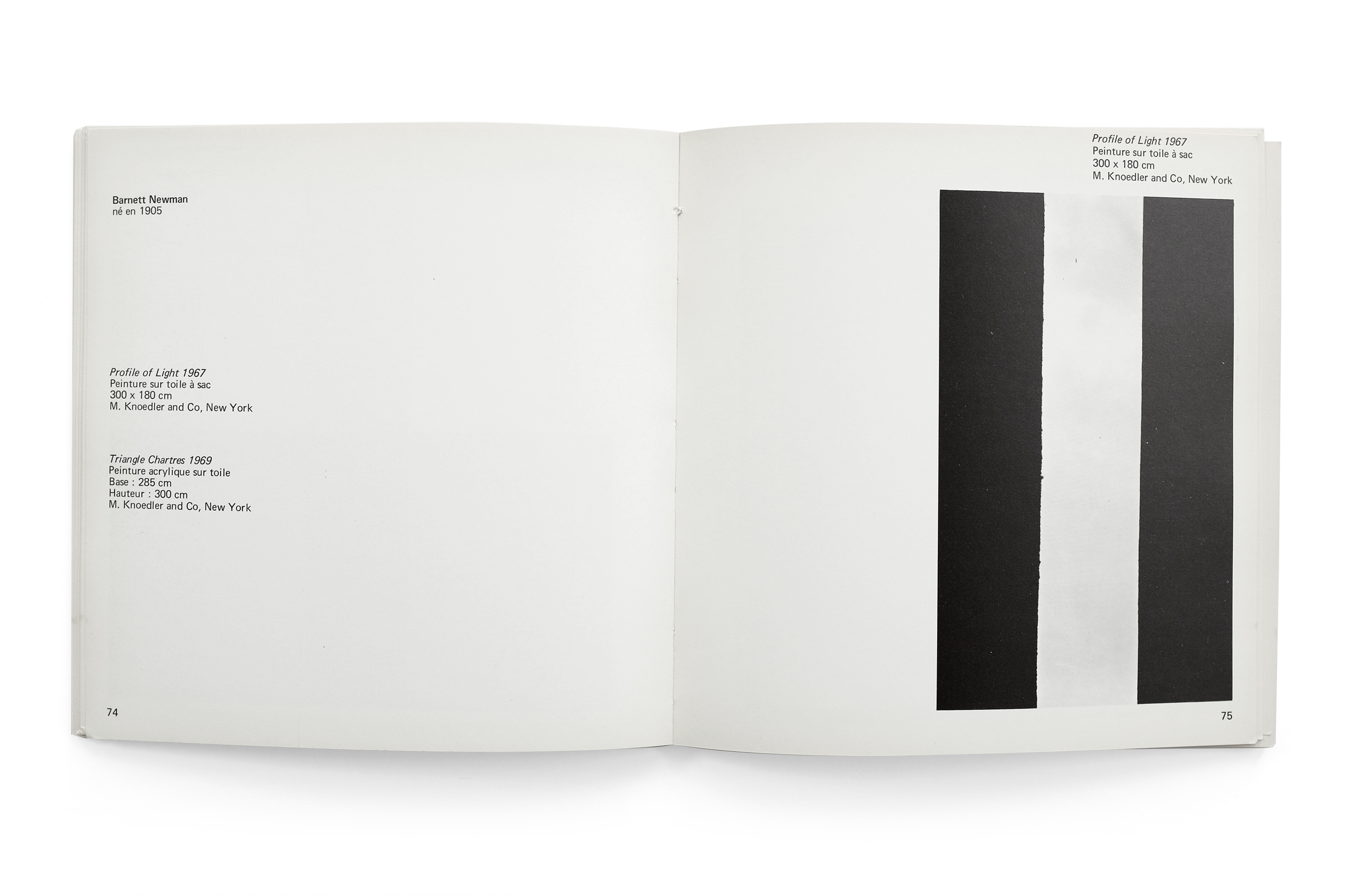
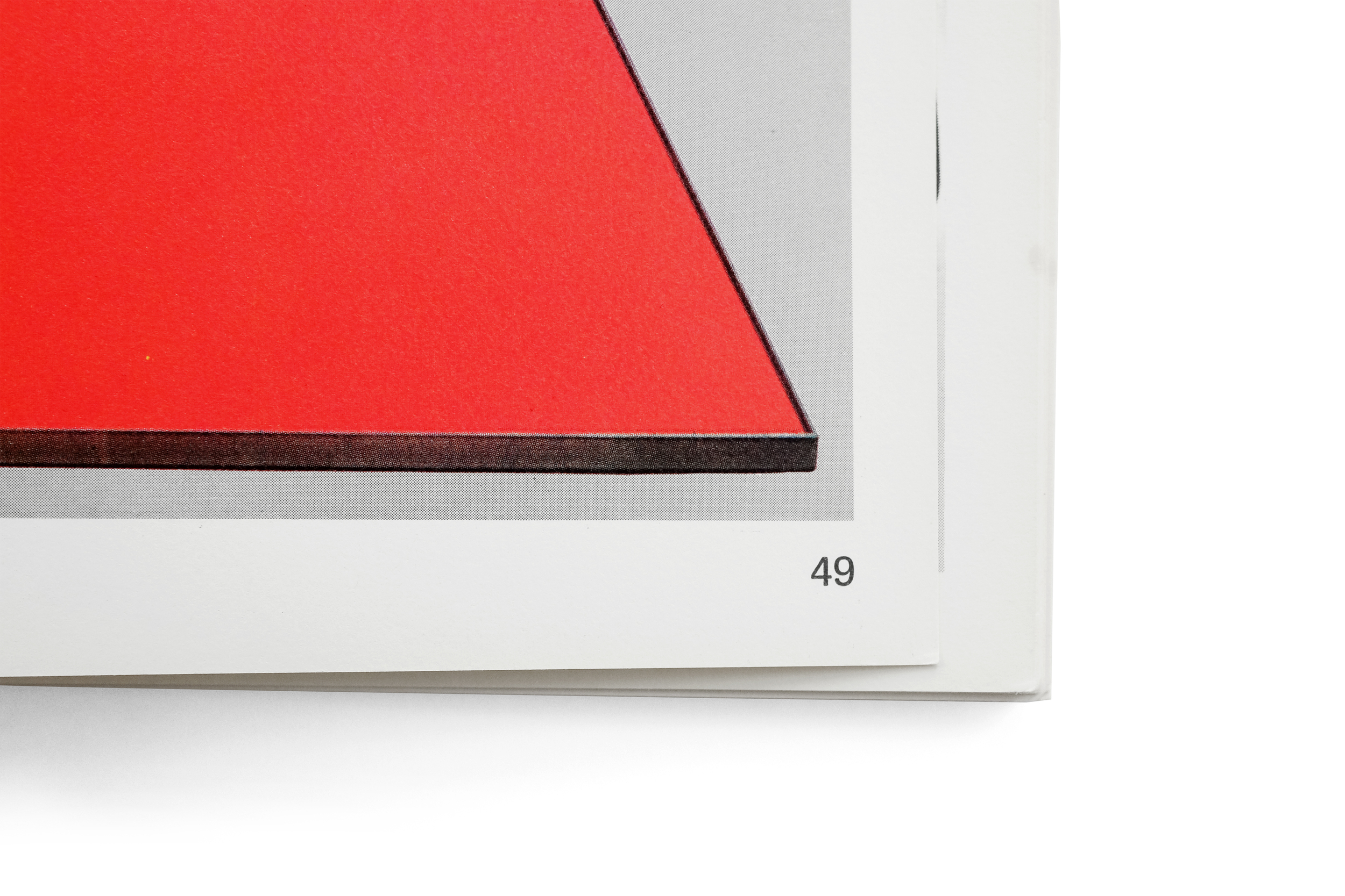
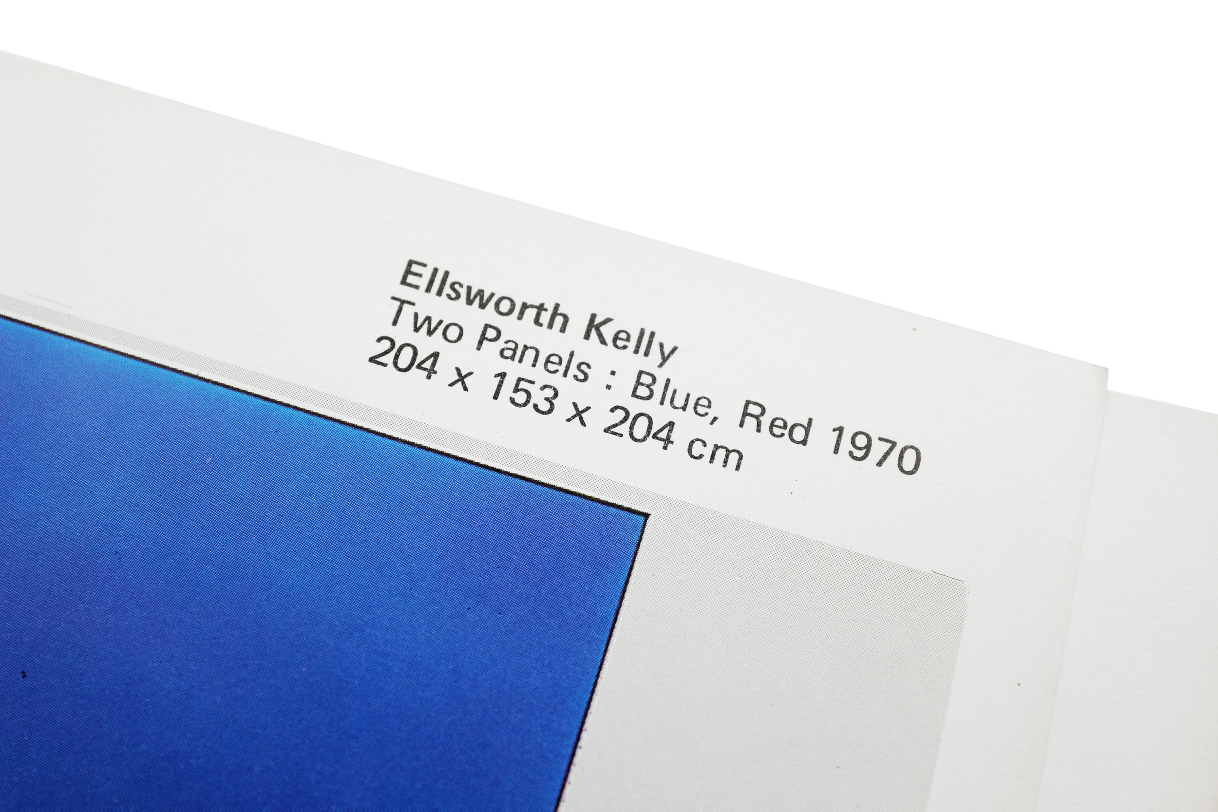
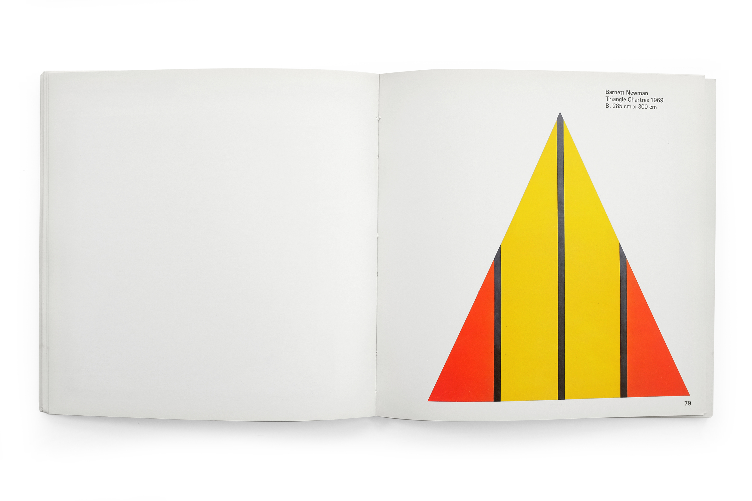
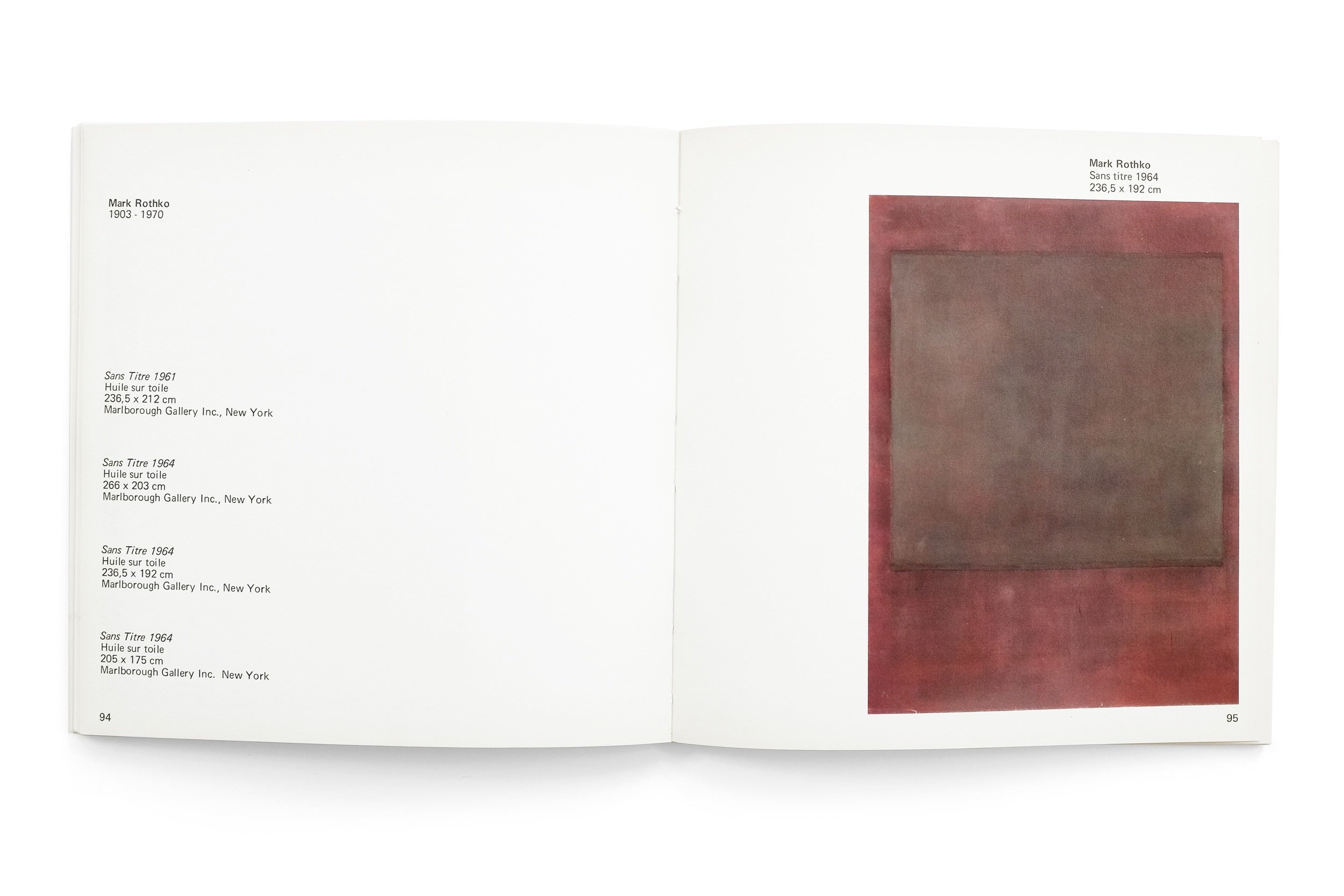
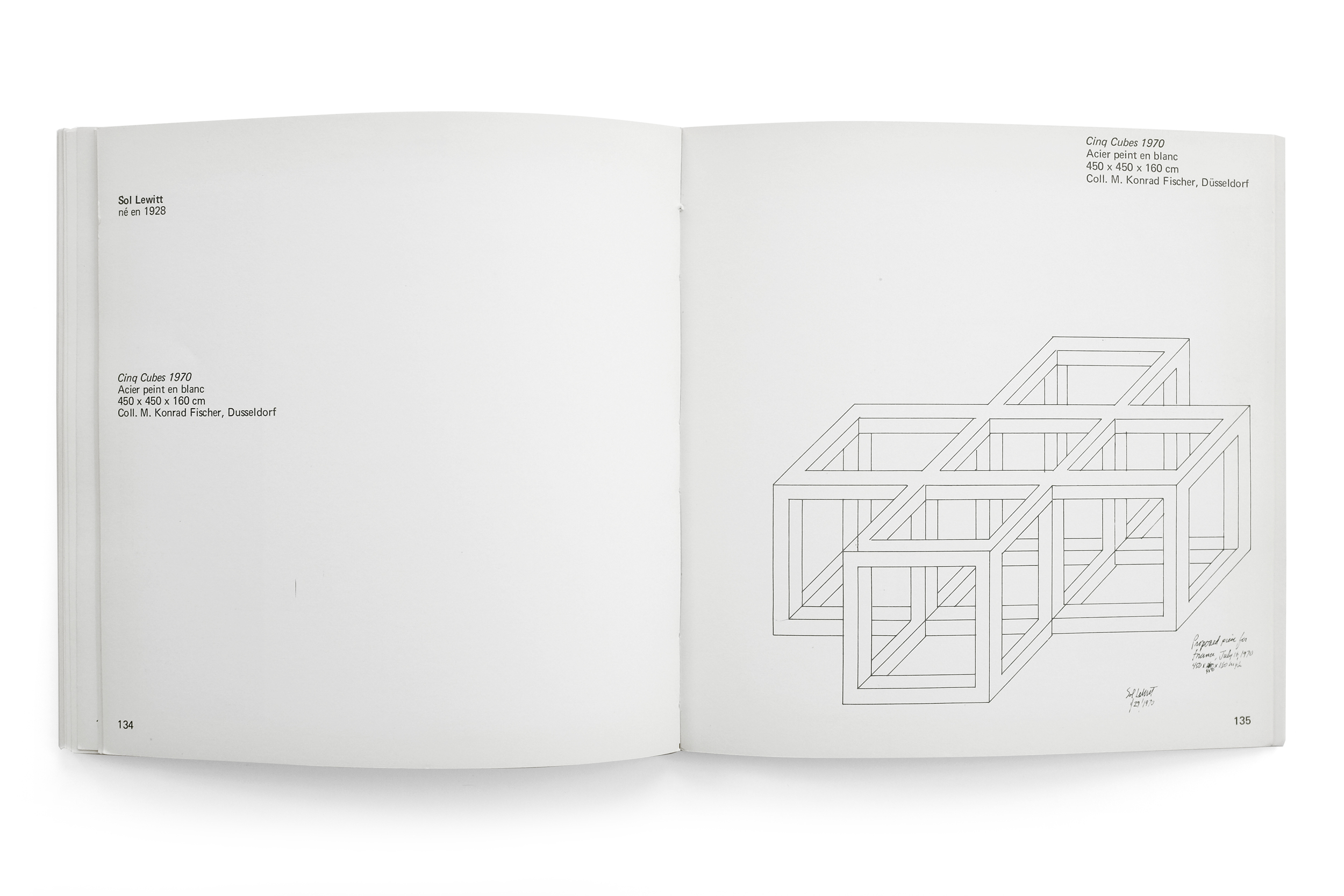
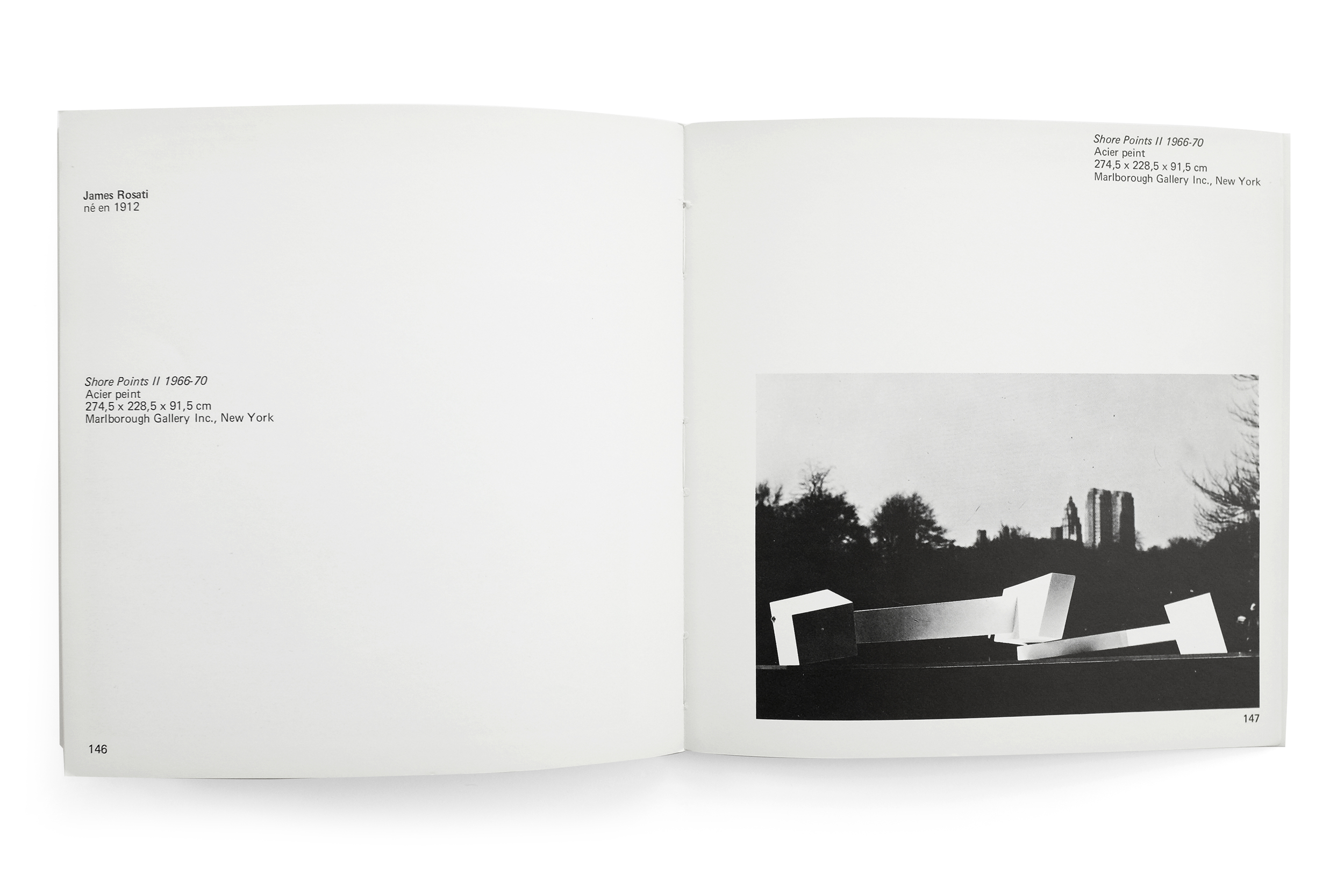
The design of the book, with the exception of the boisterous cover, is relatively reserved and straight-forward. What attracts me to it is its beautiful printing, pacing, and generous use of negative space. In fact, at times I see myself reading the negative space of certain spreads before the content themselves, due to the text and image seemingly retreating to the margins in an effort to avoid recognition, or at the very least create as much space as possible in this tiny catalog. Furthering the curious and quaint nature of this text, due to a publisher error, every copy is missing their 13th and 14th pages.