Donald Judd — Fifteen Works

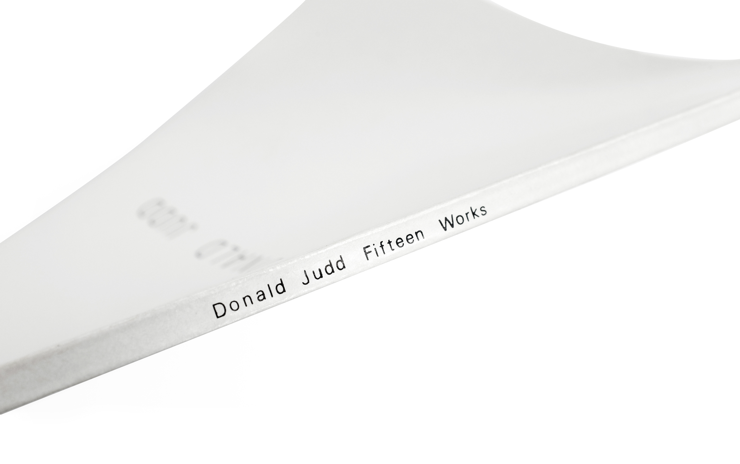
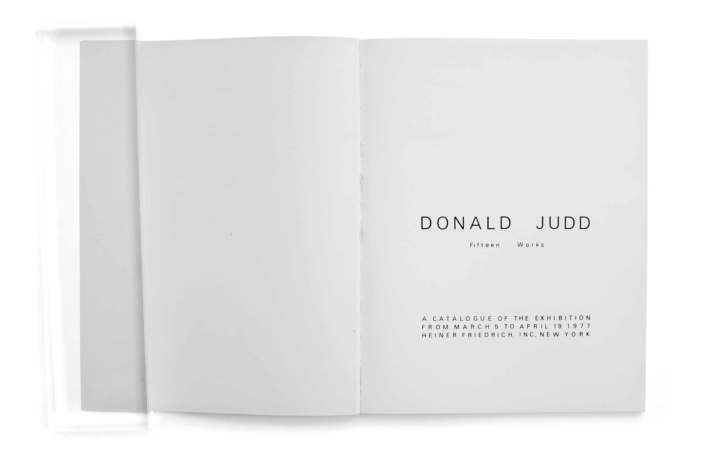

Donald Judd — Fifteen Works
1977
Lone Star Foundation
Heiner Friedrich, Inc., New York.
46 pp.
printed in New York
I consider this to be a very rare example of a perfect book. It's managed to achieve such a status by virtue of its satisfying feeling of completeness and congruence. Completeness in that the content of the book documents and presents the subject in a refreshingly total and holistic way. Congruence because the design of the book perfectly embodies the spirit of Donald Judd’s aesthetic and ideology without veering into pastiche. No decision feels out of place, overthought or heavy-handed.
I found this book at Printed Matter's NY Art Book Fair a few years back. The Dia Art Foundation, as usual, had a particularly sparse display of catalogs on their table. But this one didn't look familiar. I hadn’t recognized it from years past, nor had I seen it on their site before. It turns out that someone at the foundation had unintentionally discovered a large box full of these old exhibition catalogs from the work's debut at the Heiner Friedrich gallery. And as luck would have it, Dia is now the owner of this series of fifteen plywood sculptures that are shown in this book. So the foundation promptly acquired and began to sell the books—a wholly unique and now somewhat mysterious record of one of Dia’s most prized series of works.
I struggle to think of ways I would improve on its design. Much like Judd’s work that is featured within, it lacks all ornament and flourish. The skeletal remains feel refreshingly pragmatic and devoid of any pretension.
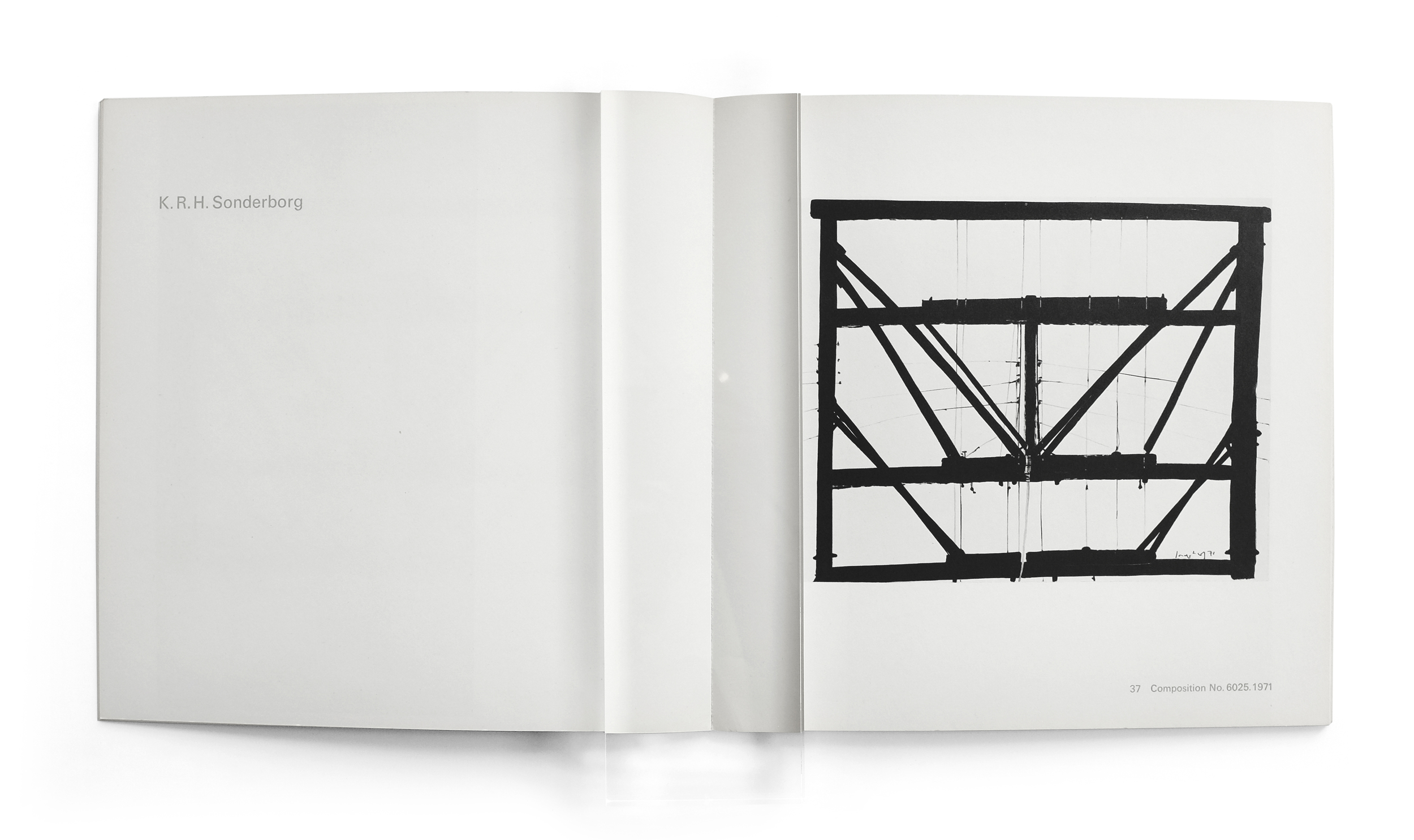
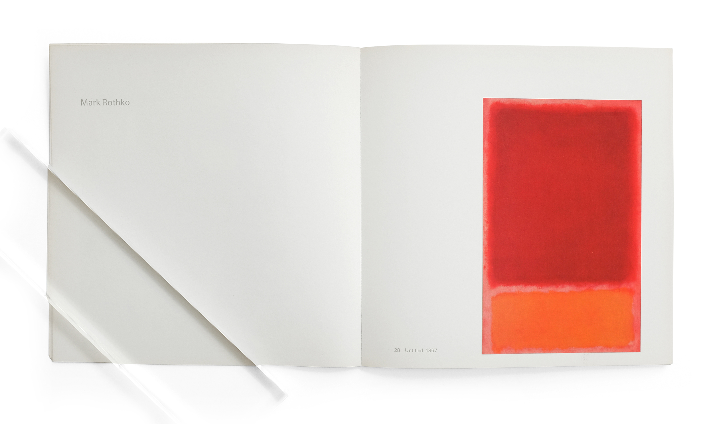
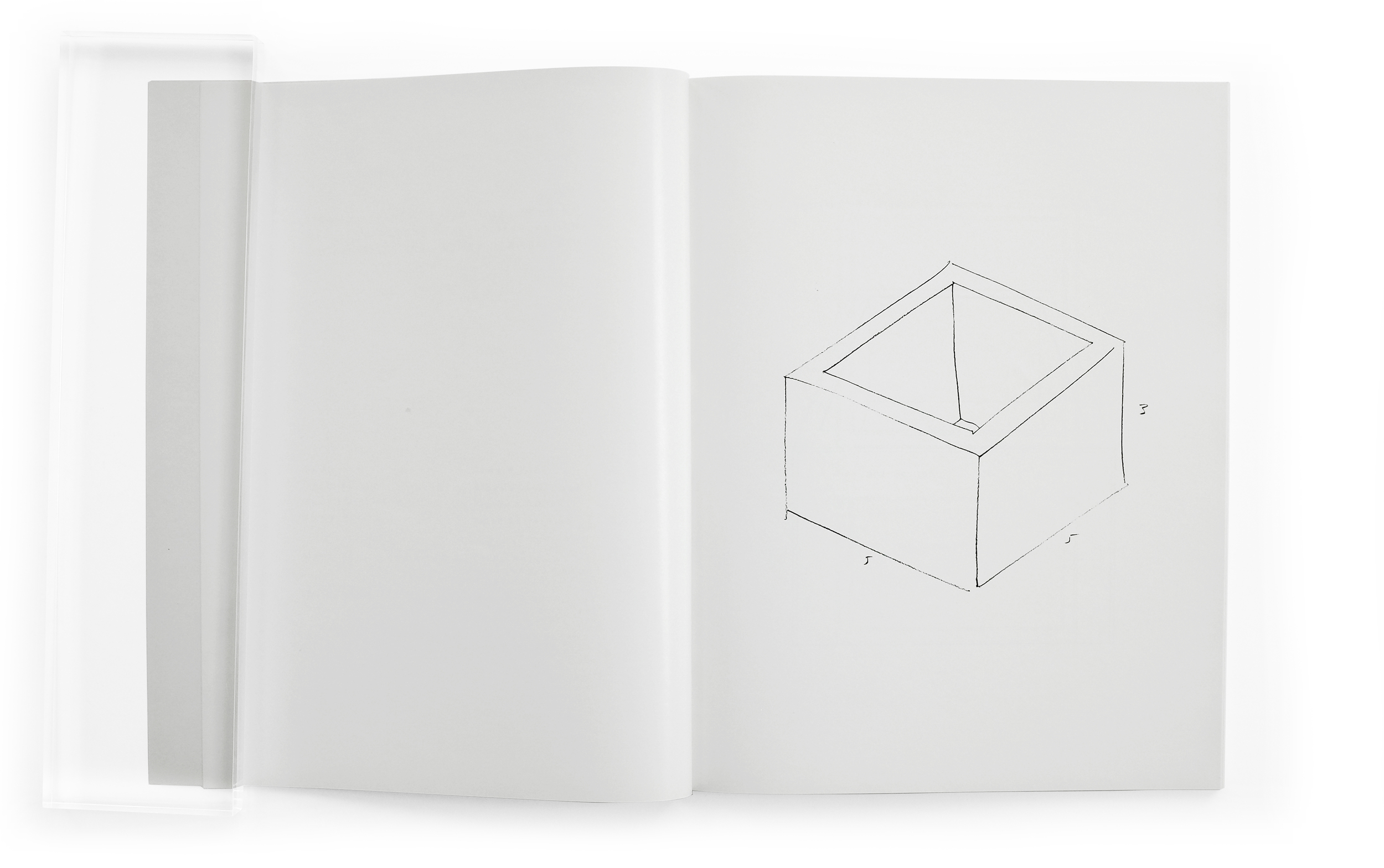
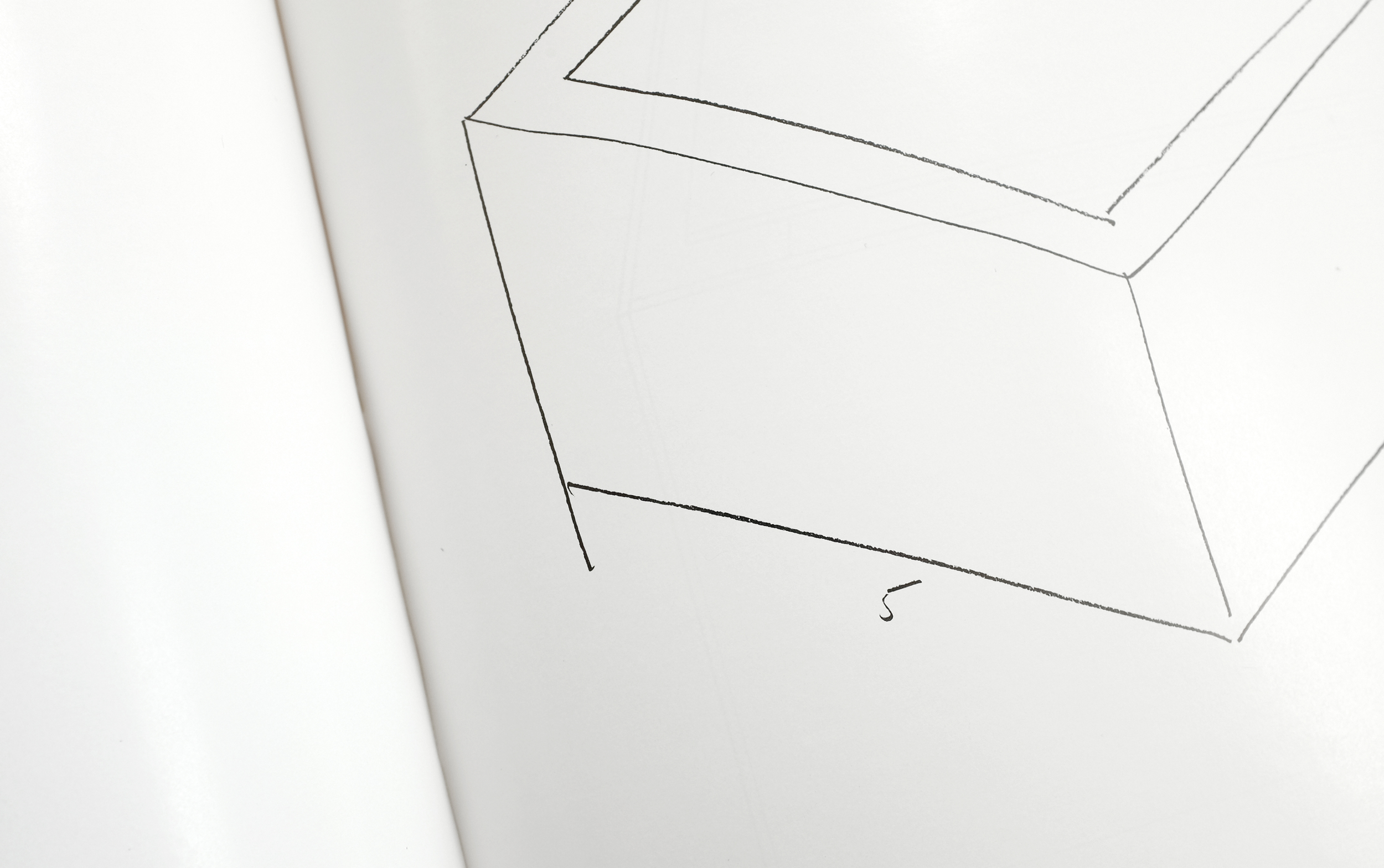
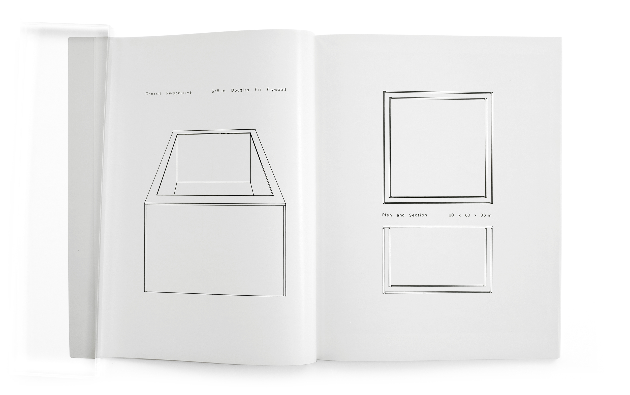
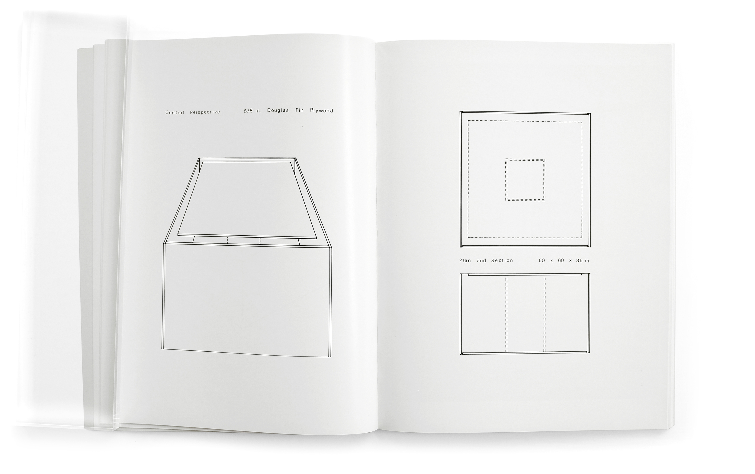
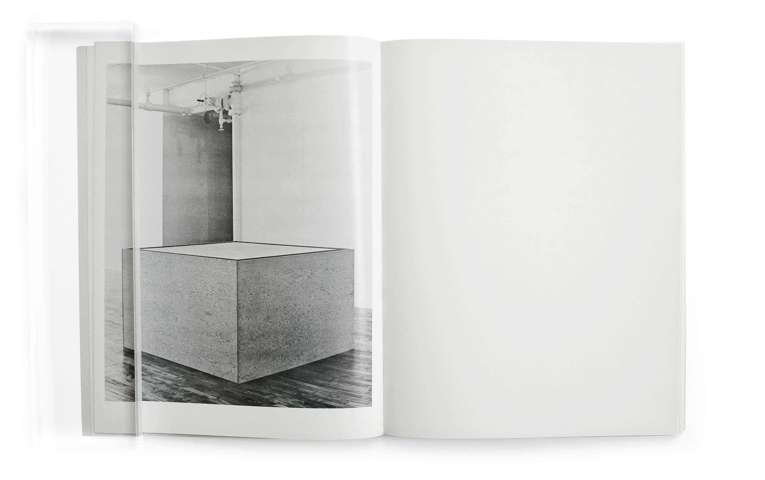
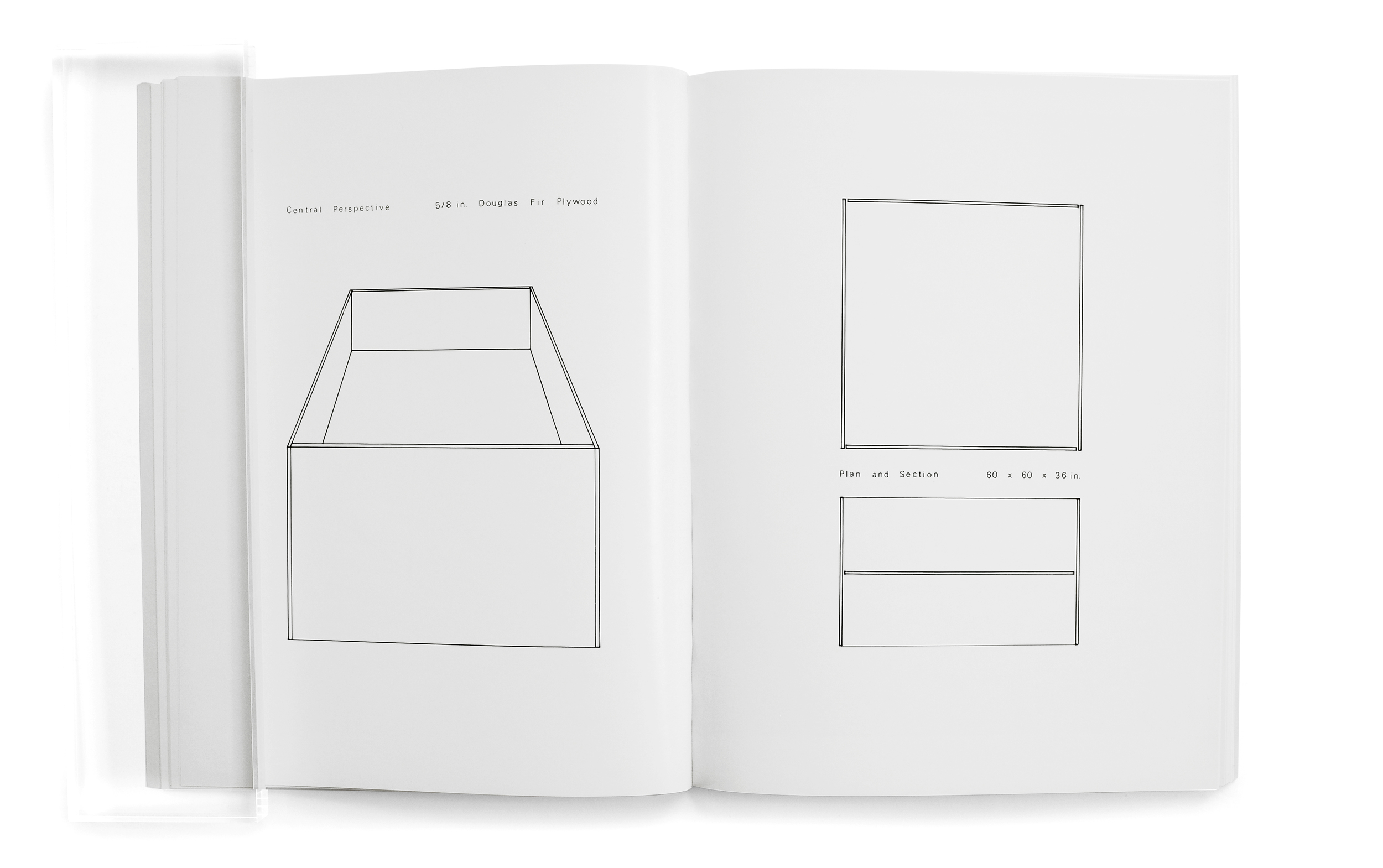
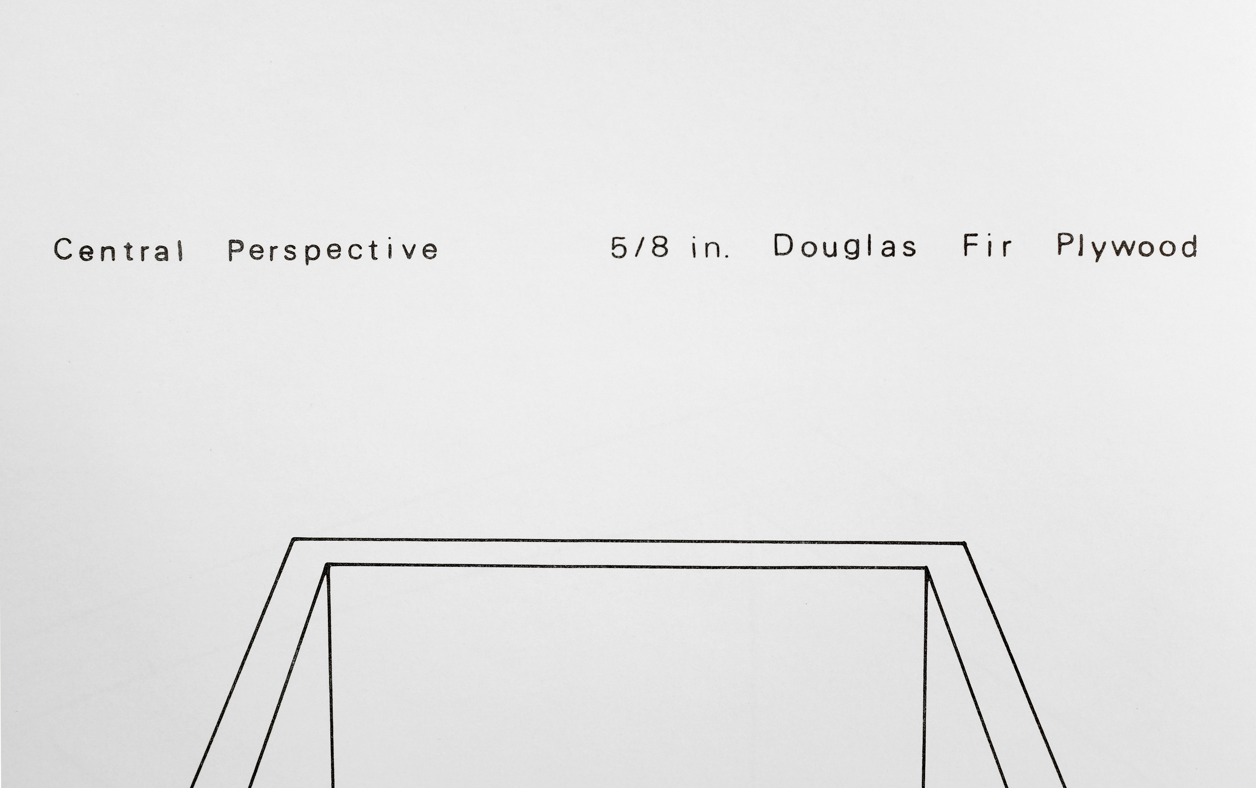
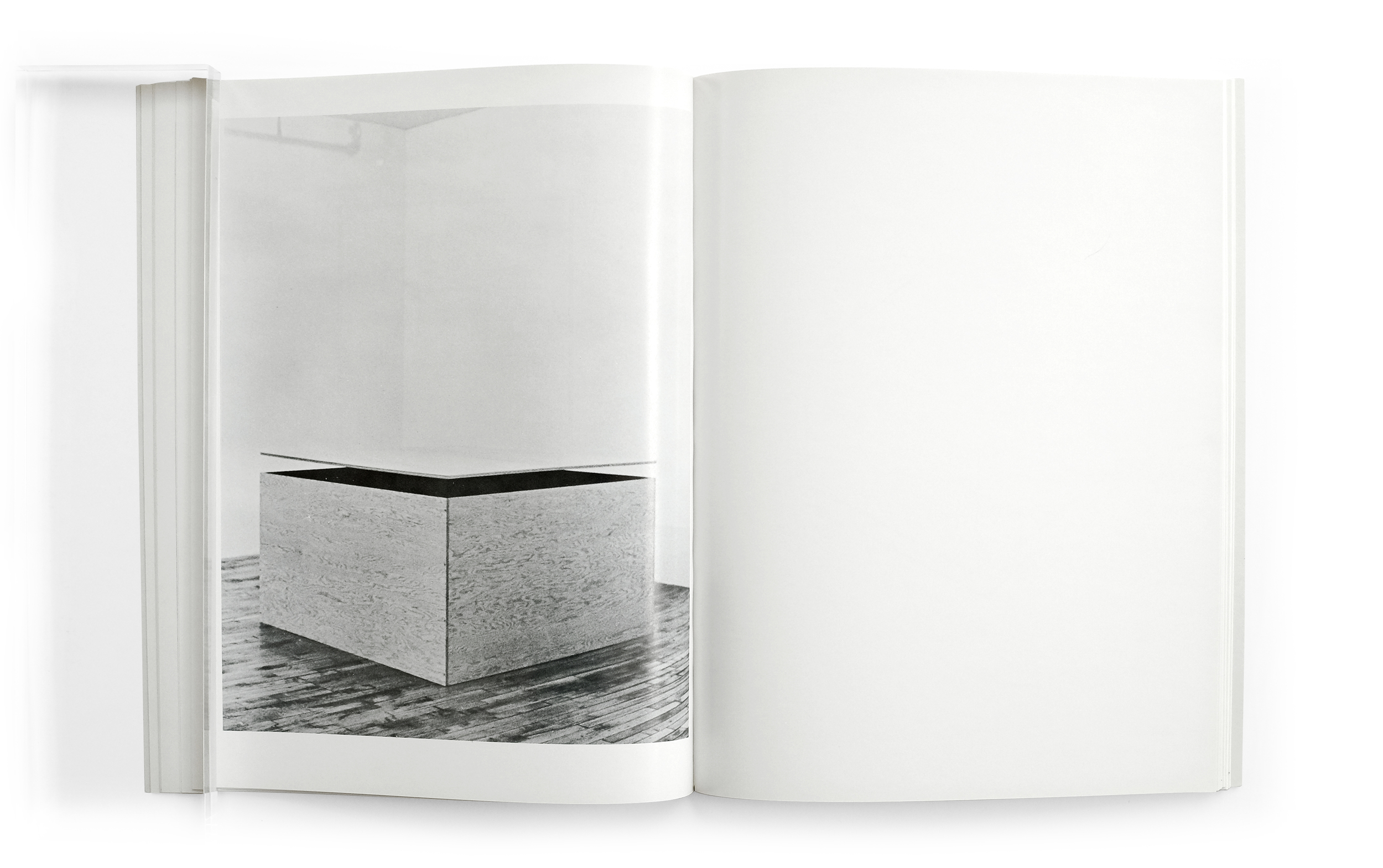
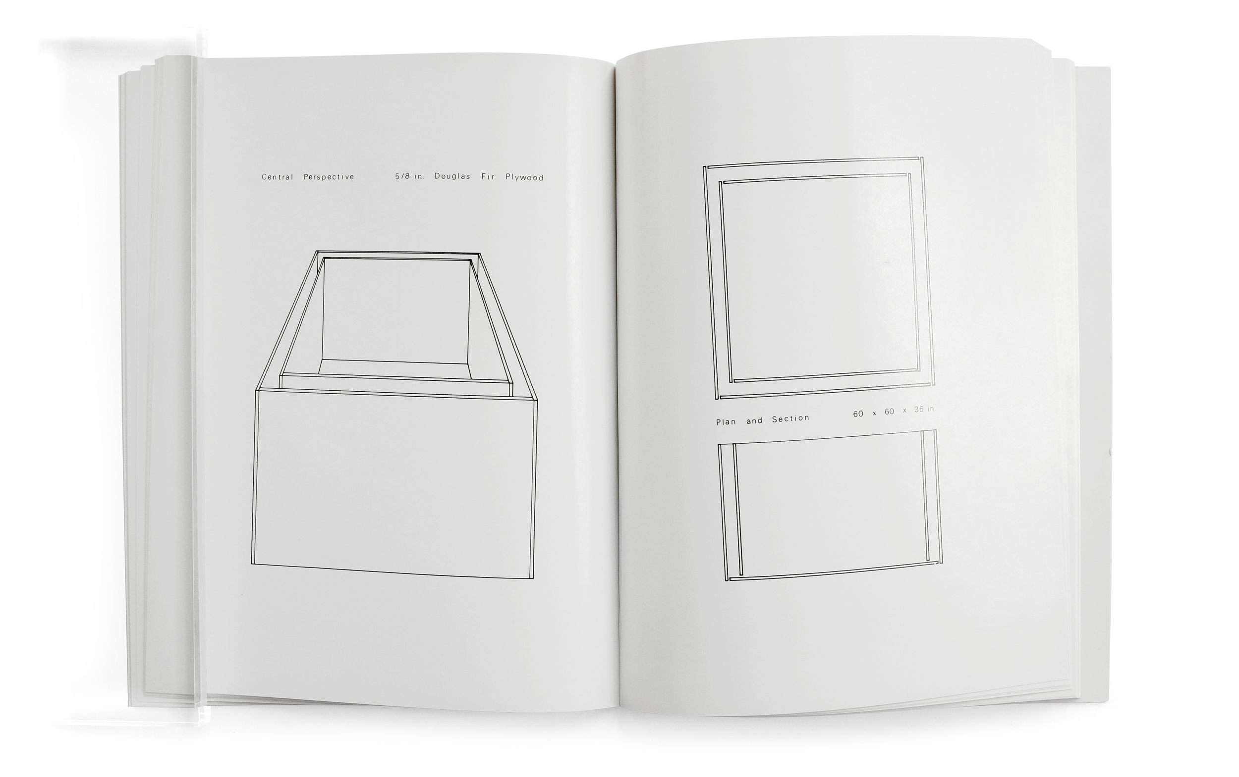
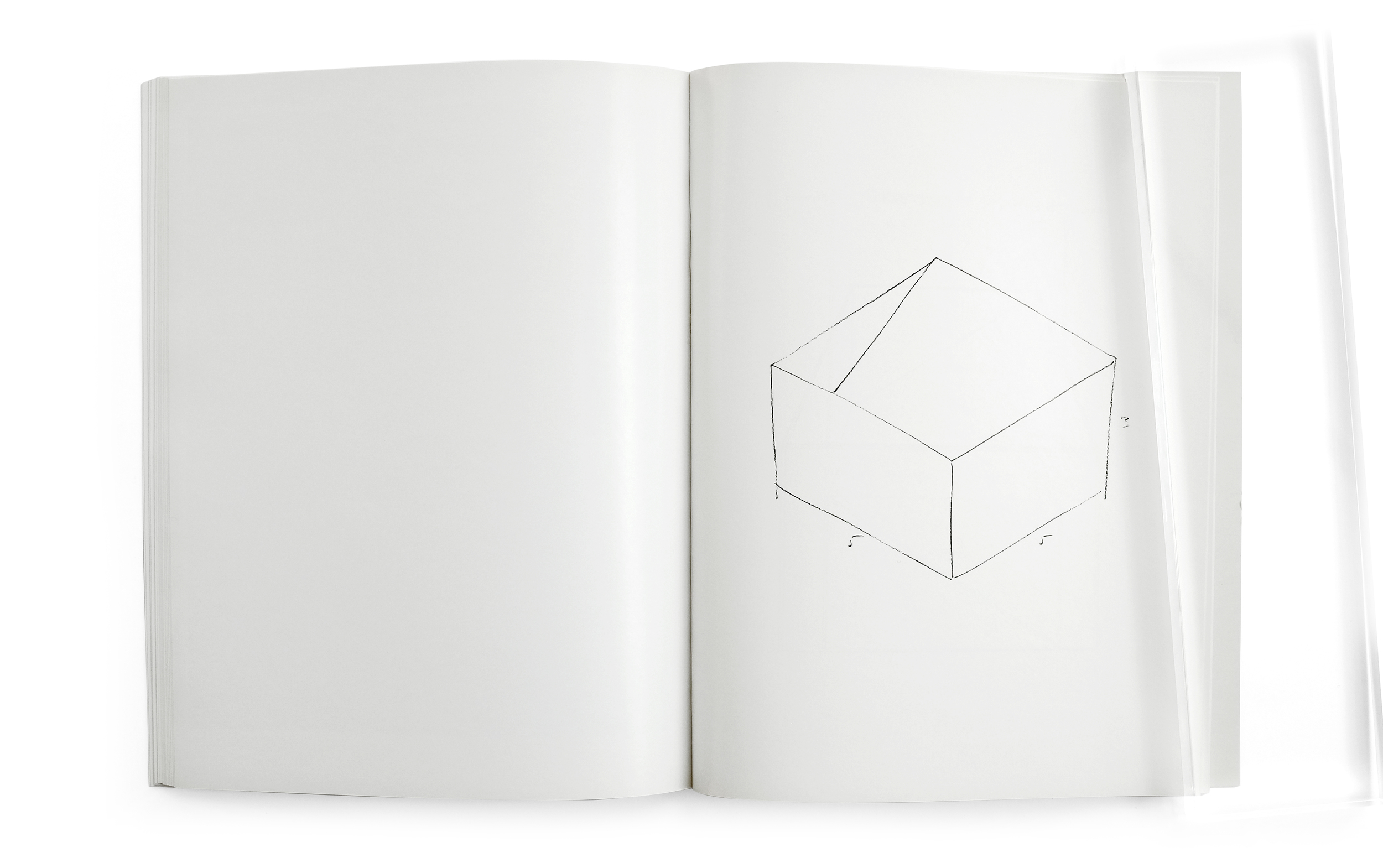
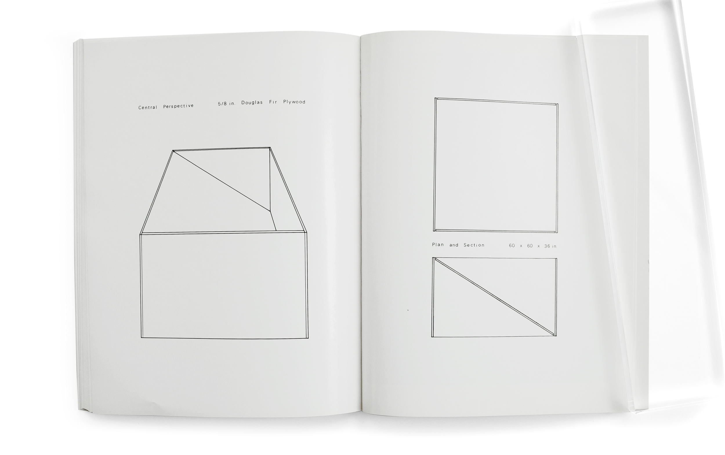
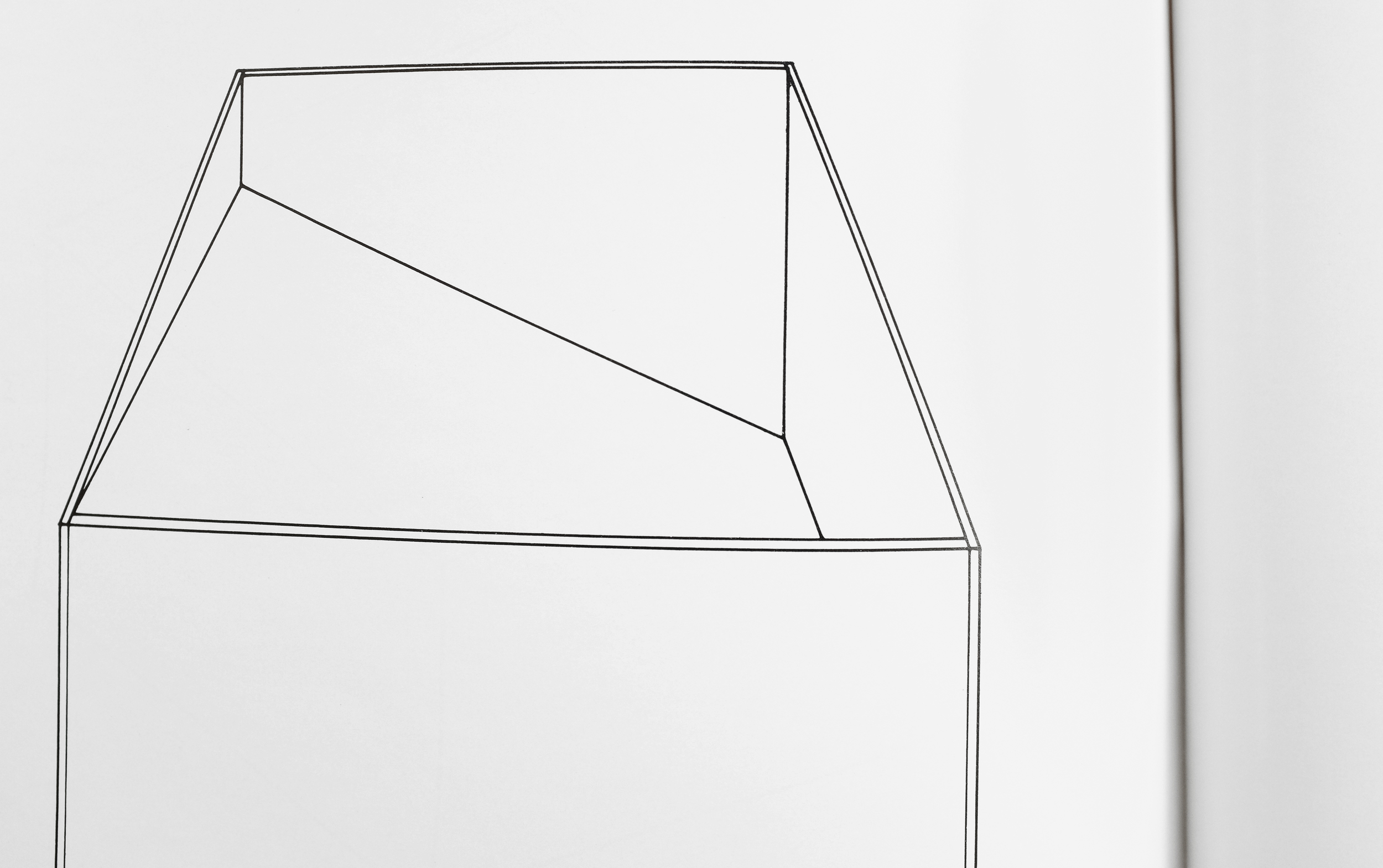
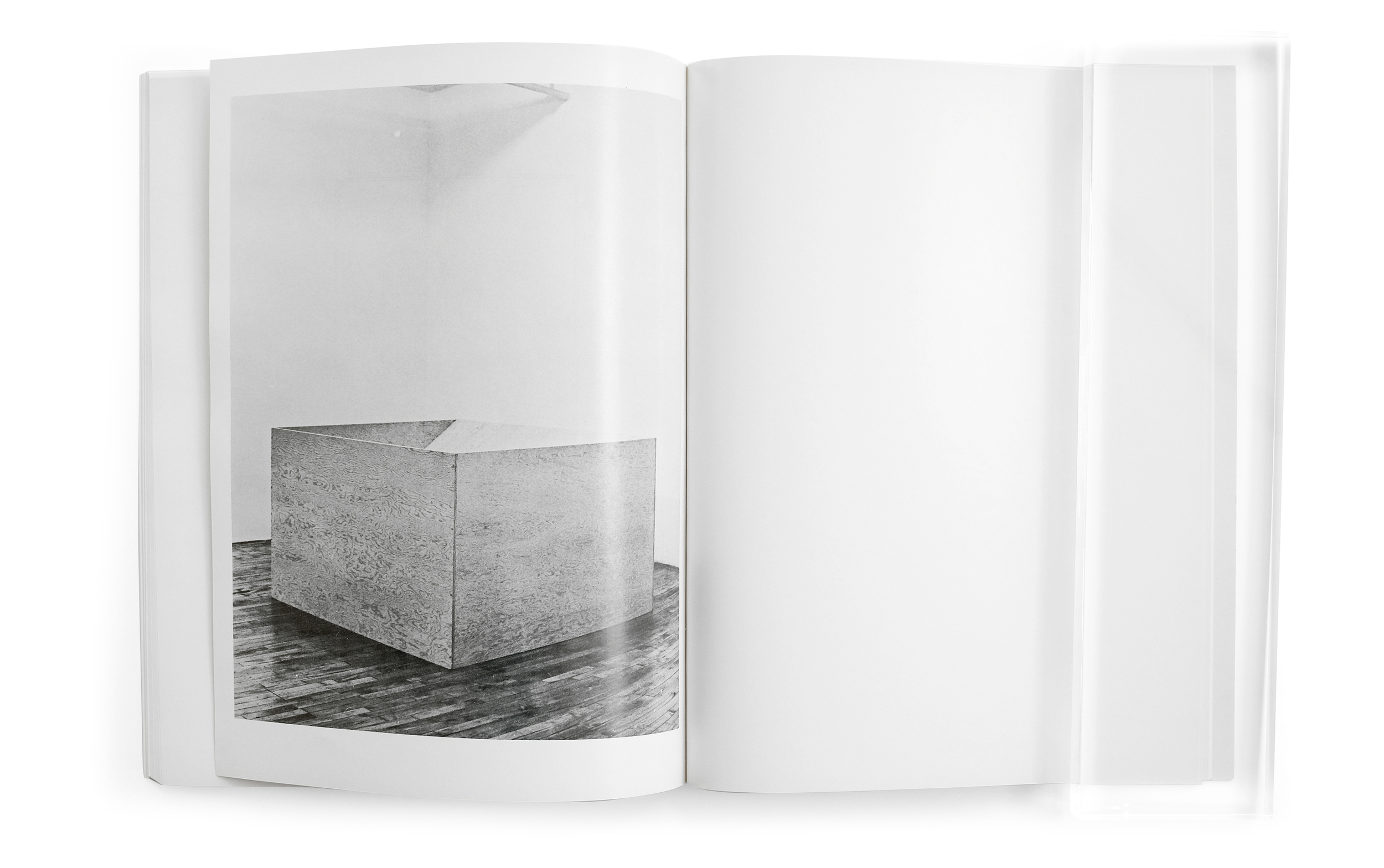
The printing was unkind to Univers with ink spilling out and across the letterforms, neutralizing the more subtle qualities of the typeface, but in turn creating a kind of utilitarian and rough-hewn quality. In a way it reminded me of the plywood boxes themselves. The structure of the book is exceptionally simple. Each of the fifteen works are presented in an identical fashion: a spread is dedicated to an initial isometric sketch by Judd. This is followed by a second spread of technical drawings illustrating the central perspective of the piece as well as the plan and section view, with all accompanying material and dimension information. The final spread is reserved for a single photograph showing the end product: the wooden sculpture sitting unceremoniously in the quiet space of the gallery. The viewer is quickly ushered through the entire series from inception to execution, without any explanatory text. Paging through the book is a methodical and meditative experience. The relationships to Judd’s work are obvious. Like his sculptures, the structure of the book is laid bare. Additionally, ample space is provided to the drawings and photographs, asking the viewer to consider both the positive and negative image, exactly like how his sculptures invite you to simultaneously confront the foreground and background, interior and exterior.
A lesser designer could have suffocated this humble catalog with gimmicks and effects, overpowering the stillness of its contents. But instead, the anonymous designer has managed to channel Judd to create a catalog that telegraphs the tranquil and unadorned nature of the sculptures themselves.